让动效"对味":目的、时长、缓动与克制讓動效「對味」:目的、時長、緩動與克制Motion that feels right: purpose, duration, easing, restraintしっくりくるモーション:目的・時間・イージング・抑制자연스러운 모션: 목적, 시간, 이징, 절제Gerakan yang terasa betul: tujuan, tempoh, easing, kawalanChuyển động đúng cảm giác: mục đích, thời lượng, easing, tiết chếUn mouvement juste : intention, durée, easing, retenueMovimiento que se siente bien: propósito, duración, easing, contenciónBewegung, die sich richtig anfühlt: Zweck, Dauer, Easing, Zurückhaltung
大多数界面动效应在 300ms 内、用 ease-out,高频操作干脆不做。炫技属于营销页,不属于工具。大多數介面動效應在 300ms 內、用 ease-out,高頻操作乾脆不做。Most UI motion should be under 300ms, ease-out, and skipped for frequent actions. Spectacle belongs on marketing pages, not in tools.UIモーションは300ms以内・ease-out、頻繁な操作には付けない。UI 모션은 300ms 이하, ease-out, 잦은 동작엔 생략.Kebanyakan gerakan UI di bawah 300ms, ease-out, dan dilangkau untuk tindakan kerap.Hầu hết chuyển động dưới 300ms, ease-out, bỏ qua với thao tác thường xuyên.Moins de 300 ms, ease-out, et rien pour les actions fréquentes.Menos de 300 ms, ease-out, y nada en acciones frecuentes.Unter 300 ms, ease-out, und keine Animation für häufige Aktionen.
正文以簡體中文顯示。
本文は英語で表示しています。
본문은 영어로 표시됩니다.
Kandungan dipaparkan dalam bahasa Inggeris.
Nội dung hiển thị bằng tiếng Anh.
Le corps de l’article est en anglais.
El cuerpo del artículo está en inglés.
Der Beitragstext ist auf Englisch.
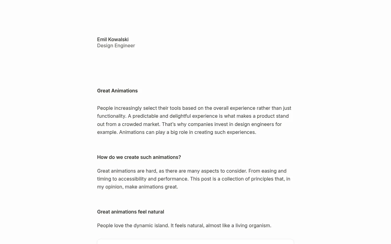
Emil Kowalski's rule of thumb is blunt: if a user triggers something a hundred times a day, do not animate it. Motion in an interface has three legitimate jobs: orientation (where did this come from and where did it go?), feedback (your action worked) and, sparingly, delight. Everything else is decoration that costs time on every interaction. This post gives starting numbers, a step-by-step way to add motion to a component, code you can paste, and the mistakes that make AI-generated pages feel cheap.
Decide the job before the animation
Before writing a transition, write one sentence: "This animates so the user understands ___." If you cannot fill the blank, leave it static. Some examples:
- A dropdown scales from its trigger so the user sees which button opened it (orientation).
- A "Copied" check replaces the copy icon for 1.5 seconds (feedback).
- A hero illustration drifts slowly on first load of a marketing page (delight, once).
A command palette that opens 50 times a day should appear almost instantly. Keep frequent surfaces fast and spend motion on rare moments.
Numbers to start from
- Duration: 150–250ms for small UI changes (tooltips, dropdowns, toggles); 300–400ms for larger surfaces (drawers, modals, page sections). Material 3's motion tokens sit in the same ranges.
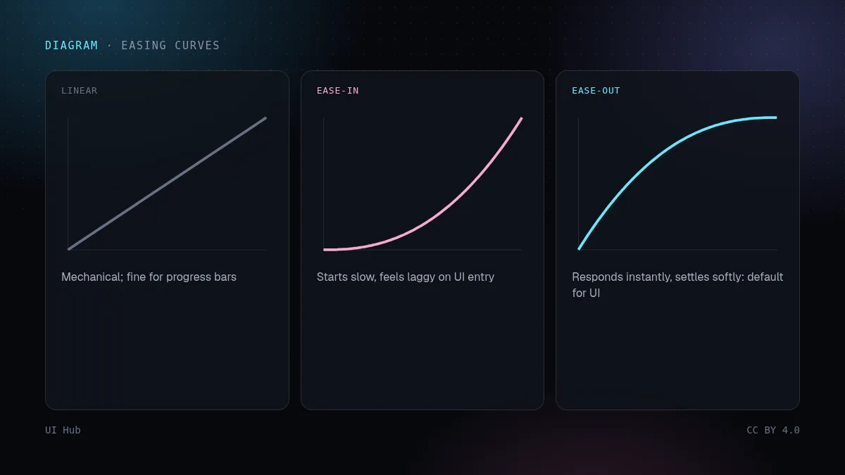
- Easing: enter and respond with ease-out, so the element moves immediately and settles. Avoid ease-in for UI responses; it feels like lag. Use ease-in-out for elements moving from one on-screen position to another.
- Distance: small. A dropdown needs 4–8px of travel or a scale from 0.96, not a slide from off-screen.
- Properties: animate
transformandopacity. Animatingwidth,height,toporbox-shadowtriggers layout or paint on every frame and stutters on mid-range phones.
Step by step: a dropdown that feels right
Step 1: set the origin. Scale from the trigger, not from the centre. Radix and similar libraries expose the transform origin as a CSS variable you can use.
Step 2: write enter and exit separately. Exits should be faster than entries; the user has already decided to move on.
.menu {
  transform-origin: var(--radix-dropdown-menu-content-transform-origin, top left);
}
.menu[data-state="open"] {
  animation: menu-in 180ms cubic-bezier(0.16, 1, 0.3, 1);
}
.menu[data-state="closed"] {
  animation: menu-out 120ms ease-in;
}
@keyframes menu-in {
  from { opacity: 0; transform: scale(0.96) translateY(-4px); }
  to   { opacity: 1; transform: none; }
}
@keyframes menu-out {
  to { opacity: 0; transform: scale(0.98); }
}
Step 3: respect reduced motion. Some users get motion sickness from movement. Keep the opacity change, drop the movement:
@media (prefers-reduced-motion: reduce) {
  .menu[data-state="open"],
  .menu[data-state="closed"] {
    animation-name: fade;
  }
  @keyframes fade { from { opacity: 0; } to { opacity: 1; } }
}
Step 4: test at speed. Open and close it ten times quickly. If the animation ever blocks the next click, it is too long or not interruptible.
Springs and layout animation
For elements that move between positions (a reordered list item, an expanding card, a tab indicator), springs feel more natural than fixed curves because they respond to interruption. Motion (formerly Framer Motion) makes layout animation one prop:
import { motion } from "motion/react";

<motion.div
  layout
  transition={{ type: "spring", stiffness: 500, damping: 40 }}
  className="tab-indicator"
/>
Keep springs stiff and well damped for UI. A bouncy spring is fun once and annoying the twentieth time.
One hero moment per page
Aceternity- and Magic UI-style effects (beams, spotlights, meteor showers, marquees) are designed to impress. They work as one hero moment per page. Put a spotlight on the hero and a marquee on the logo strip and an animated gradient border on every card, and the page reads as a template. When an AI generator gives you three effects, keep the one closest to your story and make the rest static.
A quick motion audit
To review an existing page, list every animation in a table with four columns: element, trigger, duration and job. Anything without a job is deleted. Anything triggered often gets shortened to near-instant. Anything over 400ms needs a reason. Then record the screen at normal speed and watch it back at half speed: you will see easing problems, overlapping animations and elements that move in different directions at once, which are hard to notice live.
Pitfalls
- Animating frequent actions. Toggling a sidebar, switching tabs or opening a command palette should feel instant.
- Ease-in on responses. The element seems to hesitate before reacting.
- Long exits. Users wait for a closing modal before they can click what is behind it.
- Layout properties. Height animations on accordions jank; animate a wrapper's transform or use the grid-rows
0frto1frtechnique. - Ignoring reduced motion. It is a single media query and it matters to real people.
- Scroll-jacking. Scroll-linked effects that change scroll speed break trackpads and screen readers.
Questions we get
CSS transitions or a JavaScript library? Use CSS for simple state changes (hover, open/close, fades): it is cheap and runs off the main thread for transform and opacity. Reach for a library like Motion when you need layout animation, shared-element transitions, gestures or interruptible springs.
How do I find janky animations? Open the browser's performance panel, record while triggering the animation, and look for long frames and layout or paint work on every frame. On a real mid-range phone, jank you cannot see on a laptop becomes obvious.
What about loading states? Skeletons with a subtle shimmer are fine, but the shimmer should be slow and low-contrast. Better still, show content as soon as it arrives instead of fading everything in together.
Should marketing pages follow the same rules? Mostly. Marketing pages can afford one bigger moment because they are visited rarely, but the same limits on duration, easing and reduced motion still apply to buttons, menus and navigation on those pages.
How do I brief an AI generator about motion? Give it the numbers: durations, the easing curve, "transform and opacity only", "one hero effect", and a reduced-motion requirement. Without numbers, generators default to slow, floaty transitions on everything.
Our take
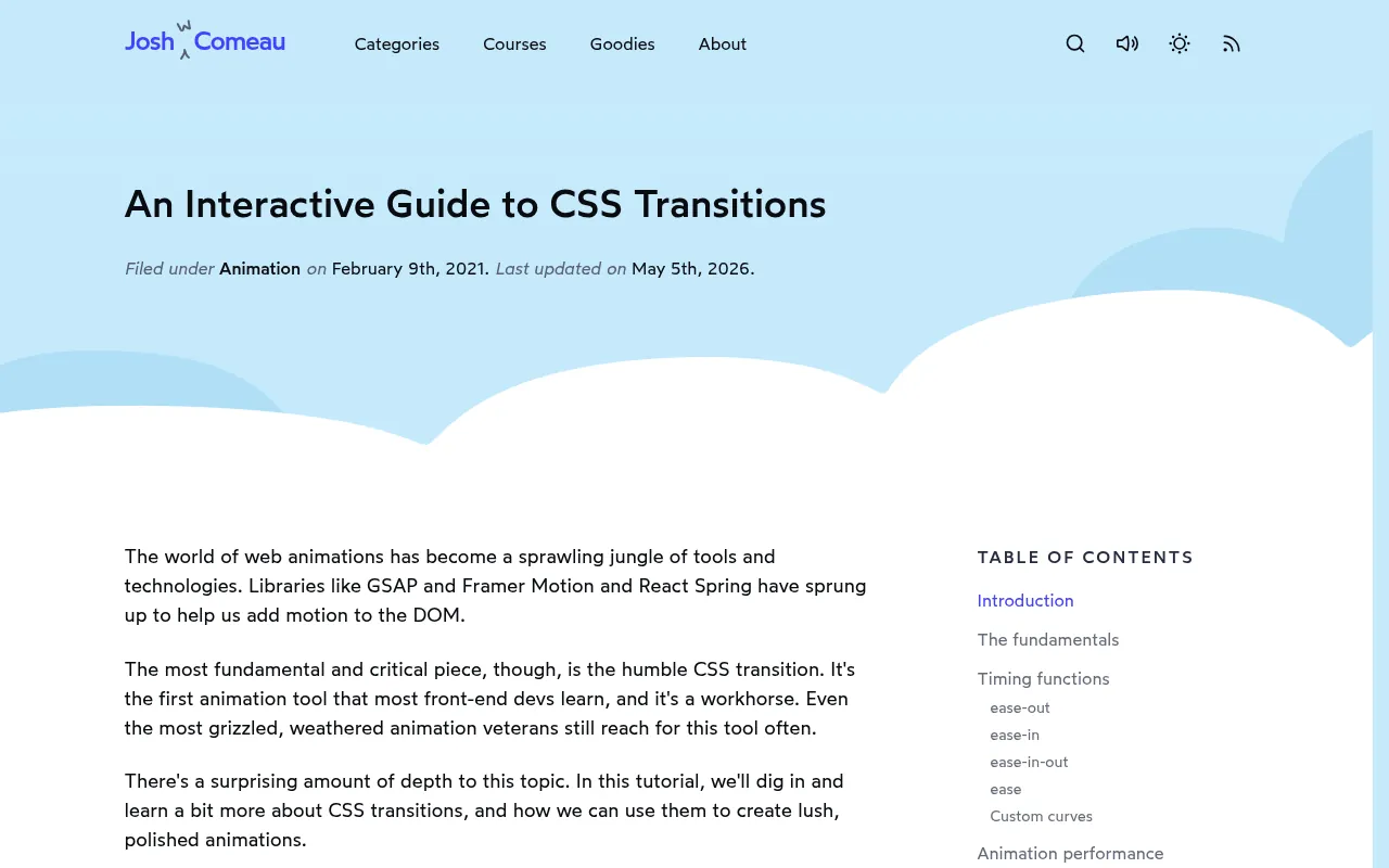
Good motion is mostly invisible: users notice that the interface feels responsive, not that it animates. Start every component static, add motion only where you can name its job, keep it short and ease-out, and spend your one big effect where the story needs it. Josh Comeau's interactive guide to CSS transitions is the best explanation of why easing curves matter; read it once and you will see bad easing everywhere.
Checklist
- Each animation has a named job: orientation, feedback or delight
- Small UI 150–250ms, large surfaces 300–400ms; exits faster than entries
- Ease-out for entering and responding
- Only transform and opacity animated
- prefers-reduced-motion handled
- At most one hero effect per page
Emil Kowalski 的经验法则很直接:用户一天要触发一百次的操作,就不要加动画。界面里的动效只有三种正当用途:定位(这个东西从哪来、到哪去了)、反馈(你的操作生效了),以及偶尔的愉悦感。其余都是装饰,每次交互都要白白付出时间。这篇给出起步数值、给组件加动效的分步方法、可以直接粘贴的代码,以及让 AI 生成的页面显得廉价的常见错误。
先定用途,再做动画
写过渡之前先写一句话:"这里加动画,是为了让用户明白 ___。"填不出来,就保持静态。几个例子:
- 下拉菜单从触发按钮处缩放展开,用户能看出是哪个按钮打开的(定位)。
- 复制图标变成"已复制"的对勾,持续 1.5 秒(反馈)。
- 营销页首次加载时,首屏插图缓慢漂移(愉悦,只一次)。
一天打开 50 次的命令面板应该几乎瞬间出现。高频界面保持快速,把动效留给少见的时刻。
起步数值
- 时长:小的界面变化(提示、下拉、开关)150–250ms;较大的面(抽屉、弹窗、页面区块)300–400ms。Material 3 的动效 token 也在这个范围内。
- 缓动:进入和响应用 ease-out,元素立即开始动、再慢慢停稳。界面响应不要用 ease-in,会显得迟钝。元素在屏幕内从一个位置移到另一个位置时,用 ease-in-out。
- 距离:要小。下拉菜单移动 4–8px 或从 0.96 缩放就够了,不需要从屏幕外滑进来。
- 属性:只动
transform和opacity。动width、height、top、box-shadow会让每一帧都触发布局或重绘,在中端手机上会卡。
分步示例:手感对的下拉菜单
第 1 步:设定变换原点。 从触发按钮处缩放,而不是从中心。Radix 等库会把变换原点暴露成 CSS 变量,可以直接用。
第 2 步:进入和退出分开写。 退出要比进入快,因为用户已经决定离开了。
.menu {
  transform-origin: var(--radix-dropdown-menu-content-transform-origin, top left);
}
.menu[data-state="open"] {
  animation: menu-in 180ms cubic-bezier(0.16, 1, 0.3, 1);
}
.menu[data-state="closed"] {
  animation: menu-out 120ms ease-in;
}
@keyframes menu-in {
  from { opacity: 0; transform: scale(0.96) translateY(-4px); }
  to   { opacity: 1; transform: none; }
}
@keyframes menu-out {
  to { opacity: 0; transform: scale(0.98); }
}
第 3 步:尊重"减少动态效果"设置。 有些用户看到移动会晕。保留透明度变化,去掉位移:
@media (prefers-reduced-motion: reduce) {
  .menu[data-state="open"],
  .menu[data-state="closed"] {
    animation-name: fade;
  }
  @keyframes fade { from { opacity: 0; } to { opacity: 1; } }
}
第 4 步:快速测试。 连续快速开关十次。只要动画挡住了下一次点击,就说明太长或者不能被打断。
弹簧与布局动画
对于在位置之间移动的元素(重新排序的列表项、展开的卡片、标签页指示条),弹簧比固定曲线更自然,因为它能响应中途打断。Motion(原 Framer Motion)只需一个属性就能做布局动画:
import { motion } from "motion/react";

<motion.div
  layout
  transition={{ type: "spring", stiffness: 500, damping: 40 }}
  className="tab-indicator"
/>
界面里的弹簧要硬、阻尼要足。弹来弹去的弹簧第一次很有趣,第二十次就很烦。
每页只留一个高光时刻
Aceternity、Magic UI 风格的特效(光束、聚光灯、流星、跑马灯)本来就是为了惊艳而设计的,适合每页一个高光时刻。首屏放聚光灯、logo 条放跑马灯、每张卡片再加动态渐变边框,页面看起来就像模板。AI 生成器一次给你三种特效时,留下最贴合你故事的那一个,其余改成静态。
快速动效走查
走查现有页面时,把每个动画列进一张四列表格:元素、触发方式、时长、用途。没有用途的删掉;高频触发的缩短到几乎瞬间;超过 400ms 的必须说出理由。然后按正常速度录屏,再用半速回放:缓动问题、互相重叠的动画、同时朝不同方向移动的元素,这些现场很难察觉的问题都会暴露出来。
常见坑
- 给高频操作加动画。 折叠侧栏、切换标签页、打开命令面板,都应该感觉是瞬间完成的。
- 响应用 ease-in。 元素看起来在犹豫,然后才反应。
- 退出太长。 用户得等弹窗关完,才能点它后面的东西。
- 动布局属性。 手风琴用 height 动画会卡;改为动外层的 transform,或者用 grid-rows 从
0fr到1fr的技巧。 - 忽略减少动态效果。 只是一个媒体查询,却对真实的人很重要。
- 劫持滚动。 改变滚动速度的滚动联动效果,会破坏触控板和读屏器的体验。
常见问题
用 CSS 过渡还是 JavaScript 库? 简单的状态变化(hover、开合、淡入淡出)用 CSS:开销小,而且 transform 和 opacity 动画可以不占用主线程。需要布局动画、共享元素过渡、手势或可打断的弹簧时,再用 Motion 这类库。
怎么找出卡顿的动画? 打开浏览器性能面板,录制触发动画的过程,看有没有长帧、有没有每一帧都在做布局或重绘。在真实的中端手机上,笔记本上看不出的卡顿会非常明显。
加载状态怎么处理? 带轻微闪光的骨架屏可以用,但闪光要慢、对比度要低。更好的做法是内容一到就显示,而不是等全部到齐再一起淡入。
营销页也要遵守这些规则吗? 大体要。营销页访问频率低,可以多一个大的高光时刻,但页面上的按钮、菜单和导航,同样要遵守时长、缓动和减少动态效果的限制。
怎么给 AI 生成器交代动效要求? 直接给数字:时长、缓动曲线、"只动 transform 和 opacity"、"只留一个高光特效",以及减少动态效果的要求。不给数字,生成器默认会给所有东西加上又慢又飘的过渡。
我们的看法
好的动效大多是隐形的:用户注意到的是界面反应很快,而不是它在动。每个组件先做成静态,只在能说出用途的地方加动效,保持短、用 ease-out,把唯一一个大特效花在故事最需要的地方。Josh Comeau 的 CSS 过渡交互指南是讲缓动曲线为什么重要的最好材料,读一遍之后,你会到处看到糟糕的缓动。
清单
- 每个动画都有明确用途:定位、反馈或愉悦
- 小界面 150–250ms,大面 300–400ms;退出比进入快
- 进入和响应用 ease-out
- 只动 transform 和 opacity
- 处理了 prefers-reduced-motion
- 每页最多一个高光特效
Emil Kowalski's rule of thumb is blunt: if a user triggers something a hundred times a day, do not animate it. Motion in an interface has three legitimate jobs: orientation (where did this come from and where did it go?), feedback (your action worked) and, sparingly, delight. Everything else is decoration that costs time on every interaction. This post gives starting numbers, a step-by-step way to add motion to a component, code you can paste, and the mistakes that make AI-generated pages feel cheap.
Decide the job before the animation
Before writing a transition, write one sentence: "This animates so the user understands ___." If you cannot fill the blank, leave it static. Some examples:
- A dropdown scales from its trigger so the user sees which button opened it (orientation).
- A "Copied" check replaces the copy icon for 1.5 seconds (feedback).
- A hero illustration drifts slowly on first load of a marketing page (delight, once).
A command palette that opens 50 times a day should appear almost instantly. Keep frequent surfaces fast and spend motion on rare moments.
Numbers to start from
- Duration: 150–250ms for small UI changes (tooltips, dropdowns, toggles); 300–400ms for larger surfaces (drawers, modals, page sections). Material 3's motion tokens sit in the same ranges.
- Easing: enter and respond with ease-out, so the element moves immediately and settles. Avoid ease-in for UI responses; it feels like lag. Use ease-in-out for elements moving from one on-screen position to another.
- Distance: small. A dropdown needs 4–8px of travel or a scale from 0.96, not a slide from off-screen.
- Properties: animate
transformandopacity. Animatingwidth,height,toporbox-shadowtriggers layout or paint on every frame and stutters on mid-range phones.
Step by step: a dropdown that feels right
Step 1: set the origin. Scale from the trigger, not from the centre. Radix and similar libraries expose the transform origin as a CSS variable you can use.
Step 2: write enter and exit separately. Exits should be faster than entries; the user has already decided to move on.
.menu {
  transform-origin: var(--radix-dropdown-menu-content-transform-origin, top left);
}
.menu[data-state="open"] {
  animation: menu-in 180ms cubic-bezier(0.16, 1, 0.3, 1);
}
.menu[data-state="closed"] {
  animation: menu-out 120ms ease-in;
}
@keyframes menu-in {
  from { opacity: 0; transform: scale(0.96) translateY(-4px); }
  to   { opacity: 1; transform: none; }
}
@keyframes menu-out {
  to { opacity: 0; transform: scale(0.98); }
}
Step 3: respect reduced motion. Some users get motion sickness from movement. Keep the opacity change, drop the movement:
@media (prefers-reduced-motion: reduce) {
  .menu[data-state="open"],
  .menu[data-state="closed"] {
    animation-name: fade;
  }
  @keyframes fade { from { opacity: 0; } to { opacity: 1; } }
}
Step 4: test at speed. Open and close it ten times quickly. If the animation ever blocks the next click, it is too long or not interruptible.
Springs and layout animation
For elements that move between positions (a reordered list item, an expanding card, a tab indicator), springs feel more natural than fixed curves because they respond to interruption. Motion (formerly Framer Motion) makes layout animation one prop:
import { motion } from "motion/react";

<motion.div
  layout
  transition={{ type: "spring", stiffness: 500, damping: 40 }}
  className="tab-indicator"
/>
Keep springs stiff and well damped for UI. A bouncy spring is fun once and annoying the twentieth time.
One hero moment per page
Aceternity- and Magic UI-style effects (beams, spotlights, meteor showers, marquees) are designed to impress. They work as one hero moment per page. Put a spotlight on the hero and a marquee on the logo strip and an animated gradient border on every card, and the page reads as a template. When an AI generator gives you three effects, keep the one closest to your story and make the rest static.
A quick motion audit
To review an existing page, list every animation in a table with four columns: element, trigger, duration and job. Anything without a job is deleted. Anything triggered often gets shortened to near-instant. Anything over 400ms needs a reason. Then record the screen at normal speed and watch it back at half speed: you will see easing problems, overlapping animations and elements that move in different directions at once, which are hard to notice live.
Pitfalls
- Animating frequent actions. Toggling a sidebar, switching tabs or opening a command palette should feel instant.
- Ease-in on responses. The element seems to hesitate before reacting.
- Long exits. Users wait for a closing modal before they can click what is behind it.
- Layout properties. Height animations on accordions jank; animate a wrapper's transform or use the grid-rows
0frto1frtechnique. - Ignoring reduced motion. It is a single media query and it matters to real people.
- Scroll-jacking. Scroll-linked effects that change scroll speed break trackpads and screen readers.
Questions we get
CSS transitions or a JavaScript library? Use CSS for simple state changes (hover, open/close, fades): it is cheap and runs off the main thread for transform and opacity. Reach for a library like Motion when you need layout animation, shared-element transitions, gestures or interruptible springs.
How do I find janky animations? Open the browser's performance panel, record while triggering the animation, and look for long frames and layout or paint work on every frame. On a real mid-range phone, jank you cannot see on a laptop becomes obvious.
What about loading states? Skeletons with a subtle shimmer are fine, but the shimmer should be slow and low-contrast. Better still, show content as soon as it arrives instead of fading everything in together.
Should marketing pages follow the same rules? Mostly. Marketing pages can afford one bigger moment because they are visited rarely, but the same limits on duration, easing and reduced motion still apply to buttons, menus and navigation on those pages.
How do I brief an AI generator about motion? Give it the numbers: durations, the easing curve, "transform and opacity only", "one hero effect", and a reduced-motion requirement. Without numbers, generators default to slow, floaty transitions on everything.
Our take
Good motion is mostly invisible: users notice that the interface feels responsive, not that it animates. Start every component static, add motion only where you can name its job, keep it short and ease-out, and spend your one big effect where the story needs it. Josh Comeau's interactive guide to CSS transitions is the best explanation of why easing curves matter; read it once and you will see bad easing everywhere.
Checklist
- Each animation has a named job: orientation, feedback or delight
- Small UI 150–250ms, large surfaces 300–400ms; exits faster than entries
- Ease-out for entering and responding
- Only transform and opacity animated
- prefers-reduced-motion handled
- At most one hero effect per page
AI 提示词AI 提示詞AI promptAIプロンプトAI 프롬프트Prompt AIPrompt cho AIPrompt IAPrompt de IAKI-Prompt
复制给 Claude、Cursor、v0 等 AI 助手,让它按本文的方法处理你的项目。尖括号里的内容换成你自己的。複製給 Claude、Cursor、v0 等 AI 助手,讓它按本文的方法處理你的專案。尖括號裡的內容換成你自己的。Paste this into Claude, Cursor, v0 or another assistant to apply this post to your own project. Replace the parts in angle brackets.Claude・Cursor・v0 などのAIアシスタントに貼り付けると、この記事の方法をあなたのプロジェクトに適用できます。山括弧の部分は自分の内容に置き換えてください。Claude, Cursor, v0 같은 AI 도우미에 붙여 넣으면 이 글의 방법을 내 프로젝트에 적용할 수 있습니다. 꺾쇠괄호 안은 내 내용으로 바꾸세요.Tampal ke Claude, Cursor, v0 atau pembantu lain untuk menggunakan kaedah artikel ini pada projek anda. Gantikan bahagian dalam kurungan sudut.Dán vào Claude, Cursor, v0 hoặc trợ lý khác để áp dụng bài này cho dự án của bạn. Thay phần trong dấu ngoặc nhọn bằng nội dung của bạn.Collez-le dans Claude, Cursor, v0 ou un autre assistant pour appliquer cet article à votre projet. Remplacez les parties entre chevrons.Pégalo en Claude, Cursor, v0 u otro asistente para aplicar este artículo a tu proyecto. Sustituye lo que está entre corchetes angulares.In Claude, Cursor, v0 oder einen anderen Assistenten einfügen, um diesen Beitrag auf dein Projekt anzuwenden. Teile in spitzen Klammern ersetzen.
走查并修正 <组件或页面> 里的动效。
对你找到的每个动画或过渡:
1. 说出它的用途:定位、反馈还是愉悦。没有用途,或者这个操作一天会发生很多次(切标签、折叠侧栏、命令面板),就删掉,或改成几乎瞬间(<100ms)。
2. 时长:小界面 150–250ms,大面 300–400ms;退出比进入快约 30%。
3. 缓动:进入和响应用 ease-out(如 cubic-bezier(0.16,1,0.3,1));响应绝不用 ease-in。
4. 只动 transform 和 opacity。替换掉 width/height/top/box-shadow 动画。
5. 加一段 prefers-reduced-motion,保留透明度、去掉位移。
6. 页面最多保留一个装饰性"高光"特效,其余改为静态。
输出:先给一张表(元素 · 用途 · 修改前 · 修改后),再给代码 diff。不要新增动画。
走查并修正 <组件或页面> 里的动效。
对你找到的每个动画或过渡:
1. 说出它的用途:定位、反馈还是愉悦。没有用途,或者这个操作一天会发生很多次(切标签、折叠侧栏、命令面板),就删掉,或改成几乎瞬间(<100ms)。
2. 时长:小界面 150–250ms,大面 300–400ms;退出比进入快约 30%。
3. 缓动:进入和响应用 ease-out(如 cubic-bezier(0.16,1,0.3,1));响应绝不用 ease-in。
4. 只动 transform 和 opacity。替换掉 width/height/top/box-shadow 动画。
5. 加一段 prefers-reduced-motion,保留透明度、去掉位移。
6. 页面最多保留一个装饰性"高光"特效,其余改为静态。
输出:先给一张表(元素 · 用途 · 修改前 · 修改后),再给代码 diff。不要新增动画。Review and fix the motion in <component or page>.
For every animation or transition you find:
1. Name its job: orientation, feedback or delight. If it has none, or the action happens many times a day (tabs, sidebar toggle, command palette), remove it or make it near-instant (<100ms).
2. Durations: 150–250ms for small UI, 300–400ms for large surfaces; exits ~30% faster than entries.
3. Easing: ease-out (e.g. cubic-bezier(0.16,1,0.3,1)) for entering/responding; never ease-in for responses.
4. Animate only transform and opacity. Replace width/height/top/box-shadow animations.
5. Add a prefers-reduced-motion block that keeps opacity and removes movement.
6. Keep at most one decorative "hero" effect on the page; make the rest static.
Output: a table (element · job · before · after) and then the code diff. Do not add new animations.Review and fix the motion in <component or page>.
For every animation or transition you find:
1. Name its job: orientation, feedback or delight. If it has none, or the action happens many times a day (tabs, sidebar toggle, command palette), remove it or make it near-instant (<100ms).
2. Durations: 150–250ms for small UI, 300–400ms for large surfaces; exits ~30% faster than entries.
3. Easing: ease-out (e.g. cubic-bezier(0.16,1,0.3,1)) for entering/responding; never ease-in for responses.
4. Animate only transform and opacity. Replace width/height/top/box-shadow animations.
5. Add a prefers-reduced-motion block that keeps opacity and removes movement.
6. Keep at most one decorative "hero" effect on the page; make the rest static.
Output: a table (element · job · before · after) and then the code diff. Do not add new animations.Review and fix the motion in <component or page>.
For every animation or transition you find:
1. Name its job: orientation, feedback or delight. If it has none, or the action happens many times a day (tabs, sidebar toggle, command palette), remove it or make it near-instant (<100ms).
2. Durations: 150–250ms for small UI, 300–400ms for large surfaces; exits ~30% faster than entries.
3. Easing: ease-out (e.g. cubic-bezier(0.16,1,0.3,1)) for entering/responding; never ease-in for responses.
4. Animate only transform and opacity. Replace width/height/top/box-shadow animations.
5. Add a prefers-reduced-motion block that keeps opacity and removes movement.
6. Keep at most one decorative "hero" effect on the page; make the rest static.
Output: a table (element · job · before · after) and then the code diff. Do not add new animations.Review and fix the motion in <component or page>.
For every animation or transition you find:
1. Name its job: orientation, feedback or delight. If it has none, or the action happens many times a day (tabs, sidebar toggle, command palette), remove it or make it near-instant (<100ms).
2. Durations: 150–250ms for small UI, 300–400ms for large surfaces; exits ~30% faster than entries.
3. Easing: ease-out (e.g. cubic-bezier(0.16,1,0.3,1)) for entering/responding; never ease-in for responses.
4. Animate only transform and opacity. Replace width/height/top/box-shadow animations.
5. Add a prefers-reduced-motion block that keeps opacity and removes movement.
6. Keep at most one decorative "hero" effect on the page; make the rest static.
Output: a table (element · job · before · after) and then the code diff. Do not add new animations.Review and fix the motion in <component or page>.
For every animation or transition you find:
1. Name its job: orientation, feedback or delight. If it has none, or the action happens many times a day (tabs, sidebar toggle, command palette), remove it or make it near-instant (<100ms).
2. Durations: 150–250ms for small UI, 300–400ms for large surfaces; exits ~30% faster than entries.
3. Easing: ease-out (e.g. cubic-bezier(0.16,1,0.3,1)) for entering/responding; never ease-in for responses.
4. Animate only transform and opacity. Replace width/height/top/box-shadow animations.
5. Add a prefers-reduced-motion block that keeps opacity and removes movement.
6. Keep at most one decorative "hero" effect on the page; make the rest static.
Output: a table (element · job · before · after) and then the code diff. Do not add new animations.Review and fix the motion in <component or page>.
For every animation or transition you find:
1. Name its job: orientation, feedback or delight. If it has none, or the action happens many times a day (tabs, sidebar toggle, command palette), remove it or make it near-instant (<100ms).
2. Durations: 150–250ms for small UI, 300–400ms for large surfaces; exits ~30% faster than entries.
3. Easing: ease-out (e.g. cubic-bezier(0.16,1,0.3,1)) for entering/responding; never ease-in for responses.
4. Animate only transform and opacity. Replace width/height/top/box-shadow animations.
5. Add a prefers-reduced-motion block that keeps opacity and removes movement.
6. Keep at most one decorative "hero" effect on the page; make the rest static.
Output: a table (element · job · before · after) and then the code diff. Do not add new animations.Review and fix the motion in <component or page>.
For every animation or transition you find:
1. Name its job: orientation, feedback or delight. If it has none, or the action happens many times a day (tabs, sidebar toggle, command palette), remove it or make it near-instant (<100ms).
2. Durations: 150–250ms for small UI, 300–400ms for large surfaces; exits ~30% faster than entries.
3. Easing: ease-out (e.g. cubic-bezier(0.16,1,0.3,1)) for entering/responding; never ease-in for responses.
4. Animate only transform and opacity. Replace width/height/top/box-shadow animations.
5. Add a prefers-reduced-motion block that keeps opacity and removes movement.
6. Keep at most one decorative "hero" effect on the page; make the rest static.
Output: a table (element · job · before · after) and then the code diff. Do not add new animations.Review and fix the motion in <component or page>.
For every animation or transition you find:
1. Name its job: orientation, feedback or delight. If it has none, or the action happens many times a day (tabs, sidebar toggle, command palette), remove it or make it near-instant (<100ms).
2. Durations: 150–250ms for small UI, 300–400ms for large surfaces; exits ~30% faster than entries.
3. Easing: ease-out (e.g. cubic-bezier(0.16,1,0.3,1)) for entering/responding; never ease-in for responses.
4. Animate only transform and opacity. Replace width/height/top/box-shadow animations.
5. Add a prefers-reduced-motion block that keeps opacity and removes movement.
6. Keep at most one decorative "hero" effect on the page; make the rest static.
Output: a table (element · job · before · after) and then the code diff. Do not add new animations.引用来源引用來源References参考文献참고 자료RujukanNguồn tham khảoRéférencesReferenciasQuellen
- Great animations — Emil Kowalski
- animations.dev — Emil Kowalski
- Motion overview — Material 3 — Google
- An Interactive Guide to CSS Transitions — Josh W. Comeau
- prefers-reduced-motion — MDN
- Motion docs — Motion
- Animations guide — web.dev
- Layout animations — Motion
相关文章相關文章Related posts関連記事관련 글Artikel berkaitanBài liên quanArticles liésArtículos relacionadosÄhnliche Beiträge
把暗色模式做对:token、层级与对比度把暗色模式做對:token、層級與對比度Dark mode done right: tokens, elevation and contrast正しいダークモード:トークン・階層・コントラスト다크 모드 제대로: 토큰, 고도, 대비Mod gelap yang betul: token, ketinggian dan kontrasLàm dark mode đúng: token, độ nổi và độ tương phảnUn mode sombre réussi : tokens, élévation et contrasteModo oscuro bien hecho: tokens, elevación y contrasteDark Mode richtig: Tokens, Elevation und Kontrast
暗色模式是第二套配色,不是反色。用语义 token,用更亮的表面表达层级,强调色要降饱和。暗色模式是第二套配色,不是反色。用語義 token,用更亮的表面表達層級。Dark mode is a second palette, not an inverted one. Use semantic tokens, lighter surfaces for elevation, and desaturated accents.ダークモードは反転ではなく第二のパレット。意味トークン、明るい面で階層、彩度を下げたアクセント。다크 모드는 반전이 아니라 두 번째 팔레트. 시맨틱 토큰, 밝은 면으로 고도 표현.Mod gelap ialah palet kedua, bukan terbalik. Guna token semantik dan permukaan lebih cerah untuk ketinggian.Dark mode là bảng màu thứ hai, không phải đảo màu. Dùng token ngữ nghĩa, bề mặt sáng hơn để thể hiện độ nổi.Une seconde palette, pas une inversion. Tokens sémantiques, surfaces plus claires pour l'élévation.Una segunda paleta, no una inversión. Tokens semánticos y superficies más claras para la elevación.Eine zweite Palette, keine Invertierung. Semantische Tokens, hellere Flächen für Elevation.
AI 生成界面的无障碍:模型常漏的检查项AI 生成介面的無障礙:模型常漏的檢查項Accessibility in AI-generated UI: the checks models skipAI生成UIのアクセシビリティ:モデルが飛ばすチェックAI 생성 UI의 접근성: 모델이 빠뜨리는 점검Kebolehcapaian dalam UI jana AI: semakan yang dilangkau modelKhả năng tiếp cận trong UI do AI tạo: những kiểm tra mô hình bỏ quaAccessibilité de l'UI générée par IA : les vérifications oubliéesAccesibilidad en UI generada por IA: las comprobaciones que se saltanBarrierefreiheit in KI-generierter UI: die übersprungenen Checks
生成的界面看着没问题,键盘和读屏却用不了。先用无障碍底层组件,再按 WCAG 2.2 走查。生成的介面看著沒問題,鍵盤和讀屏卻用不了。先用無障礙底層元件,再按 WCAG 2.2 檢查。Generated UIs look fine and fail keyboards and screen readers. Start from accessible primitives, then audit against WCAG 2.2.見た目は良くてもキーボードやスクリーンリーダーで失敗。アクセシブルな基盤からWCAG 2.2で監査。보기엔 괜찮아도 키보드·스크린리더에서 실패. 접근성 기반에서 시작해 WCAG 2.2로 점검.Nampak baik tetapi gagal untuk papan kekunci dan pembaca skrin. Mula dengan primitif boleh capai, audit dengan WCAG 2.2.Trông ổn nhưng hỏng với bàn phím và trình đọc màn hình. Dùng primitive dễ tiếp cận, kiểm theo WCAG 2.2.Belles mais inutilisables au clavier. Partir de primitives accessibles, auditer selon WCAG 2.2.Se ven bien pero fallan con teclado y lector. Parte de primitivas accesibles y audita con WCAG 2.2.Sieht gut aus, scheitert an Tastatur und Screenreader. Mit barrierefreien Primitives starten, nach WCAG 2.2 prüfen.
AI 生成界面的字体排印:摆脱平庸感最快的办法AI 產生介面的字體排印:擺脫平庸感最快的辦法Typography for AI-generated UI: the fastest way to look less genericAI生成UIのタイポグラフィ:没個性から抜け出す最短路AI 생성 UI의 타이포그래피: 평범함을 벗는 가장 빠른 길Tipografi untuk UI jana AITypography cho UI do AI tạo: cách nhanh nhất để bớt tầm thườngLa typographie des UI générées par IATipografía para UI generada por IATypografie für KI-generierte UIs
生成器默认一种无衬线、三个字号。一套字号阶梯、第二种字体、大字号收紧字距和合理行长,能解决大部分问题。產生器預設一種無襯線、三個字級。一套字級階梯、第二種字體、大字收緊字距和合理行長,能解決大部分問題。Generators default to one sans at three sizes. A type scale, a second typeface, tighter tracking on display sizes and real line lengths fix most of it.生成器は1書体3サイズが既定。スケール、第2書体、見出しの字詰め、行長で大半が直る。생성기는 산세리프 하나에 크기 셋. 스케일, 두 번째 서체, 자간, 줄 길이로 대부분 해결.Skala jenis, muka taip kedua, jarak huruf dan panjang baris menyelesaikan kebanyakannya.Thang cỡ chữ, font thứ hai, giãn chữ và độ dài dòng giải quyết phần lớn.Une échelle, une seconde police, l'approche et la longueur de ligne règlent l'essentiel.Una escala, una segunda fuente, el tracking y la longitud de línea resuelven casi todo.Skala, zweite Schrift, Laufweite und Zeilenlänge lösen das meiste.