用 AI 从设计稿到代码:映射到组件,而不是像素用 AI 從設計稿到程式碼:對應到元件,而不是像素Design-to-code with AI: map to your components, not to pixelsAIでデザインからコードへ:ピクセルではなくコンポーネントに対応付けるAI로 디자인→코드: 픽셀이 아니라 컴포넌트에 매핑하라Reka bentuk ke kod dengan AI: petakan ke komponen, bukan pikselTừ thiết kế sang code bằng AI: ánh xạ vào component, không phải pixelDu design au code avec l'IA : mapper vers vos composants, pas des pixelsDe diseño a código con IA: mapea a tus componentes, no a píxelesDesign-to-Code mit KI: auf Komponenten mappen, nicht auf Pixel
像素级导出只会产出一次性代码。通过 MCP 把组件注册表和 token 交给 Agent,让产出复用现有组件。像素級匯出只會產出一次性程式碼。透過 MCP 把元件註冊表和 token 交給 Agent。Pixel-perfect export creates throwaway code. Give the agent your component registry and tokens via MCP so output reuses what you already ship.ピクセル完全な書き出しは使い捨てコードになる。MCPでレジストリとトークンを渡そう。픽셀 퍼펙트 내보내기는 일회용 코드다. MCP로 레지스트리와 토큰을 넘겨라.Eksport piksel sempurna menghasilkan kod pakai buang. Beri registri komponen dan token melalui MCP.Xuất pixel-perfect tạo code dùng một lần. Đưa registry và token qua MCP.L'export au pixel produit du code jetable. Donnez registre et tokens via MCP.Exportar al píxel crea código desechable. Pasa registro y tokens vía MCP.Pixelgenauer Export erzeugt Wegwerfcode. Registry und Tokens per MCP übergeben.
正文以簡體中文顯示。
本文は英語で表示しています。
본문은 영어로 표시됩니다.
Kandungan dipaparkan dalam bahasa Inggeris.
Nội dung hiển thị bằng tiếng Anh.
Le corps de l’article est en anglais.
El cuerpo del artículo está en inglés.
Der Beitragstext ist auf Englisch.
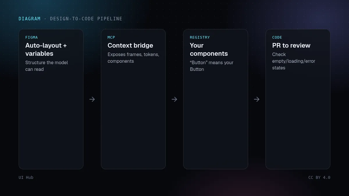
Early design-to-code tools translated frames into absolutely positioned divs. The result looked right in one viewport and was unmaintainable everywhere else. The current generation works differently. Figma's MCP server, Builder.io's Visual Copilot and agents running inside Cursor or Claude Code read structure and variables and can map them to code you already own. Whether you get reusable code or throwaway markup now depends less on the tool and more on what you feed it.
The core idea: map, don't trace
A design file contains three kinds of information: structure (frames, auto-layout, nesting), decisions (variables for colour, spacing, radius, type) and components (instances of a button, an input, a card). Tracing copies the pixels. Mapping turns structure into flex and grid, decisions into your CSS variables, and component instances into your own <Button> and <Input>. Mapped output is a pull request you can merge. Traced output is a screenshot written in HTML.
Step 1: make the design file readable
Models can only map what is explicit. Before you connect any tool:
- Use auto-layout everywhere. A frame without it forces the model to guess flex direction, gap and alignment from coordinates. Guessed layouts break at the first resize.
- Bind styles to variables. A fill of
#2563EBgives the model a hex code. A fill bound tocolor/accentgives it a name it can map tovar(--accent). - Use real component instances. A detached button is just a rectangle with text. An instance of your Button component tells the agent which code component to use.
- Name layers like code. "Frame 482" carries no meaning.
PricingCard / Featuredcarries a lot.
Step 2: export tokens as code
Keep one source of truth for design decisions and generate CSS variables from it. The Design Tokens Community Group format is a JSON shape that tools like Style Dictionary can transform:
{
  "color": {
    "accent":  { "$type": "color", "$value": "#2563eb" },
    "surface": { "$type": "color", "$value": "#ffffff" }
  },
  "radius": { "md": { "$type": "dimension", "$value": "10px" } }
}
:root {
  --color-accent: #2563eb;
  --color-surface: #ffffff;
  --radius-md: 10px;
}
[data-theme="dark"] {
  --color-surface: #0d0f15;
}
When the agent sees that color/accent in Figma and --color-accent in CSS share a name, it uses the variable instead of pasting hex values.
Step 3: publish a component registry
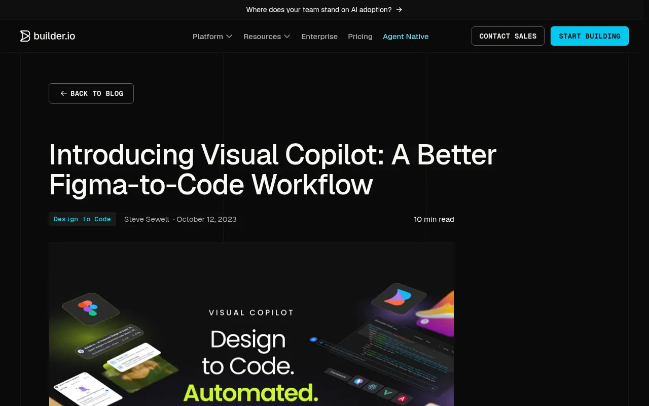
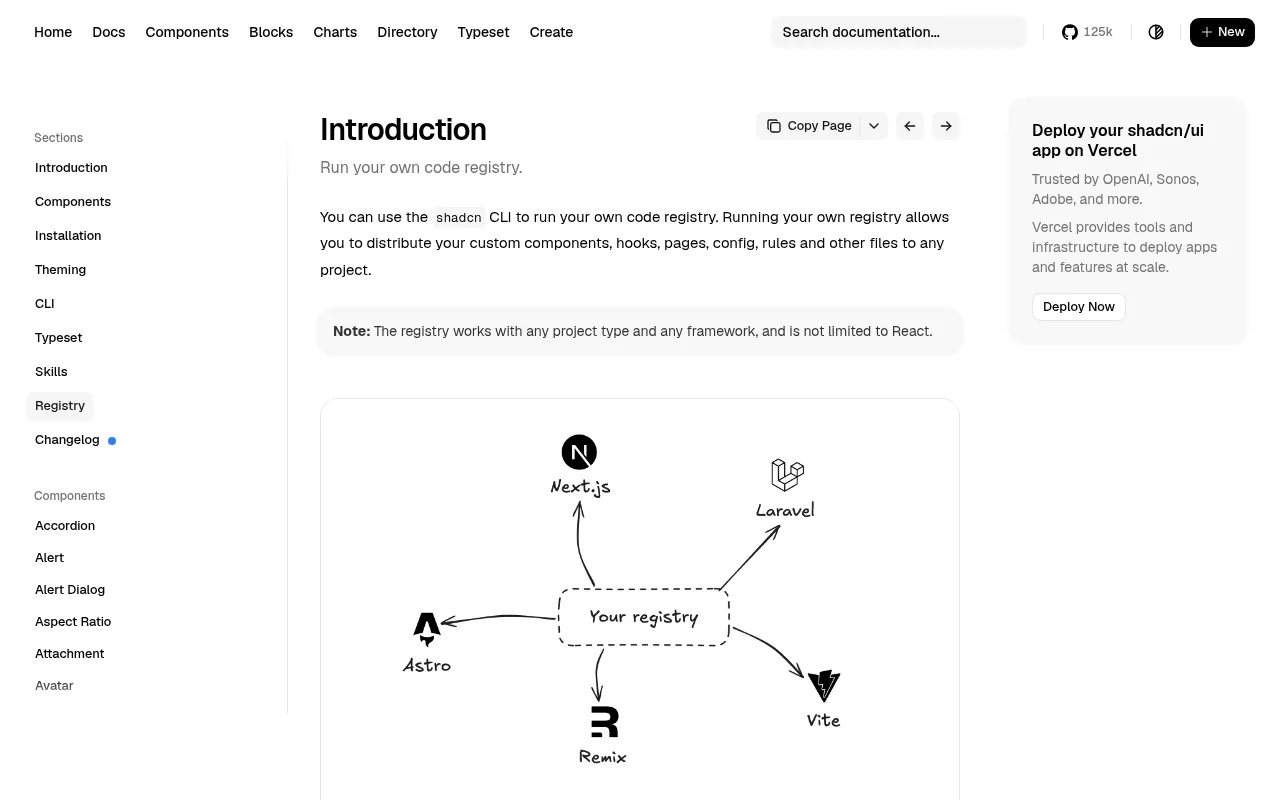
A registry tells tools which components exist in your codebase and how to install them. With shadcn/ui, a registry.json lists your items and the CLI builds them into installable JSON files:
# build registry items from registry.json into public/r/
npx shadcn@latest build

# install one of your own components into another project
npx shadcn@latest add https://your-domain.com/r/pricing-card.json
Figma's Code Connect solves the same problem from the design side: it links a Figma component to the code component, so design context sent to an agent can say "this is <Button variant="primary">" instead of describing a blue rectangle.
Step 4: connect the bridge
The Figma MCP server exposes the selected frame's structure, variables and component mappings to an MCP client such as Cursor, VS Code or Claude Code. The workflow is short:
- Select one frame, not the whole page. Smaller context gives better code.
- Ask the agent to fetch the design context for the selection and list which of your components it will use before writing code.
- Correct that list first. It is much cheaper to fix "use
Card, not a div" before 200 lines exist. - Let it generate, then review the diff like any other PR.
Builder.io's Visual Copilot follows a similar path from a Figma plugin and can also map to your components. Whichever bridge you use, the quality ceiling is set by Steps 1–3.
Step 5: review generated code like a junior's PR
Generated UI is usually right in the default state and wrong at the edges. Review these every time:
- Empty, loading and error states. The design file usually shows only the happy path.
- Long content. Paste a 60-character name and a German translation; check wrapping and truncation.
- Responsive behaviour below the smallest frame in the file.
- Hard-coded values. Search the diff for hex colours and pixel sizes that should be tokens.
- Accessibility. Buttons are
<button>, inputs have labels, focus is visible, dialogs trap focus.
# quick checks on a generated diff
git diff | grep -nE '#[0-9a-fA-F]{3,6}\b'      # raw hex colours
git diff | grep -nE '\b[0-9]{2,}px\b'           # magic pixel values
git diff | grep -n 'onClick' | grep -n '<div'   # clickable divs
Pitfalls
- Converting a whole page at once. The context gets huge and the model starts inventing structure. Go frame by frame.
- Detached instances. One detached component in a frame produces one-off markup that never updates with your library.
- Two sources of truth for tokens. If Figma variables and CSS variables drift, the agent will faithfully reproduce the drift.
- Skipping the plan step. Asking for code immediately means you review 300 lines instead of a 10-line component list.
- Pixel-perfect expectations. Mapped code will differ by a few pixels because it uses your spacing scale. That is the point.
Questions we get
Is it worth it for a small project? If you will build fewer than five screens, skip the registry and just give the agent your tokens file and a list of components. The full pipeline pays off when several people or several agents build screens over months.
What if the design file is messy and we cannot fix it? Then do not convert from it directly. Ask the agent to describe the frame in words first (sections, components, content), correct that description, and generate from the description plus your kit. A clean description beats a messy file.
Which bridge should we pick? Pick the one your designers already use and that can see your component mappings. The bridge matters less than whether variables, auto-layout and component instances exist in the file.
How do we measure success? Count how much generated code survives review unchanged, and how many raw values reviewers had to replace with tokens. Both numbers should improve week over week as the registry grows.
Our take
Treat the registry and token pipeline as infrastructure, not a one-off. The first screen takes longer because you are setting up mappings; every later screen gets cheaper because the agent reuses them. Teams that skip this step get fast first drafts and slow maintenance forever.
Checklist
- Frames use auto-layout; layers have meaningful names
- Fills, spacing and radii are bound to variables
- Tokens exported to CSS variables with the same names
- Components published in a registry or linked with Code Connect
- Agent lists components before generating code
- Diff reviewed for states, long content, hex values and a11y
早期的设计转代码工具把画板翻译成一堆绝对定位的 div。在一个视口里看着没问题,换个尺寸就没法维护。新一代工具的思路不一样:Figma 的 MCP Server、Builder.io 的 Visual Copilot,以及跑在 Cursor 或 Claude Code 里的 Agent,读取的是结构和变量,并且能映射到你已有的代码。最后得到的是可复用代码还是一次性标记,现在更多取决于你喂给它什么,而不是用哪个工具。
核心思路:映射,而不是描摹
设计稿里有三类信息:结构(画板、自动布局、嵌套)、决定(颜色、间距、圆角、字体变量)和组件(按钮、输入框、卡片的实例)。描摹是照抄像素;映射则把结构变成 flex 和 grid,把决定变成你的 CSS 变量,把组件实例变成你自己的 <Button> 和 <Input>。映射出来的是能合并的 PR,描摹出来的只是一张用 HTML 写的截图。
第 1 步:让设计稿可读
模型只能映射明确写出来的东西。接入任何工具之前,先做这几件事:
- 全部使用自动布局。 没有自动布局的画板,模型只能根据坐标去猜 flex 方向、间距和对齐。猜出来的布局一缩放就坏。
- 样式绑定到变量。 填充色写死
#2563EB,模型拿到的只是色值;绑定到color/accent,它就拿到一个可以映射成var(--accent)的名字。 - 使用真正的组件实例。 被分离(detach)的按钮只是一个带文字的矩形;Button 组件的实例才能告诉 Agent 该用哪个代码组件。
- 按代码习惯命名图层。 "Frame 482"毫无信息;
PricingCard / Featured信息量很大。
第 2 步:把 token 导出成代码
设计决定只保留一个来源,再从它生成 CSS 变量。Design Tokens Community Group 定义了一种 JSON 格式,Style Dictionary 这类工具可以把它转换出来:
{
  "color": {
    "accent":  { "$type": "color", "$value": "#2563eb" },
    "surface": { "$type": "color", "$value": "#ffffff" }
  },
  "radius": { "md": { "$type": "dimension", "$value": "10px" } }
}
:root {
  --color-accent: #2563eb;
  --color-surface: #ffffff;
  --radius-md: 10px;
}
[data-theme="dark"] {
  --color-surface: #0d0f15;
}
Agent 看到 Figma 里的 color/accent 和 CSS 里的 --color-accent 同名,就会用变量,而不是粘贴色值。
第 3 步:发布组件注册表
注册表告诉工具:你的代码库里有哪些组件、怎么安装。以 shadcn/ui 为例,registry.json 列出你的组件,CLI 会把它们构建成可安装的 JSON 文件:
# 根据 registry.json 构建组件到 public/r/
npx shadcn@latest build

# 把你自己的组件安装到另一个项目
npx shadcn@latest add https://your-domain.com/r/pricing-card.json
Figma 的 Code Connect 从设计端解决同一个问题:它把 Figma 组件和代码组件关联起来,这样发给 Agent 的设计上下文可以直接说"这是 <Button variant="primary">",而不是描述一个蓝色矩形。
第 4 步:接上桥梁
Figma MCP Server 会把选中画板的结构、变量和组件映射,提供给 Cursor、VS Code、Claude Code 这类 MCP 客户端。流程很短:
- 只选一个画板,不要选整页。上下文越小,代码越好。
- 让 Agent 读取选区的设计上下文,并在写代码之前先列出它打算用你的哪些组件。
- 先修正这份清单。在 200 行代码出现之前改一句"用
Card,不要用 div",成本低得多。 - 再让它生成,然后像审普通 PR 一样审 diff。
Builder.io 的 Visual Copilot 从 Figma 插件出发,走的是类似的路,也能映射到你的组件。无论用哪座桥,质量上限都由前 3 步决定。
第 5 步:像审新人的 PR 一样审生成代码
生成的界面通常默认状态是对的,边界情况是错的。每次都要检查:
- 空、加载、错误状态。 设计稿通常只画了顺利的那条路。
- 长内容。 贴一个 60 字符的名称和一段德语翻译,看换行和截断。
- 比设计稿最小画板更窄时的响应式表现。
- 写死的数值。 在 diff 里搜应该是 token 的色值和像素值。
- 无障碍。 按钮是
<button>,输入框有标签,焦点可见,对话框会锁定焦点。
# 对生成的 diff 做快速检查
git diff | grep -nE '#[0-9a-fA-F]{3,6}\b'      # 裸色值
git diff | grep -nE '\b[0-9]{2,}px\b'           # 魔法像素值
git diff | grep -n 'onClick' | grep -n '<div'   # 可点击的 div
常见坑
- 一次转整页。 上下文过大,模型开始自己编结构。应该一个画板一个画板地来。
- 分离的实例。 画板里只要有一个被分离的组件,就会产出一段永远不会随组件库更新的一次性代码。
- token 有两个来源。 Figma 变量和 CSS 变量一旦不一致,Agent 会忠实地复现这种不一致。
- 跳过"先列清单"这一步。 直接要代码,你就得审 300 行,而不是 10 行的组件清单。
- 期待像素级一致。 映射出的代码会差几个像素,因为它用的是你的间距刻度。这恰恰是目的。
常见问题
小项目值得这么做吗? 如果总共不到五个页面,可以跳过注册表,直接把 token 文件和组件清单给 Agent。整套流水线的回报,出现在多人或多个 Agent 持续几个月做页面的时候。
设计稿很乱又改不了怎么办? 那就别直接从设计稿转。先让 Agent 用文字描述画板(分区、组件、内容),你修正这份描述,再根据描述和你的组件库生成。一份干净的描述胜过一个混乱的文件。
该选哪座桥? 选设计师已经在用、并且能读到你组件映射的那一个。桥本身没那么重要,重要的是设计稿里有没有变量、自动布局和组件实例。
怎么衡量效果? 统计生成代码有多少能原样通过评审,以及评审者需要把多少裸数值换成 token。随着注册表变大,这两个数字应该每周都在改善。
我们的看法
把注册表和 token 流水线当作基础设施,而不是一次性工作。第一个页面会慢一些,因为你在建立映射;之后每个页面都更便宜,因为 Agent 会复用它们。跳过这一步的团队,得到的是很快的初稿和永远很慢的维护。
清单
- 画板使用自动布局,图层命名有意义
- 填充、间距、圆角都绑定到变量
- token 已导出为同名 CSS 变量
- 组件已发布到注册表,或用 Code Connect 关联
- Agent 先列组件清单,再生成代码
- diff 检查了状态、长内容、色值和无障碍
Early design-to-code tools translated frames into absolutely positioned divs. The result looked right in one viewport and was unmaintainable everywhere else. The current generation works differently. Figma's MCP server, Builder.io's Visual Copilot and agents running inside Cursor or Claude Code read structure and variables and can map them to code you already own. Whether you get reusable code or throwaway markup now depends less on the tool and more on what you feed it.
The core idea: map, don't trace
A design file contains three kinds of information: structure (frames, auto-layout, nesting), decisions (variables for colour, spacing, radius, type) and components (instances of a button, an input, a card). Tracing copies the pixels. Mapping turns structure into flex and grid, decisions into your CSS variables, and component instances into your own <Button> and <Input>. Mapped output is a pull request you can merge. Traced output is a screenshot written in HTML.
Step 1: make the design file readable
Models can only map what is explicit. Before you connect any tool:
- Use auto-layout everywhere. A frame without it forces the model to guess flex direction, gap and alignment from coordinates. Guessed layouts break at the first resize.
- Bind styles to variables. A fill of
#2563EBgives the model a hex code. A fill bound tocolor/accentgives it a name it can map tovar(--accent). - Use real component instances. A detached button is just a rectangle with text. An instance of your Button component tells the agent which code component to use.
- Name layers like code. "Frame 482" carries no meaning.
PricingCard / Featuredcarries a lot.
Step 2: export tokens as code
Keep one source of truth for design decisions and generate CSS variables from it. The Design Tokens Community Group format is a JSON shape that tools like Style Dictionary can transform:
{
  "color": {
    "accent":  { "$type": "color", "$value": "#2563eb" },
    "surface": { "$type": "color", "$value": "#ffffff" }
  },
  "radius": { "md": { "$type": "dimension", "$value": "10px" } }
}
:root {
  --color-accent: #2563eb;
  --color-surface: #ffffff;
  --radius-md: 10px;
}
[data-theme="dark"] {
  --color-surface: #0d0f15;
}
When the agent sees that color/accent in Figma and --color-accent in CSS share a name, it uses the variable instead of pasting hex values.
Step 3: publish a component registry
A registry tells tools which components exist in your codebase and how to install them. With shadcn/ui, a registry.json lists your items and the CLI builds them into installable JSON files:
# build registry items from registry.json into public/r/
npx shadcn@latest build

# install one of your own components into another project
npx shadcn@latest add https://your-domain.com/r/pricing-card.json
Figma's Code Connect solves the same problem from the design side: it links a Figma component to the code component, so design context sent to an agent can say "this is <Button variant="primary">" instead of describing a blue rectangle.
Step 4: connect the bridge
The Figma MCP server exposes the selected frame's structure, variables and component mappings to an MCP client such as Cursor, VS Code or Claude Code. The workflow is short:
- Select one frame, not the whole page. Smaller context gives better code.
- Ask the agent to fetch the design context for the selection and list which of your components it will use before writing code.
- Correct that list first. It is much cheaper to fix "use
Card, not a div" before 200 lines exist. - Let it generate, then review the diff like any other PR.
Builder.io's Visual Copilot follows a similar path from a Figma plugin and can also map to your components. Whichever bridge you use, the quality ceiling is set by Steps 1–3.
Step 5: review generated code like a junior's PR
Generated UI is usually right in the default state and wrong at the edges. Review these every time:
- Empty, loading and error states. The design file usually shows only the happy path.
- Long content. Paste a 60-character name and a German translation; check wrapping and truncation.
- Responsive behaviour below the smallest frame in the file.
- Hard-coded values. Search the diff for hex colours and pixel sizes that should be tokens.
- Accessibility. Buttons are
<button>, inputs have labels, focus is visible, dialogs trap focus.
# quick checks on a generated diff
git diff | grep -nE '#[0-9a-fA-F]{3,6}\b'      # raw hex colours
git diff | grep -nE '\b[0-9]{2,}px\b'           # magic pixel values
git diff | grep -n 'onClick' | grep -n '<div'   # clickable divs
Pitfalls
- Converting a whole page at once. The context gets huge and the model starts inventing structure. Go frame by frame.
- Detached instances. One detached component in a frame produces one-off markup that never updates with your library.
- Two sources of truth for tokens. If Figma variables and CSS variables drift, the agent will faithfully reproduce the drift.
- Skipping the plan step. Asking for code immediately means you review 300 lines instead of a 10-line component list.
- Pixel-perfect expectations. Mapped code will differ by a few pixels because it uses your spacing scale. That is the point.
Questions we get
Is it worth it for a small project? If you will build fewer than five screens, skip the registry and just give the agent your tokens file and a list of components. The full pipeline pays off when several people or several agents build screens over months.
What if the design file is messy and we cannot fix it? Then do not convert from it directly. Ask the agent to describe the frame in words first (sections, components, content), correct that description, and generate from the description plus your kit. A clean description beats a messy file.
Which bridge should we pick? Pick the one your designers already use and that can see your component mappings. The bridge matters less than whether variables, auto-layout and component instances exist in the file.
How do we measure success? Count how much generated code survives review unchanged, and how many raw values reviewers had to replace with tokens. Both numbers should improve week over week as the registry grows.
Our take
Treat the registry and token pipeline as infrastructure, not a one-off. The first screen takes longer because you are setting up mappings; every later screen gets cheaper because the agent reuses them. Teams that skip this step get fast first drafts and slow maintenance forever.
Checklist
- Frames use auto-layout; layers have meaningful names
- Fills, spacing and radii are bound to variables
- Tokens exported to CSS variables with the same names
- Components published in a registry or linked with Code Connect
- Agent lists components before generating code
- Diff reviewed for states, long content, hex values and a11y
AI 提示词AI 提示詞AI promptAIプロンプトAI 프롬프트Prompt AIPrompt cho AIPrompt IAPrompt de IAKI-Prompt
复制给 Claude、Cursor、v0 等 AI 助手,让它按本文的方法处理你的项目。尖括号里的内容换成你自己的。複製給 Claude、Cursor、v0 等 AI 助手,讓它按本文的方法處理你的專案。尖括號裡的內容換成你自己的。Paste this into Claude, Cursor, v0 or another assistant to apply this post to your own project. Replace the parts in angle brackets.Claude・Cursor・v0 などのAIアシスタントに貼り付けると、この記事の方法をあなたのプロジェクトに適用できます。山括弧の部分は自分の内容に置き換えてください。Claude, Cursor, v0 같은 AI 도우미에 붙여 넣으면 이 글의 방법을 내 프로젝트에 적용할 수 있습니다. 꺾쇠괄호 안은 내 내용으로 바꾸세요.Tampal ke Claude, Cursor, v0 atau pembantu lain untuk menggunakan kaedah artikel ini pada projek anda. Gantikan bahagian dalam kurungan sudut.Dán vào Claude, Cursor, v0 hoặc trợ lý khác để áp dụng bài này cho dự án của bạn. Thay phần trong dấu ngoặc nhọn bằng nội dung của bạn.Collez-le dans Claude, Cursor, v0 ou un autre assistant pour appliquer cet article à votre projet. Remplacez les parties entre chevrons.Pégalo en Claude, Cursor, v0 u otro asistente para aplicar este artículo a tu proyecto. Sustituye lo que está entre corchetes angulares.In Claude, Cursor, v0 oder einen anderen Assistenten einfügen, um diesen Beitrag auf dein Projekt anzuwenden. Teile in spitzen Klammern ersetzen.
你要把一个 Figma 画板转换成我现有代码库里的生产代码。
你掌握的上下文:画板的设计上下文(通过 Figma MCP Server 或我的导出),我的 token 在 <token 文件>,我的组件在 <组件目录或注册表 URL>。
流程:
1. 写代码之前,先列出画板里的每个元素,以及你打算用"我的代码库"里的哪个组件实现它。找不到对应组件的标记为 "NEW",然后停下来等我确认。
2. 根据自动布局映射成 flex/grid。除非设计里真的有重叠,否则不要用绝对定位。
3. 只用 CSS 变量 / token 名。不要裸色值,不要我间距刻度以外的像素值。
4. 实现默认、hover、focus-visible、加载、空和错误状态,即使画板只画了默认状态。
5. 使用语义化 HTML:<button>、<a>、<label>,标题层级按顺序。
输出:先给组件清单;我确认后再给代码,最后列出你做的假设和设计稿没有说明的地方。
你要把一个 Figma 画板转换成我现有代码库里的生产代码。
你掌握的上下文:画板的设计上下文(通过 Figma MCP Server 或我的导出),我的 token 在 <token 文件>,我的组件在 <组件目录或注册表 URL>。
流程:
1. 写代码之前,先列出画板里的每个元素,以及你打算用"我的代码库"里的哪个组件实现它。找不到对应组件的标记为 "NEW",然后停下来等我确认。
2. 根据自动布局映射成 flex/grid。除非设计里真的有重叠,否则不要用绝对定位。
3. 只用 CSS 变量 / token 名。不要裸色值,不要我间距刻度以外的像素值。
4. 实现默认、hover、focus-visible、加载、空和错误状态,即使画板只画了默认状态。
5. 使用语义化 HTML:<button>、<a>、<label>,标题层级按顺序。
输出:先给组件清单;我确认后再给代码,最后列出你做的假设和设计稿没有说明的地方。You are converting one Figma frame into production code for my existing codebase.
Context you have: the frame's design context (via the Figma MCP server or my export), my tokens in <tokens file>, my components in <components dir or registry URL>.
Process:
1. Before writing code, list every element in the frame and the component from MY codebase you will use for it. Mark anything with no match as "NEW" and stop for my confirmation.
2. Map layout to flex/grid from auto-layout. No absolute positioning unless the design truly overlaps.
3. Use CSS variables / token names only. No raw hex colours, no pixel values that are not on my spacing scale.
4. Implement default, hover, focus-visible, loading, empty and error states, even if the frame only shows the default.
5. Use semantic HTML: <button>, <a>, <label>, headings in order.
Output: the component list first; after I confirm, the code, then a short list of assumptions and anything the design did not specify.You are converting one Figma frame into production code for my existing codebase.
Context you have: the frame's design context (via the Figma MCP server or my export), my tokens in <tokens file>, my components in <components dir or registry URL>.
Process:
1. Before writing code, list every element in the frame and the component from MY codebase you will use for it. Mark anything with no match as "NEW" and stop for my confirmation.
2. Map layout to flex/grid from auto-layout. No absolute positioning unless the design truly overlaps.
3. Use CSS variables / token names only. No raw hex colours, no pixel values that are not on my spacing scale.
4. Implement default, hover, focus-visible, loading, empty and error states, even if the frame only shows the default.
5. Use semantic HTML: <button>, <a>, <label>, headings in order.
Output: the component list first; after I confirm, the code, then a short list of assumptions and anything the design did not specify.You are converting one Figma frame into production code for my existing codebase.
Context you have: the frame's design context (via the Figma MCP server or my export), my tokens in <tokens file>, my components in <components dir or registry URL>.
Process:
1. Before writing code, list every element in the frame and the component from MY codebase you will use for it. Mark anything with no match as "NEW" and stop for my confirmation.
2. Map layout to flex/grid from auto-layout. No absolute positioning unless the design truly overlaps.
3. Use CSS variables / token names only. No raw hex colours, no pixel values that are not on my spacing scale.
4. Implement default, hover, focus-visible, loading, empty and error states, even if the frame only shows the default.
5. Use semantic HTML: <button>, <a>, <label>, headings in order.
Output: the component list first; after I confirm, the code, then a short list of assumptions and anything the design did not specify.You are converting one Figma frame into production code for my existing codebase.
Context you have: the frame's design context (via the Figma MCP server or my export), my tokens in <tokens file>, my components in <components dir or registry URL>.
Process:
1. Before writing code, list every element in the frame and the component from MY codebase you will use for it. Mark anything with no match as "NEW" and stop for my confirmation.
2. Map layout to flex/grid from auto-layout. No absolute positioning unless the design truly overlaps.
3. Use CSS variables / token names only. No raw hex colours, no pixel values that are not on my spacing scale.
4. Implement default, hover, focus-visible, loading, empty and error states, even if the frame only shows the default.
5. Use semantic HTML: <button>, <a>, <label>, headings in order.
Output: the component list first; after I confirm, the code, then a short list of assumptions and anything the design did not specify.You are converting one Figma frame into production code for my existing codebase.
Context you have: the frame's design context (via the Figma MCP server or my export), my tokens in <tokens file>, my components in <components dir or registry URL>.
Process:
1. Before writing code, list every element in the frame and the component from MY codebase you will use for it. Mark anything with no match as "NEW" and stop for my confirmation.
2. Map layout to flex/grid from auto-layout. No absolute positioning unless the design truly overlaps.
3. Use CSS variables / token names only. No raw hex colours, no pixel values that are not on my spacing scale.
4. Implement default, hover, focus-visible, loading, empty and error states, even if the frame only shows the default.
5. Use semantic HTML: <button>, <a>, <label>, headings in order.
Output: the component list first; after I confirm, the code, then a short list of assumptions and anything the design did not specify.You are converting one Figma frame into production code for my existing codebase.
Context you have: the frame's design context (via the Figma MCP server or my export), my tokens in <tokens file>, my components in <components dir or registry URL>.
Process:
1. Before writing code, list every element in the frame and the component from MY codebase you will use for it. Mark anything with no match as "NEW" and stop for my confirmation.
2. Map layout to flex/grid from auto-layout. No absolute positioning unless the design truly overlaps.
3. Use CSS variables / token names only. No raw hex colours, no pixel values that are not on my spacing scale.
4. Implement default, hover, focus-visible, loading, empty and error states, even if the frame only shows the default.
5. Use semantic HTML: <button>, <a>, <label>, headings in order.
Output: the component list first; after I confirm, the code, then a short list of assumptions and anything the design did not specify.You are converting one Figma frame into production code for my existing codebase.
Context you have: the frame's design context (via the Figma MCP server or my export), my tokens in <tokens file>, my components in <components dir or registry URL>.
Process:
1. Before writing code, list every element in the frame and the component from MY codebase you will use for it. Mark anything with no match as "NEW" and stop for my confirmation.
2. Map layout to flex/grid from auto-layout. No absolute positioning unless the design truly overlaps.
3. Use CSS variables / token names only. No raw hex colours, no pixel values that are not on my spacing scale.
4. Implement default, hover, focus-visible, loading, empty and error states, even if the frame only shows the default.
5. Use semantic HTML: <button>, <a>, <label>, headings in order.
Output: the component list first; after I confirm, the code, then a short list of assumptions and anything the design did not specify.You are converting one Figma frame into production code for my existing codebase.
Context you have: the frame's design context (via the Figma MCP server or my export), my tokens in <tokens file>, my components in <components dir or registry URL>.
Process:
1. Before writing code, list every element in the frame and the component from MY codebase you will use for it. Mark anything with no match as "NEW" and stop for my confirmation.
2. Map layout to flex/grid from auto-layout. No absolute positioning unless the design truly overlaps.
3. Use CSS variables / token names only. No raw hex colours, no pixel values that are not on my spacing scale.
4. Implement default, hover, focus-visible, loading, empty and error states, even if the frame only shows the default.
5. Use semantic HTML: <button>, <a>, <label>, headings in order.
Output: the component list first; after I confirm, the code, then a short list of assumptions and anything the design did not specify.引用来源引用來源References参考文献참고 자료RujukanNguồn tham khảoRéférencesReferenciasQuellen
- Introducing the Figma MCP server — Figma
- Figma to code with Visual Copilot — Builder.io
- shadcn/ui Registry — shadcn
- Tailwind CSS dark mode docs — Tailwind Labs
- Guide to the Figma MCP server — Figma Help Center
- Code Connect — Figma Help Center
- Design Tokens Community Group — W3C Community Group
- Style Dictionary — Style Dictionary
- shadcn CLI — shadcn
相关文章相關文章Related posts関連記事관련 글Artikel berkaitanBài liên quanArticles liésArtículos relacionadosÄhnliche Beiträge
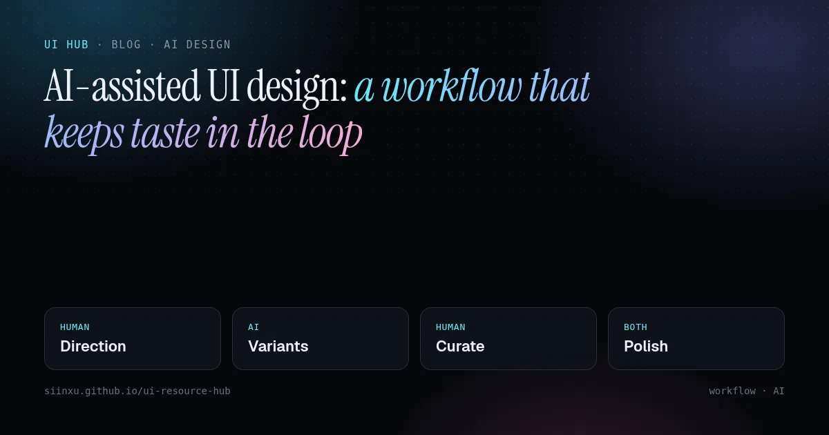
AI 辅助 UI 设计:一条不丢审美的工作流AI 輔助 UI 設計:一條不丟審美的工作流AI-assisted UI design: a workflow that keeps taste in the loopAI支援UIデザイン:センスを手放さないワークフローAI 보조 UI 디자인: 취향을 잃지 않는 워크플로Reka bentuk UI berbantu AI: aliran kerja yang mengekalkan cita rasaThiết kế UI có AI hỗ trợ: quy trình giữ được gu thẩm mỹDesign d'UI assisté par l'IA : un flux qui garde le goût dans la boucleDiseño de UI asistido por IA: un flujo que mantiene el criterioKI-gestütztes UI-Design: ein Workflow, der Geschmack im Spiel hält
生成器快但平庸。把活拆开:人定方向和约束,AI 铺变体,人来挑选和打磨。生成器快但平庸。把活拆開:人定方向和約束,AI 鋪變體,人來挑選和打磨。Generators are fast but average. Split the job: humans set direction and constraints, AI explores variants, humans curate and polish.生成ツールは速いが平均的。方向と制約は人、バリエーションはAI、選別と仕上げは人。생성기는 빠르지만 평범하다. 방향과 제약은 사람, 변형은 AI, 선별과 다듬기는 사람.Penjana pantas tetapi biasa. Manusia tetapkan hala, AI teroka variasi, manusia pilih dan gilap.Công cụ sinh nhanh nhưng tầm thường. Người định hướng, AI khám phá biến thể, người chọn lọc và hoàn thiện.Rapides mais moyens : l'humain fixe la direction, l'IA explore, l'humain sélectionne et peaufine.Rápidos pero promedio: el humano fija la dirección, la IA explora, el humano elige y pule.Schnell, aber durchschnittlich: Mensch gibt Richtung vor, KI exploriert, Mensch kuratiert und poliert.
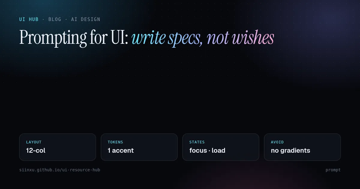
写 UI 提示词:写规格,不要写愿望寫 UI 提示詞:寫規格,不要寫願望Prompting for UI: write specs, not wishesUIのためのプロンプト:願望ではなく仕様を書くUI 프롬프트: 소원 말고 명세를 써라Prompt untuk UI: tulis spesifikasi, bukan hasratViết prompt cho UI: viết đặc tả, đừng viết mong muốnPrompts pour l'UI : écrire des specs, pas des souhaitsPrompts para UI: escribe especificaciones, no deseosPrompts für UI: Spezifikationen statt Wünsche
"现代、简洁"对模型毫无信息量。要写清布局、token、状态、真实内容和禁区。「現代、簡潔」對模型毫無資訊量。要寫清佈局、token、狀態、真實內容和禁區。"Modern and clean" means nothing to a model. Name layout, tokens, states, content and what to avoid.「モダンでクリーン」はモデルに何も伝えない。レイアウト、トークン、状態、内容、禁止事項を書く。"모던하고 깔끔하게"는 의미가 없다. 레이아웃, 토큰, 상태, 콘텐츠, 금지 사항을 적어라."Moden dan bersih" tiada makna. Nyatakan susun atur, token, keadaan, kandungan dan larangan."Hiện đại, gọn gàng" chẳng nói gì. Hãy nêu bố cục, token, trạng thái, nội dung và điều cấm.« Moderne et épuré » ne dit rien. Précisez mise en page, tokens, états, contenu et interdits."Moderno y limpio" no dice nada. Indica layout, tokens, estados, contenido y prohibiciones.„Modern und clean“ sagt nichts. Nenne Layout, Tokens, Zustände, Inhalt und Verbote.
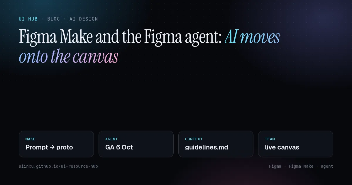
Figma Make 与 Figma 智能体:AI 搬上画布Figma Make 與 Figma 智慧體:AI 搬上畫布Figma Make and the Figma agent: AI moves onto the canvasFigma MakeとFigmaエージェント:AIがキャンバスへFigma Make와 Figma 에이전트: AI가 캔버스로Figma Make dan ejen Figma: AI pindah ke kanvasFigma Make và agent của Figma: AI lên canvasFigma Make et l'agent Figma : l'IA arrive sur le canevasFigma Make y el agente de Figma: la IA llega al lienzoFigma Make und der Figma-Agent: KI zieht auf die Canvas
Figma Make 把提示变成可交互原型;Figma 智能体自 2026-10-06 正式可用,能读取团队规范文件。为什么规范文件才是关键。Figma Make 把提示變成可互動原型;Figma 智慧體自 2026-10-06 正式可用,能讀取團隊規範檔。為什麼規範檔才是關鍵。Figma Make turns prompts into working prototypes; the Figma agent, generally available since 6 Oct 2026, reads team guideline files. Why the guideline file matters most.Figma Makeはプロンプトを動くプロトタイプに。2026/10/6 GAのエージェントはガイドラインを読む。肝はガイドライン。Figma Make는 프롬프트를 프로토타입으로, 2026-10-06 정식 출시된 에이전트는 가이드라인 파일을 읽는다.Figma Make jadikan prompt prototaip; ejen Figma (GA 6 Okt 2026) membaca fail garis panduan pasukan.Figma Make biến prompt thành prototype; agent Figma (GA 6/10/2026) đọc file hướng dẫn của nhóm.Figma Make transforme des prompts en prototypes ; l'agent (GA le 6/10/2026) lit les guides d'équipe.Figma Make convierte prompts en prototipos; el agente (GA 6/10/2026) lee las guías del equipo.Figma Make macht Prompts zu Prototypen; der Agent (GA 6.10.2026) liest Team-Guidelines.