经得起用的仪表盘模式:从指标条到下钻表格經得起用的儀表板模式:從指標條到下鑽表格Dashboard patterns that hold up: from KPI strip to drill-down table使えるダッシュボードの型:KPIからドリルダウン表まで버티는 대시보드 패턴: KPI 띠부터 드릴다운 표까지Corak papan pemuka yang tahanMẫu dashboard bền vững: từ dải KPI đến bảng drill-downDes patterns de dashboard qui tiennentPatrones de dashboard que funcionanDashboard-Muster, die halten
AI 工具爱生成十二张图表。好的仪表盘按顺序回答三个问题:正常吗、变了什么、为什么。每一层对应的布局和组件。AI 工具愛產生十二張圖表。好的儀表板依序回答三個問題:正常嗎、變了什麼、為什麼。每層對應的版面與元件。AI tools love to generate twelve charts. Good dashboards answer three questions in order: is it OK, what changed, why. A layout and a component list for each.良いダッシュボードは「大丈夫か・何が変わったか・なぜか」の順に答える。좋은 대시보드는 괜찮은가, 무엇이 바뀌었나, 왜인가 순으로 답한다.Papan pemuka yang baik menjawab tiga soalan mengikut urutan.Dashboard tốt trả lời ba câu theo thứ tự: ổn không, đổi gì, tại sao.Un bon dashboard répond dans l'ordre : ça va ? qu'est-ce qui change ? pourquoi ?Un buen dashboard responde: ¿va bien?, ¿qué cambió?, ¿por qué?Gute Dashboards beantworten: Läuft es? Was hat sich geändert? Warum?
正文以簡體中文顯示。
本文は英語で表示しています。
본문은 영어로 표시됩니다.
Kandungan dipaparkan dalam bahasa Inggeris.
Nội dung hiển thị bằng tiếng Anh.
Le corps de l’article est en anglais.
El cuerpo del artículo está en inglés.
Der Beitragstext ist auf Englisch.
Ask a generator for an "analytics dashboard" and you will likely get a sidebar, four stat cards and a grid of charts of equal weight. It looks complete and answers nothing. A better structure follows the questions a user actually asks, in order.
Three layers
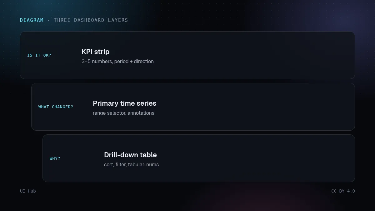
- Is everything OK? A KPI strip of 3–5 numbers, each with the comparison period and a direction, not a sparkline zoo.
- What changed? One primary time-series chart with a range selector, annotated where something happened.
- Why? A sortable, filterable table that drills into detail. Tables are where people actually work.
Details generators skip
- Tabular figures (
font-variant-numeric: tabular-nums) so numbers align. - Right-aligned numeric columns, left-aligned text.
- Empty, loading (skeleton) and error states for every widget.
- Units and time zone in labels; a "last updated" timestamp.
- Colour used for status only, with a non-colour cue (icon or text) for colour-blind users.
Components to start from
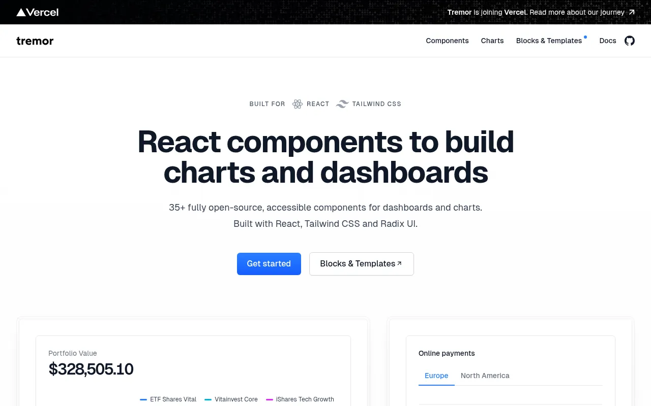
shadcn's dashboard blocks and its charts (built on Recharts) give you the scaffolding; Tremor offers dashboard-focused React components. Specify the three layers in your prompt and you get a page people can use, not just screenshot.
让生成器做一个「数据分析仪表盘」,大概率得到一个侧栏、四张数字卡和一堆同样大小的图表。看起来很完整,却什么也没回答。更好的结构是按用户真正会问的问题依次排布。
三个层次
- 一切正常吗?3–5 个数字组成的指标条,每个带对比周期和涨跌方向,而不是一堆迷你折线图。
- 变了什么?一张主时序图配时间范围选择,在发生事情的地方加标注。
- 为什么?可排序、可筛选、能下钻的表格。表格才是用户真正干活的地方。
生成器常漏掉的细节
- 等宽数字(
font-variant-numeric: tabular-nums),让数字对齐。 - 数字列右对齐,文字列左对齐。
- 每个组件都有空状态、加载骨架和错误状态。
- 标签里写单位和时区,再加一个「最后更新时间」。
- 颜色只表示状态,同时配非颜色提示(图标或文字),照顾色弱用户。
从哪些组件起步
shadcn 的仪表盘区块和图表(基于 Recharts)提供骨架;Tremor 提供专为仪表盘设计的 React 组件。在提示里写明这三个层次,你得到的就是能用的页面,而不只是好截图。
Ask a generator for an "analytics dashboard" and you will likely get a sidebar, four stat cards and a grid of charts of equal weight. It looks complete and answers nothing. A better structure follows the questions a user actually asks, in order.
Three layers
- Is everything OK? A KPI strip of 3–5 numbers, each with the comparison period and a direction, not a sparkline zoo.
- What changed? One primary time-series chart with a range selector, annotated where something happened.
- Why? A sortable, filterable table that drills into detail. Tables are where people actually work.
Details generators skip
- Tabular figures (
font-variant-numeric: tabular-nums) so numbers align. - Right-aligned numeric columns, left-aligned text.
- Empty, loading (skeleton) and error states for every widget.
- Units and time zone in labels; a "last updated" timestamp.
- Colour used for status only, with a non-colour cue (icon or text) for colour-blind users.
Components to start from
shadcn's dashboard blocks and its charts (built on Recharts) give you the scaffolding; Tremor offers dashboard-focused React components. Specify the three layers in your prompt and you get a page people can use, not just screenshot.
AI 提示词AI 提示詞AI promptAIプロンプトAI 프롬프트Prompt AIPrompt cho AIPrompt IAPrompt de IAKI-Prompt
复制给 Claude、Cursor、v0 等 AI 助手,让它按本文的方法处理你的项目。尖括号里的内容换成你自己的。複製給 Claude、Cursor、v0 等 AI 助手,讓它按本文的方法處理你的專案。尖括號裡的內容換成你自己的。Paste this into Claude, Cursor, v0 or another assistant to apply this post to your own project. Replace the parts in angle brackets.Claude・Cursor・v0 などのAIアシスタントに貼り付けると、この記事の方法をあなたのプロジェクトに適用できます。山括弧の部分は自分の内容に置き換えてください。Claude, Cursor, v0 같은 AI 도우미에 붙여 넣으면 이 글의 방법을 내 프로젝트에 적용할 수 있습니다. 꺾쇠괄호 안은 내 내용으로 바꾸세요.Tampal ke Claude, Cursor, v0 atau pembantu lain untuk menggunakan kaedah artikel ini pada projek anda. Gantikan bahagian dalam kurungan sudut.Dán vào Claude, Cursor, v0 hoặc trợ lý khác để áp dụng bài này cho dự án của bạn. Thay phần trong dấu ngoặc nhọn bằng nội dung của bạn.Collez-le dans Claude, Cursor, v0 ou un autre assistant pour appliquer cet article à votre projet. Remplacez les parties entre chevrons.Pégalo en Claude, Cursor, v0 u otro asistente para aplicar este artículo a tu proyecto. Sustituye lo que está entre corchetes angulares.In Claude, Cursor, v0 oder einen anderen Assistenten einfügen, um diesen Beitrag auf dein Projekt anzuwenden. Teile in spitzen Klammern ersetzen.
你是一名资深 UI 工程师。请把文章《经得起用的仪表盘模式:从指标条到下钻表格》(https://ui.incidental.site/blog/dashboard-design-patterns/)的方法用到我的项目上。
核心观点:AI 工具爱生成十二张图表。好的仪表盘按顺序回答三个问题:正常吗、变了什么、为什么。每一层对应的布局和组件。
步骤:
1. 读文章,把建议整理成一份具体、可检查的编号清单。
2. 用这份清单检查 <我的页面 / 组件 / 仓库>,每条标注通过或不通过,并写明文件和行号。
3. 用我现有的 token 和组件,小批量修复不通过的项。不要编造 API,以文章链接的官方文档为准。
4. 最后列出待确认的问题和你无法核实的内容。
你是一名資深 UI 工程師。請把文章《經得起用的儀表板模式:從指標條到下鑽表格》(https://ui.incidental.site/blog/dashboard-design-patterns/)的方法用到我的專案上。
核心觀點:AI 工具愛產生十二張圖表。好的儀表板依序回答三個問題:正常嗎、變了什麼、為什麼。每層對應的版面與元件。
步驟:
1. 讀文章,把建議整理成一份具體、可檢查的編號清單。
2. 用這份清單檢查 <我的頁面 / 元件 / 儲存庫>,每條標註通過或不通過,並寫明檔案和行號。
3. 用我現有的 token 和元件,小批量修復不通過的項目。不要編造 API,以文章連結的官方文件為準。
4. 最後列出待確認的問題和你無法核實的內容。You are a senior UI engineer. Apply the article “Dashboard patterns that hold up: from KPI strip to drill-down table” (https://ui.incidental.site/blog/dashboard-design-patterns/) to my project.
Key idea: AI tools love to generate twelve charts. Good dashboards answer three questions in order: is it OK, what changed, why. A layout and a component list for each.
Steps:
1. Read the article and turn its advice into a numbered checklist of concrete, checkable rules.
2. Audit <my page / component / repo> against that checklist; mark each rule PASS or FAIL with file and line.
3. Fix the FAIL items in small batches, using my existing tokens and components. Do not invent APIs; follow the official docs the article links to.
4. Finish with a short list of open questions and anything you could not verify.あなたはシニアUIエンジニアです。記事「使えるダッシュボードの型:KPIからドリルダウン表まで」(https://ui.incidental.site/blog/dashboard-design-patterns/)の方法を私のプロジェクトに適用してください。
要点:良いダッシュボードは「大丈夫か・何が変わったか・なぜか」の順に答える。
手順:
1. 記事を読み、助言を具体的で確認可能な番号付きチェックリストにする。
2. そのチェックリストで <私のページ / コンポーネント / リポジトリ> を監査し、各項目を合格/不合格で示し、ファイルと行番号を書く。
3. 不合格の項目を、既存のトークンとコンポーネントを使って少しずつ修正する。APIを捏造せず、記事がリンクする公式ドキュメントに従う。
4. 最後に未解決の質問と検証できなかった点を挙げる。당신은 시니어 UI 엔지니어입니다. 글 “버티는 대시보드 패턴: KPI 띠부터 드릴다운 표까지”(https://ui.incidental.site/blog/dashboard-design-patterns/)의 방법을 내 프로젝트에 적용해 주세요.
핵심: 좋은 대시보드는 괜찮은가, 무엇이 바뀌었나, 왜인가 순으로 답한다.
단계:
1. 글을 읽고 조언을 구체적이고 확인 가능한 번호 목록으로 정리한다.
2. 그 목록으로 <내 페이지 / 컴포넌트 / 저장소>를 점검하고, 항목마다 통과/실패와 파일·줄 번호를 적는다.
3. 실패 항목을 기존 토큰과 컴포넌트로 조금씩 고친다. API를 지어내지 말고 글에 링크된 공식 문서를 따른다.
4. 마지막으로 남은 질문과 확인하지 못한 내용을 정리한다.Anda jurutera UI kanan. Gunakan kaedah artikel “Corak papan pemuka yang tahan” (https://ui.incidental.site/blog/dashboard-design-patterns/) pada projek saya.
Idea utama: Papan pemuka yang baik menjawab tiga soalan mengikut urutan.
Langkah:
1. Baca artikel dan jadikan nasihatnya senarai semak bernombor yang konkrit dan boleh disemak.
2. Audit <halaman / komponen / repo saya> dengan senarai itu; tandakan setiap peraturan LULUS atau GAGAL dengan fail dan baris.
3. Baiki item GAGAL sedikit demi sedikit menggunakan token dan komponen sedia ada. Jangan reka API; ikut dokumen rasmi yang dipautkan artikel.
4. Akhiri dengan soalan terbuka dan perkara yang tidak dapat disahkan.Bạn là kỹ sư UI cấp cao. Hãy áp dụng bài viết “Mẫu dashboard bền vững: từ dải KPI đến bảng drill-down” (https://ui.incidental.site/blog/dashboard-design-patterns/) cho dự án của tôi.
Ý chính: Dashboard tốt trả lời ba câu theo thứ tự: ổn không, đổi gì, tại sao.
Các bước:
1. Đọc bài và biến lời khuyên thành danh sách kiểm tra đánh số, cụ thể, kiểm chứng được.
2. Rà soát <trang / component / repo của tôi> theo danh sách đó; ghi ĐẠT hoặc KHÔNG ĐẠT kèm tệp và dòng.
3. Sửa các mục KHÔNG ĐẠT theo từng đợt nhỏ, dùng token và component sẵn có. Không bịa API; làm theo tài liệu chính thức mà bài viết dẫn tới.
4. Kết thúc bằng các câu hỏi còn mở và những điểm chưa xác minh được.Tu es ingénieur UI senior. Applique l’article « Des patterns de dashboard qui tiennent » (https://ui.incidental.site/blog/dashboard-design-patterns/) à mon projet.
Idée clé : Un bon dashboard répond dans l'ordre : ça va ? qu'est-ce qui change ? pourquoi ?
Étapes :
1. Lis l’article et transforme ses conseils en une liste numérotée de règles concrètes et vérifiables.
2. Audite <ma page / mon composant / mon dépôt> avec cette liste ; indique OK ou KO pour chaque règle, avec fichier et ligne.
3. Corrige les points KO par petits lots, avec mes tokens et composants existants. N’invente pas d’API ; suis la documentation officielle citée par l’article.
4. Termine par les questions ouvertes et ce que tu n’as pas pu vérifier.Eres un ingeniero de UI sénior. Aplica el artículo “Patrones de dashboard que funcionan” (https://ui.incidental.site/blog/dashboard-design-patterns/) a mi proyecto.
Idea clave: Un buen dashboard responde: ¿va bien?, ¿qué cambió?, ¿por qué?
Pasos:
1. Lee el artículo y convierte sus consejos en una lista numerada de reglas concretas y comprobables.
2. Audita <mi página / componente / repositorio> con esa lista; marca cada regla como CUMPLE o NO CUMPLE con archivo y línea.
3. Corrige los puntos que no cumplen en lotes pequeños, usando mis tokens y componentes actuales. No inventes APIs; sigue la documentación oficial que enlaza el artículo.
4. Termina con las preguntas abiertas y lo que no pudiste verificar.Du bist Senior-UI-Engineer. Wende den Artikel „Dashboard-Muster, die halten“ (https://ui.incidental.site/blog/dashboard-design-patterns/) auf mein Projekt an.
Kernidee: Gute Dashboards beantworten: Läuft es? Was hat sich geändert? Warum?
Schritte:
1. Lies den Artikel und mach aus den Empfehlungen eine nummerierte Liste konkreter, prüfbarer Regeln.
2. Prüfe <meine Seite / Komponente / mein Repo> anhand dieser Liste; markiere jede Regel mit OK oder FEHLT, mit Datei und Zeile.
3. Behebe die fehlenden Punkte in kleinen Schritten mit meinen vorhandenen Tokens und Komponenten. Erfinde keine APIs; folge der offiziellen Doku, die der Artikel verlinkt.
4. Schließe mit offenen Fragen und dem, was du nicht prüfen konntest.引用来源引用來源References参考文献참고 자료RujukanNguồn tham khảoRéférencesReferenciasQuellen
- Dashboard blocks — shadcn/ui
- Charts — shadcn/ui
- Tremor — Tremor
- Dashboards: making charts and graphs easier to understand — Nielsen Norman Group
- font-variant-numeric — MDN
相关文章相關文章Related posts関連記事관련 글Artikel berkaitanBài liên quanArticles liésArtículos relacionadosÄhnliche Beiträge
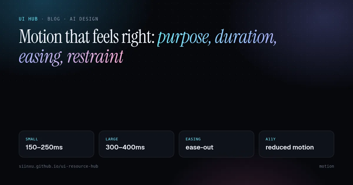
让动效"对味":目的、时长、缓动与克制讓動效「對味」:目的、時長、緩動與克制Motion that feels right: purpose, duration, easing, restraintしっくりくるモーション:目的・時間・イージング・抑制자연스러운 모션: 목적, 시간, 이징, 절제Gerakan yang terasa betul: tujuan, tempoh, easing, kawalanChuyển động đúng cảm giác: mục đích, thời lượng, easing, tiết chếUn mouvement juste : intention, durée, easing, retenueMovimiento que se siente bien: propósito, duración, easing, contenciónBewegung, die sich richtig anfühlt: Zweck, Dauer, Easing, Zurückhaltung
大多数界面动效应在 300ms 内、用 ease-out,高频操作干脆不做。炫技属于营销页,不属于工具。大多數介面動效應在 300ms 內、用 ease-out,高頻操作乾脆不做。Most UI motion should be under 300ms, ease-out, and skipped for frequent actions. Spectacle belongs on marketing pages, not in tools.UIモーションは300ms以内・ease-out、頻繁な操作には付けない。UI 모션은 300ms 이하, ease-out, 잦은 동작엔 생략.Kebanyakan gerakan UI di bawah 300ms, ease-out, dan dilangkau untuk tindakan kerap.Hầu hết chuyển động dưới 300ms, ease-out, bỏ qua với thao tác thường xuyên.Moins de 300 ms, ease-out, et rien pour les actions fréquentes.Menos de 300 ms, ease-out, y nada en acciones frecuentes.Unter 300 ms, ease-out, und keine Animation für häufige Aktionen.
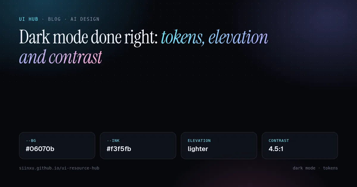
把暗色模式做对:token、层级与对比度把暗色模式做對:token、層級與對比度Dark mode done right: tokens, elevation and contrast正しいダークモード:トークン・階層・コントラスト다크 모드 제대로: 토큰, 고도, 대비Mod gelap yang betul: token, ketinggian dan kontrasLàm dark mode đúng: token, độ nổi và độ tương phảnUn mode sombre réussi : tokens, élévation et contrasteModo oscuro bien hecho: tokens, elevación y contrasteDark Mode richtig: Tokens, Elevation und Kontrast
暗色模式是第二套配色,不是反色。用语义 token,用更亮的表面表达层级,强调色要降饱和。暗色模式是第二套配色,不是反色。用語義 token,用更亮的表面表達層級。Dark mode is a second palette, not an inverted one. Use semantic tokens, lighter surfaces for elevation, and desaturated accents.ダークモードは反転ではなく第二のパレット。意味トークン、明るい面で階層、彩度を下げたアクセント。다크 모드는 반전이 아니라 두 번째 팔레트. 시맨틱 토큰, 밝은 면으로 고도 표현.Mod gelap ialah palet kedua, bukan terbalik. Guna token semantik dan permukaan lebih cerah untuk ketinggian.Dark mode là bảng màu thứ hai, không phải đảo màu. Dùng token ngữ nghĩa, bề mặt sáng hơn để thể hiện độ nổi.Une seconde palette, pas une inversion. Tokens sémantiques, surfaces plus claires pour l'élévation.Una segunda paleta, no una inversión. Tokens semánticos y superficies más claras para la elevación.Eine zweite Palette, keine Invertierung. Semantische Tokens, hellere Flächen für Elevation.
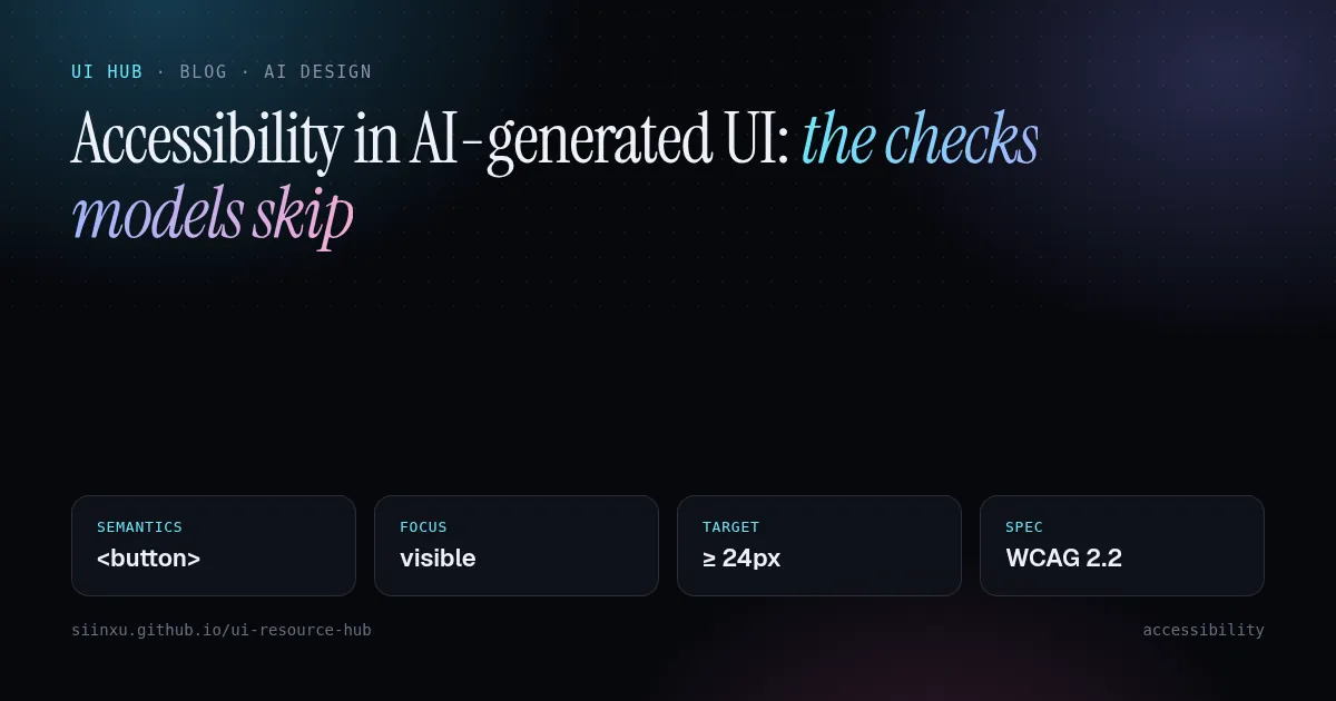
AI 生成界面的无障碍:模型常漏的检查项AI 生成介面的無障礙:模型常漏的檢查項Accessibility in AI-generated UI: the checks models skipAI生成UIのアクセシビリティ:モデルが飛ばすチェックAI 생성 UI의 접근성: 모델이 빠뜨리는 점검Kebolehcapaian dalam UI jana AI: semakan yang dilangkau modelKhả năng tiếp cận trong UI do AI tạo: những kiểm tra mô hình bỏ quaAccessibilité de l'UI générée par IA : les vérifications oubliéesAccesibilidad en UI generada por IA: las comprobaciones que se saltanBarrierefreiheit in KI-generierter UI: die übersprungenen Checks
生成的界面看着没问题,键盘和读屏却用不了。先用无障碍底层组件,再按 WCAG 2.2 走查。生成的介面看著沒問題,鍵盤和讀屏卻用不了。先用無障礙底層元件,再按 WCAG 2.2 檢查。Generated UIs look fine and fail keyboards and screen readers. Start from accessible primitives, then audit against WCAG 2.2.見た目は良くてもキーボードやスクリーンリーダーで失敗。アクセシブルな基盤からWCAG 2.2で監査。보기엔 괜찮아도 키보드·스크린리더에서 실패. 접근성 기반에서 시작해 WCAG 2.2로 점검.Nampak baik tetapi gagal untuk papan kekunci dan pembaca skrin. Mula dengan primitif boleh capai, audit dengan WCAG 2.2.Trông ổn nhưng hỏng với bàn phím và trình đọc màn hình. Dùng primitive dễ tiếp cận, kiểm theo WCAG 2.2.Belles mais inutilisables au clavier. Partir de primitives accessibles, auditer selon WCAG 2.2.Se ven bien pero fallan con teclado y lector. Parte de primitivas accesibles y audita con WCAG 2.2.Sieht gut aus, scheitert an Tastatur und Screenreader. Mit barrierefreien Primitives starten, nach WCAG 2.2 prüfen.