把暗色模式做对:token、层级与对比度把暗色模式做對:token、層級與對比度Dark mode done right: tokens, elevation and contrast正しいダークモード:トークン・階層・コントラスト다크 모드 제대로: 토큰, 고도, 대비Mod gelap yang betul: token, ketinggian dan kontrasLàm dark mode đúng: token, độ nổi và độ tương phảnUn mode sombre réussi : tokens, élévation et contrasteModo oscuro bien hecho: tokens, elevación y contrasteDark Mode richtig: Tokens, Elevation und Kontrast
暗色模式是第二套配色,不是反色。用语义 token,用更亮的表面表达层级,强调色要降饱和。暗色模式是第二套配色,不是反色。用語義 token,用更亮的表面表達層級。Dark mode is a second palette, not an inverted one. Use semantic tokens, lighter surfaces for elevation, and desaturated accents.ダークモードは反転ではなく第二のパレット。意味トークン、明るい面で階層、彩度を下げたアクセント。다크 모드는 반전이 아니라 두 번째 팔레트. 시맨틱 토큰, 밝은 면으로 고도 표현.Mod gelap ialah palet kedua, bukan terbalik. Guna token semantik dan permukaan lebih cerah untuk ketinggian.Dark mode là bảng màu thứ hai, không phải đảo màu. Dùng token ngữ nghĩa, bề mặt sáng hơn để thể hiện độ nổi.Une seconde palette, pas une inversion. Tokens sémantiques, surfaces plus claires pour l'élévation.Una segunda paleta, no una inversión. Tokens semánticos y superficies más claras para la elevación.Eine zweite Palette, keine Invertierung. Semantische Tokens, hellere Flächen für Elevation.
正文以簡體中文顯示。
本文は英語で表示しています。
본문은 영어로 표시됩니다.
Kandungan dipaparkan dalam bahasa Inggeris.
Nội dung hiển thị bằng tiếng Anh.
Le corps de l’article est en anglais.
El cuerpo del artículo está en inglés.
Der Beitragstext ist auf Englisch.
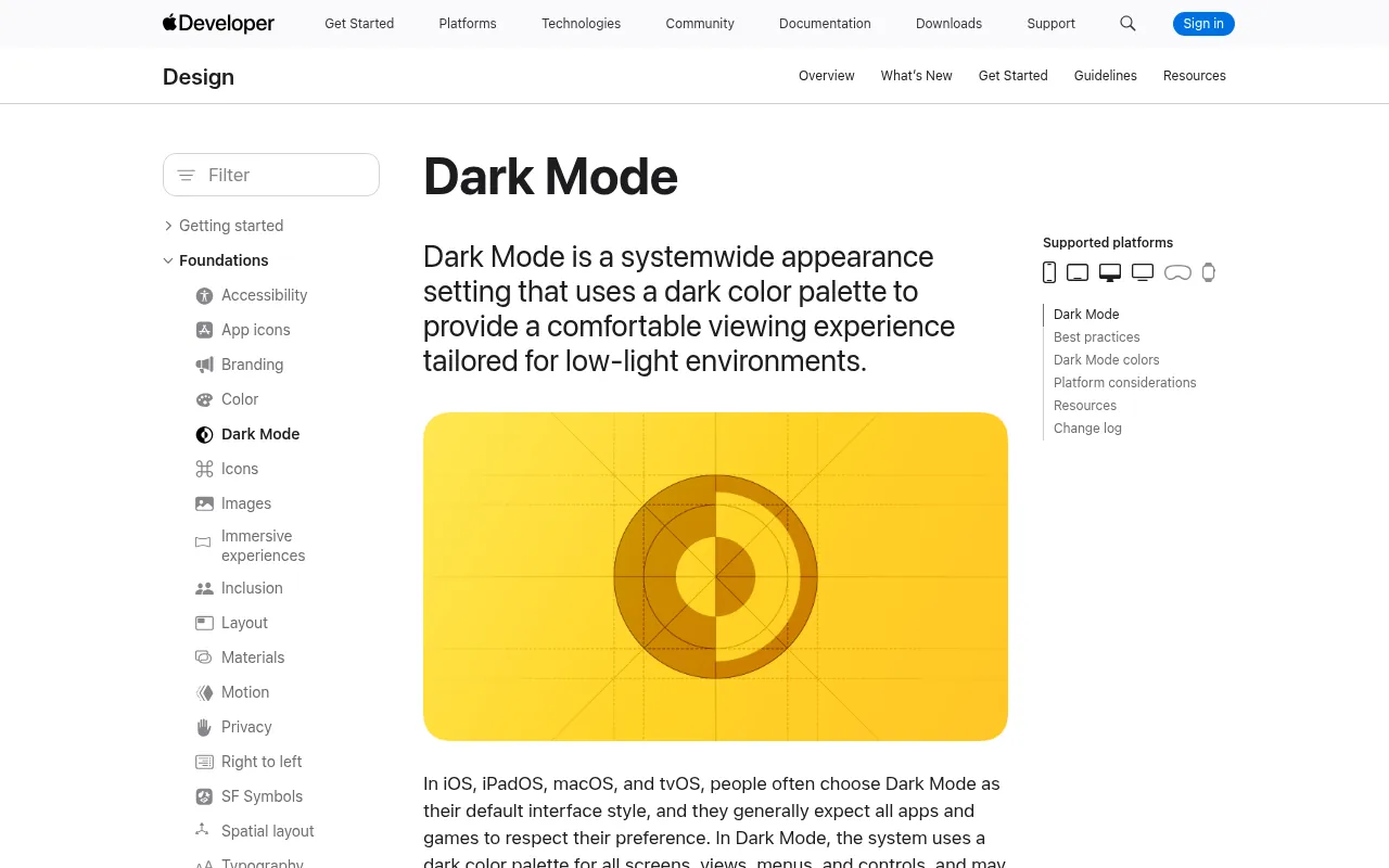
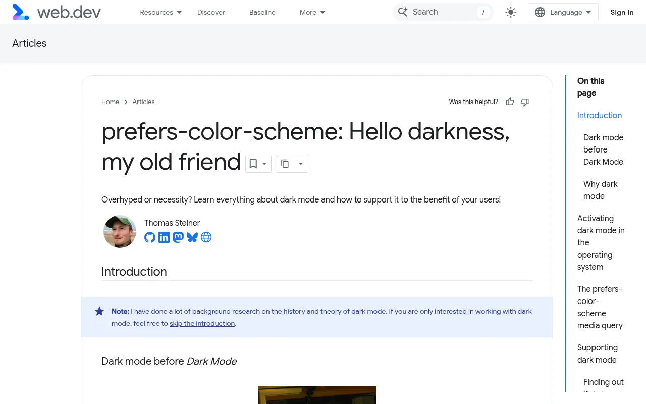
Inverting colours is the fastest way to ship a bad dark mode: pure black backgrounds, glowing saturated blues, borders that vanish and shadows nobody can see. Apple's Human Interface Guidelines and web.dev both treat dark mode as its own design pass, not a filter. This post covers the token structure that makes two themes cheap, the rules for surfaces, colour and contrast, a step-by-step implementation without the white flash, and what to check before you ship.
Start from semantic tokens
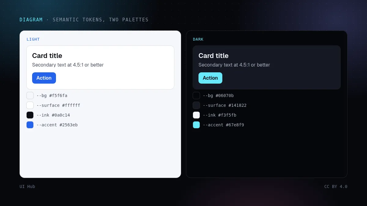
The single decision that makes dark mode manageable is naming colours by role, not by value. Components use --bg, --surface, --ink, --muted, --line and --accent. Each theme assigns values to those roles. A component never knows which theme it is in.
:root, [data-theme="light"] {
  color-scheme: light;
  --bg: #f5f6fa;  --surface: #ffffff;  --raised: #ffffff;
  --ink: #0a0c14; --muted: #4a5164;    --line: rgb(10 12 20 / .10);
  --accent: #2563eb;
}
[data-theme="dark"] {
  color-scheme: dark;
  --bg: #06070b;  --surface: #0d0f15;  --raised: #151924;
  --ink: #f3f5fb; --muted: #a6adbf;    --line: rgb(255 255 255 / .10);
  --accent: #67e8f9;
}
.card { background: var(--surface); color: var(--ink); border: 1px solid var(--line); }
If your codebase has #fff and text-gray-900 scattered through components, the first step of a dark mode project is replacing them with roles. Agents are good at this mechanical refactor when you give them the role table.
Rules for surfaces and colour
- Off-black, not black. Pure
#000behind white text maximises halation (the glow around bright text) on many screens. A very dark blue-grey such as#06070breads as black and is easier on the eyes. - Off-white text.
#f3f5fbinstead of#fffffffor body text; reserve pure white for small emphasis if at all. - Elevation by lightness. In light mode, shadows separate layers. In dark mode, shadows barely show, so raised surfaces get slightly lighter: background, then surface, then raised. Material's dark theme guidance uses the same idea.
- Desaturate and lighten accents. A saturated
#2563ebthat works on white vibrates on near-black. Pick a lighter, less saturated accent for dark, and check it as text and as a button fill separately. - Borders carry more weight. With weak shadows, a 1px translucent line is often what separates cards from the background.
- Images and illustrations. Logos and diagrams with white backgrounds become glaring rectangles. Provide dark variants or put them on a neutral surface.
Contrast in both themes
WCAG asks for at least 4.5:1 contrast for normal text and 3:1 for large text and UI components. Check muted text, placeholder text, disabled states and links in both themes. The usual failure is muted grey that passes on white and fails on near-black, or the reverse.
Step by step: implementing the switch
Step 1: respect the system, remember the choice. Default to prefers-color-scheme, let the user override it, and store the override.
Step 2: set the theme before first paint. A tiny inline script in <head> avoids the white flash on load:
<script>
  try {
    const saved = localStorage.getItem("theme");
    const sys = matchMedia("(prefers-color-scheme: dark)").matches ? "dark" : "light";
    document.documentElement.dataset.theme = saved || sys;
  } catch (e) {
    document.documentElement.dataset.theme = "light";
  }
</script>
Step 3: set color-scheme. It tells the browser to render form controls, scrollbars and the default canvas in the right theme. Without it you get light scrollbars on a dark page.
Step 4: consider light-dark(). Modern browsers support the CSS light-dark() function, which picks a value based on the active color-scheme. It is handy for one-off values: border-color: light-dark(#e5e7eb, #262a35);.
Step 5: wire the toggle. Update data-theme, save the choice, and update aria-pressed or the label so screen-reader users know the current state.
A five-minute dark-mode review
Open the page in dark mode on a real phone at low brightness and on a laptop at full brightness. Look for four things: text that glows or blurs at the edges (too much contrast, often pure white on pure black), cards that disappear into the background (missing border or lightness step), accent colours that vibrate, and any white rectangle (an image, embed or code block that was never themed). Then switch themes with the toggle and reload: the page should come back in the theme you chose, without a flash.
Pitfalls
- Inverting with a filter.
filter: invert(1)flips photos and brand colours too. - Forgetting third-party embeds. Code blocks, maps, charts and iframes often stay light. Theme them or frame them.
- Shadows as the only separator. They disappear in dark mode; add borders or lightness steps.
- Testing only one theme. Every screenshot review, visual test and design critique should include both.
- Theme flash. Setting the theme in a framework effect after hydration flashes the wrong theme on every load.
Questions we get
Should dark mode be the default? Follow the system setting by default. Users who prefer dark have usually already said so at the operating-system level, and the same goes for light. A manual toggle covers everyone else.
Do we need a separate dark design in Figma? You need dark values for every role token and a review of key screens in dark. You do not need to redraw every screen if components use role tokens; the theme swap does the work.
What about charts and data visualisation? Chart palettes need their own dark variants. Colours that are distinguishable on white can merge on near-black, so check categorical colours side by side in both themes, and never rely on colour alone to distinguish series.
How do we keep the two themes from drifting? Run visual regression screenshots in both themes and fail the build on unexpected changes. Treat a component that looks wrong in one theme as a bug, not a polish item.
Is "dim" or high-contrast a third theme? If users need it, yes, and the role-token structure makes it a third column of values. Respect prefers-contrast before inventing a custom option.
Our take
NN/g's research shows preference between dark and light is split and situational, so ship both and remember the choice. The cost of the second theme is almost entirely in the token structure: get roles right and dark mode is a second column of values. UI Hub stores light and dark preview screenshots for each component for exactly this reason; a component that only looks good in one theme is half finished.
Checklist
- Components use role tokens only; no raw colours
- Off-black background, off-white text, lighter raised surfaces
- Dark-specific accent checked as text and as fill
- 4.5:1 text contrast verified in both themes
- Theme set before first paint;
color-schemeset - System preference respected and user override remembered
直接反色,是做出糟糕深色模式最快的办法:纯黑背景、刺眼发光的饱和蓝、消失的边框、谁也看不见的阴影。Apple 的人机界面指南和 web.dev 都把深色模式当作一次独立的设计,而不是一个滤镜。这篇讲:让两套主题成本很低的 token 结构,表面、颜色和对比度的规则,没有白屏闪烁的分步实现,以及上线前要检查什么。
从语义 token 开始
让深色模式可控的关键决定只有一个:按角色给颜色命名,而不是按色值。组件只用 --bg、--surface、--ink、--muted、--line、--accent,每套主题给这些角色赋值。组件永远不需要知道自己在哪套主题里。
:root, [data-theme="light"] {
  color-scheme: light;
  --bg: #f5f6fa;  --surface: #ffffff;  --raised: #ffffff;
  --ink: #0a0c14; --muted: #4a5164;    --line: rgb(10 12 20 / .10);
  --accent: #2563eb;
}
[data-theme="dark"] {
  color-scheme: dark;
  --bg: #06070b;  --surface: #0d0f15;  --raised: #151924;
  --ink: #f3f5fb; --muted: #a6adbf;    --line: rgb(255 255 255 / .10);
  --accent: #67e8f9;
}
.card { background: var(--surface); color: var(--ink); border: 1px solid var(--line); }
如果代码里到处是 #fff 和 text-gray-900,做深色模式的第一步就是把它们换成角色变量。只要给 Agent 一张角色对照表,这种机械重构它做得很好。
表面与颜色的规则
- 近黑,而不是纯黑。 在很多屏幕上,纯
#000背景配白字会让光晕(亮字周围的发光)最明显。#06070b这样很深的蓝灰看起来就是黑色,眼睛更舒服。 - 近白文字。 正文用
#f3f5fb而不是#ffffff;纯白最多留给少量强调。 - 用亮度表达层级。 浅色模式靠阴影分层;深色模式里阴影几乎看不见,所以越高的层越亮:背景、表面、浮层依次变亮。Material 的深色主题指南也是这个思路。
- 强调色降饱和、提亮。 在白底上好看的饱和
#2563eb,放在近黑底上会"抖"。深色主题选一个更亮、饱和度更低的强调色,并分别检查它作为文字和作为按钮底色的效果。 - 边框更重要。 阴影弱了,常常要靠一条 1px 半透明线把卡片和背景分开。
- 图片和插图。 白底的 logo 和示意图会变成刺眼的白块。提供深色版本,或者放在中性底色上。
两套主题都要查对比度
WCAG 要求普通文字对比度至少 4.5:1,大字和界面组件至少 3:1。在两套主题里都要检查次要文字、占位文字、禁用状态和链接。最常见的问题是:次要灰色在白底上合格,在近黑底上不合格,或者反过来。
分步实现切换
第 1 步:尊重系统设置,记住用户选择。 默认跟随 prefers-color-scheme,允许用户覆盖,并保存覆盖结果。
第 2 步:首次绘制前设定主题。 在 <head> 里放一小段内联脚本,避免加载时白屏闪烁:
<script>
  try {
    const saved = localStorage.getItem("theme");
    const sys = matchMedia("(prefers-color-scheme: dark)").matches ? "dark" : "light";
    document.documentElement.dataset.theme = saved || sys;
  } catch (e) {
    document.documentElement.dataset.theme = "light";
  }
</script>
第 3 步:设置 color-scheme。 它告诉浏览器用对应主题渲染表单控件、滚动条和默认画布。不设置的话,深色页面上会出现浅色滚动条。
第 4 步:考虑 light-dark()。 现代浏览器支持 CSS 的 light-dark() 函数,会根据当前 color-scheme 选值。适合零散的数值:border-color: light-dark(#e5e7eb, #262a35);。
第 5 步:接好切换按钮。 更新 data-theme、保存选择,同时更新 aria-pressed 或按钮文字,让读屏用户知道当前状态。
五分钟深色模式走查
在真实手机上把亮度调低、在笔记本上把亮度调满,分别用深色模式打开页面。看四件事:文字边缘发光或发虚(对比过强,常见于纯白字配纯黑底)、卡片融进背景(缺边框或亮度层级)、强调色发抖,以及任何白色方块(从没做过主题的图片、嵌入或代码块)。然后用按钮切换主题并刷新:页面应该保持你选的主题,而且没有闪烁。
常见坑
- 用滤镜反色。
filter: invert(1)会把照片和品牌色也一起反掉。 - 忘了第三方嵌入。 代码块、地图、图表、iframe 经常停留在浅色。给它们做主题,或者加一圈边框。
- 只靠阴影分隔。 深色模式里阴影会消失;加边框或亮度层级。
- 只测一套主题。 每次截图走查、视觉测试和设计评审都要包含两套。
- 主题闪烁。 在框架的 effect 里、水合之后才设置主题,每次加载都会先闪一下错误的主题。
常见问题
深色要不要做默认? 默认跟随系统设置。偏好深色的用户通常已经在操作系统层面设置过了,偏好浅色的也一样。手动切换按钮覆盖其余情况。
Figma 里需要单独画一套深色设计吗? 需要为每个角色 token 定义深色数值,并在深色下检查关键页面。只要组件用的是角色 token,就不需要把每个页面重画一遍,主题切换会完成这件事。
图表和数据可视化怎么办? 图表配色需要单独的深色版本。在白底上能区分的颜色,在近黑底上可能会混在一起。两套主题下都要把分类色并排检查,并且永远不要只靠颜色区分数据系列。
怎么防止两套主题逐渐走样? 在两套主题下都跑视觉回归截图,出现意外变化就让构建失败。把"在某一套主题里看起来不对"的组件当作 bug,而不是锦上添花的打磨项。
"暗淡"或高对比算不算第三套主题? 如果用户需要,就算。角色 token 结构让它只是第三列数值。在发明自定义选项之前,先尊重 prefers-contrast。
我们的看法
NN/g 的研究显示,用户对深浅色的偏好各占一部分,而且因场景而异,所以两套都要做,并记住用户的选择。第二套主题的成本几乎全在 token 结构上:角色定对了,深色模式就只是第二列数值。UI Hub 给每个组件同时保存浅色和深色预览截图,正是这个原因;只在一套主题里好看的组件,只完成了一半。
清单
- 组件只用角色 token,没有裸色值
- 近黑背景、近白文字,越高的层越亮
- 深色专用强调色分别作为文字和底色检查过
- 两套主题都验证了 4.5:1 文字对比度
- 首次绘制前设定主题,并设置了
color-scheme - 尊重系统偏好,并记住用户的覆盖选择
Inverting colours is the fastest way to ship a bad dark mode: pure black backgrounds, glowing saturated blues, borders that vanish and shadows nobody can see. Apple's Human Interface Guidelines and web.dev both treat dark mode as its own design pass, not a filter. This post covers the token structure that makes two themes cheap, the rules for surfaces, colour and contrast, a step-by-step implementation without the white flash, and what to check before you ship.
Start from semantic tokens
The single decision that makes dark mode manageable is naming colours by role, not by value. Components use --bg, --surface, --ink, --muted, --line and --accent. Each theme assigns values to those roles. A component never knows which theme it is in.
:root, [data-theme="light"] {
  color-scheme: light;
  --bg: #f5f6fa;  --surface: #ffffff;  --raised: #ffffff;
  --ink: #0a0c14; --muted: #4a5164;    --line: rgb(10 12 20 / .10);
  --accent: #2563eb;
}
[data-theme="dark"] {
  color-scheme: dark;
  --bg: #06070b;  --surface: #0d0f15;  --raised: #151924;
  --ink: #f3f5fb; --muted: #a6adbf;    --line: rgb(255 255 255 / .10);
  --accent: #67e8f9;
}
.card { background: var(--surface); color: var(--ink); border: 1px solid var(--line); }
If your codebase has #fff and text-gray-900 scattered through components, the first step of a dark mode project is replacing them with roles. Agents are good at this mechanical refactor when you give them the role table.
Rules for surfaces and colour
- Off-black, not black. Pure
#000behind white text maximises halation (the glow around bright text) on many screens. A very dark blue-grey such as#06070breads as black and is easier on the eyes. - Off-white text.
#f3f5fbinstead of#fffffffor body text; reserve pure white for small emphasis if at all. - Elevation by lightness. In light mode, shadows separate layers. In dark mode, shadows barely show, so raised surfaces get slightly lighter: background, then surface, then raised. Material's dark theme guidance uses the same idea.
- Desaturate and lighten accents. A saturated
#2563ebthat works on white vibrates on near-black. Pick a lighter, less saturated accent for dark, and check it as text and as a button fill separately. - Borders carry more weight. With weak shadows, a 1px translucent line is often what separates cards from the background.
- Images and illustrations. Logos and diagrams with white backgrounds become glaring rectangles. Provide dark variants or put them on a neutral surface.
Contrast in both themes
WCAG asks for at least 4.5:1 contrast for normal text and 3:1 for large text and UI components. Check muted text, placeholder text, disabled states and links in both themes. The usual failure is muted grey that passes on white and fails on near-black, or the reverse.
Step by step: implementing the switch
Step 1: respect the system, remember the choice. Default to prefers-color-scheme, let the user override it, and store the override.
Step 2: set the theme before first paint. A tiny inline script in <head> avoids the white flash on load:
<script>
  try {
    const saved = localStorage.getItem("theme");
    const sys = matchMedia("(prefers-color-scheme: dark)").matches ? "dark" : "light";
    document.documentElement.dataset.theme = saved || sys;
  } catch (e) {
    document.documentElement.dataset.theme = "light";
  }
</script>
Step 3: set color-scheme. It tells the browser to render form controls, scrollbars and the default canvas in the right theme. Without it you get light scrollbars on a dark page.
Step 4: consider light-dark(). Modern browsers support the CSS light-dark() function, which picks a value based on the active color-scheme. It is handy for one-off values: border-color: light-dark(#e5e7eb, #262a35);.
Step 5: wire the toggle. Update data-theme, save the choice, and update aria-pressed or the label so screen-reader users know the current state.
A five-minute dark-mode review
Open the page in dark mode on a real phone at low brightness and on a laptop at full brightness. Look for four things: text that glows or blurs at the edges (too much contrast, often pure white on pure black), cards that disappear into the background (missing border or lightness step), accent colours that vibrate, and any white rectangle (an image, embed or code block that was never themed). Then switch themes with the toggle and reload: the page should come back in the theme you chose, without a flash.
Pitfalls
- Inverting with a filter.
filter: invert(1)flips photos and brand colours too. - Forgetting third-party embeds. Code blocks, maps, charts and iframes often stay light. Theme them or frame them.
- Shadows as the only separator. They disappear in dark mode; add borders or lightness steps.
- Testing only one theme. Every screenshot review, visual test and design critique should include both.
- Theme flash. Setting the theme in a framework effect after hydration flashes the wrong theme on every load.
Questions we get
Should dark mode be the default? Follow the system setting by default. Users who prefer dark have usually already said so at the operating-system level, and the same goes for light. A manual toggle covers everyone else.
Do we need a separate dark design in Figma? You need dark values for every role token and a review of key screens in dark. You do not need to redraw every screen if components use role tokens; the theme swap does the work.
What about charts and data visualisation? Chart palettes need their own dark variants. Colours that are distinguishable on white can merge on near-black, so check categorical colours side by side in both themes, and never rely on colour alone to distinguish series.
How do we keep the two themes from drifting? Run visual regression screenshots in both themes and fail the build on unexpected changes. Treat a component that looks wrong in one theme as a bug, not a polish item.
Is "dim" or high-contrast a third theme? If users need it, yes, and the role-token structure makes it a third column of values. Respect prefers-contrast before inventing a custom option.
Our take
NN/g's research shows preference between dark and light is split and situational, so ship both and remember the choice. The cost of the second theme is almost entirely in the token structure: get roles right and dark mode is a second column of values. UI Hub stores light and dark preview screenshots for each component for exactly this reason; a component that only looks good in one theme is half finished.
Checklist
- Components use role tokens only; no raw colours
- Off-black background, off-white text, lighter raised surfaces
- Dark-specific accent checked as text and as fill
- 4.5:1 text contrast verified in both themes
- Theme set before first paint;
color-schemeset - System preference respected and user override remembered
AI 提示词AI 提示詞AI promptAIプロンプトAI 프롬프트Prompt AIPrompt cho AIPrompt IAPrompt de IAKI-Prompt
复制给 Claude、Cursor、v0 等 AI 助手,让它按本文的方法处理你的项目。尖括号里的内容换成你自己的。複製給 Claude、Cursor、v0 等 AI 助手,讓它按本文的方法處理你的專案。尖括號裡的內容換成你自己的。Paste this into Claude, Cursor, v0 or another assistant to apply this post to your own project. Replace the parts in angle brackets.Claude・Cursor・v0 などのAIアシスタントに貼り付けると、この記事の方法をあなたのプロジェクトに適用できます。山括弧の部分は自分の内容に置き換えてください。Claude, Cursor, v0 같은 AI 도우미에 붙여 넣으면 이 글의 방법을 내 프로젝트에 적용할 수 있습니다. 꺾쇠괄호 안은 내 내용으로 바꾸세요.Tampal ke Claude, Cursor, v0 atau pembantu lain untuk menggunakan kaedah artikel ini pada projek anda. Gantikan bahagian dalam kurungan sudut.Dán vào Claude, Cursor, v0 hoặc trợ lý khác để áp dụng bài này cho dự án của bạn. Thay phần trong dấu ngoặc nhọn bằng nội dung của bạn.Collez-le dans Claude, Cursor, v0 ou un autre assistant pour appliquer cet article à votre projet. Remplacez les parties entre chevrons.Pégalo en Claude, Cursor, v0 u otro asistente para aplicar este artículo a tu proyecto. Sustituye lo que está entre corchetes angulares.In Claude, Cursor, v0 oder einen anderen Assistenten einfügen, um diesen Beitrag auf dein Projekt anzuwenden. Teile in spitzen Klammern ersetzen.
为 <项目> 做一套规范的深色主题,或者走查现有的深色主题。
1. 找出组件里所有裸颜色(hex、rgb、Tailwind 颜色类名)并列出来。提出一张角色表:--bg、--surface、--raised、--ink、--muted、--line、--accent(用到的话再加 danger/success)。
2. 用角色变量替换裸颜色。分别为 [data-theme="light"] 和 [data-theme="dark"] 定义数值,并在两者中设置 color-scheme。
3. 深色数值:近黑背景(不要 #000)、近白文字(不要 #fff)、浮层比背景更亮、强调色更亮且饱和度更低。
4. 在两套主题里检查 WCAG 对比度(文字 4.5:1,大字/界面组件 3:1):正文、次要文字、占位文字、链接和按钮;输出带比值的表格,并修复不合格项。
5. 在 <head> 加一段内联脚本,在首次绘制前设置 data-theme(优先用已保存的选择,否则用 prefers-color-scheme);加一个切换按钮,保存选择并更新 aria-pressed。
6. 列出需要深色版本的第三方嵌入、图片和代码块。
不要使用 filter: invert。
为 <项目> 做一套规范的深色主题,或者走查现有的深色主题。
1. 找出组件里所有裸颜色(hex、rgb、Tailwind 颜色类名)并列出来。提出一张角色表:--bg、--surface、--raised、--ink、--muted、--line、--accent(用到的话再加 danger/success)。
2. 用角色变量替换裸颜色。分别为 [data-theme="light"] 和 [data-theme="dark"] 定义数值,并在两者中设置 color-scheme。
3. 深色数值:近黑背景(不要 #000)、近白文字(不要 #fff)、浮层比背景更亮、强调色更亮且饱和度更低。
4. 在两套主题里检查 WCAG 对比度(文字 4.5:1,大字/界面组件 3:1):正文、次要文字、占位文字、链接和按钮;输出带比值的表格,并修复不合格项。
5. 在 <head> 加一段内联脚本,在首次绘制前设置 data-theme(优先用已保存的选择,否则用 prefers-color-scheme);加一个切换按钮,保存选择并更新 aria-pressed。
6. 列出需要深色版本的第三方嵌入、图片和代码块。
不要使用 filter: invert。Add a proper dark theme to <project>, or audit the existing one.
1. Find every raw colour in components (hex, rgb, Tailwind colour classes) and list them. Propose a role table: --bg, --surface, --raised, --ink, --muted, --line, --accent (+ danger/success if used).
2. Replace raw colours with role variables. Define values for [data-theme="light"] and [data-theme="dark"]; set color-scheme in each.
3. Dark values: off-black background (not #000), off-white text (not #fff), raised surfaces lighter than the background, a lighter/less saturated accent.
4. Check WCAG contrast (4.5:1 text, 3:1 large text/UI) for ink, muted, placeholder, links and buttons in BOTH themes; report a table with the ratios and fix failures.
5. Add an inline <head> script that sets data-theme before first paint (saved choice, else prefers-color-scheme), and a toggle that saves the choice and updates aria-pressed.
6. List third-party embeds, images and code blocks that need dark variants.
Do not use filter: invert.Add a proper dark theme to <project>, or audit the existing one.
1. Find every raw colour in components (hex, rgb, Tailwind colour classes) and list them. Propose a role table: --bg, --surface, --raised, --ink, --muted, --line, --accent (+ danger/success if used).
2. Replace raw colours with role variables. Define values for [data-theme="light"] and [data-theme="dark"]; set color-scheme in each.
3. Dark values: off-black background (not #000), off-white text (not #fff), raised surfaces lighter than the background, a lighter/less saturated accent.
4. Check WCAG contrast (4.5:1 text, 3:1 large text/UI) for ink, muted, placeholder, links and buttons in BOTH themes; report a table with the ratios and fix failures.
5. Add an inline <head> script that sets data-theme before first paint (saved choice, else prefers-color-scheme), and a toggle that saves the choice and updates aria-pressed.
6. List third-party embeds, images and code blocks that need dark variants.
Do not use filter: invert.Add a proper dark theme to <project>, or audit the existing one.
1. Find every raw colour in components (hex, rgb, Tailwind colour classes) and list them. Propose a role table: --bg, --surface, --raised, --ink, --muted, --line, --accent (+ danger/success if used).
2. Replace raw colours with role variables. Define values for [data-theme="light"] and [data-theme="dark"]; set color-scheme in each.
3. Dark values: off-black background (not #000), off-white text (not #fff), raised surfaces lighter than the background, a lighter/less saturated accent.
4. Check WCAG contrast (4.5:1 text, 3:1 large text/UI) for ink, muted, placeholder, links and buttons in BOTH themes; report a table with the ratios and fix failures.
5. Add an inline <head> script that sets data-theme before first paint (saved choice, else prefers-color-scheme), and a toggle that saves the choice and updates aria-pressed.
6. List third-party embeds, images and code blocks that need dark variants.
Do not use filter: invert.Add a proper dark theme to <project>, or audit the existing one.
1. Find every raw colour in components (hex, rgb, Tailwind colour classes) and list them. Propose a role table: --bg, --surface, --raised, --ink, --muted, --line, --accent (+ danger/success if used).
2. Replace raw colours with role variables. Define values for [data-theme="light"] and [data-theme="dark"]; set color-scheme in each.
3. Dark values: off-black background (not #000), off-white text (not #fff), raised surfaces lighter than the background, a lighter/less saturated accent.
4. Check WCAG contrast (4.5:1 text, 3:1 large text/UI) for ink, muted, placeholder, links and buttons in BOTH themes; report a table with the ratios and fix failures.
5. Add an inline <head> script that sets data-theme before first paint (saved choice, else prefers-color-scheme), and a toggle that saves the choice and updates aria-pressed.
6. List third-party embeds, images and code blocks that need dark variants.
Do not use filter: invert.Add a proper dark theme to <project>, or audit the existing one.
1. Find every raw colour in components (hex, rgb, Tailwind colour classes) and list them. Propose a role table: --bg, --surface, --raised, --ink, --muted, --line, --accent (+ danger/success if used).
2. Replace raw colours with role variables. Define values for [data-theme="light"] and [data-theme="dark"]; set color-scheme in each.
3. Dark values: off-black background (not #000), off-white text (not #fff), raised surfaces lighter than the background, a lighter/less saturated accent.
4. Check WCAG contrast (4.5:1 text, 3:1 large text/UI) for ink, muted, placeholder, links and buttons in BOTH themes; report a table with the ratios and fix failures.
5. Add an inline <head> script that sets data-theme before first paint (saved choice, else prefers-color-scheme), and a toggle that saves the choice and updates aria-pressed.
6. List third-party embeds, images and code blocks that need dark variants.
Do not use filter: invert.Add a proper dark theme to <project>, or audit the existing one.
1. Find every raw colour in components (hex, rgb, Tailwind colour classes) and list them. Propose a role table: --bg, --surface, --raised, --ink, --muted, --line, --accent (+ danger/success if used).
2. Replace raw colours with role variables. Define values for [data-theme="light"] and [data-theme="dark"]; set color-scheme in each.
3. Dark values: off-black background (not #000), off-white text (not #fff), raised surfaces lighter than the background, a lighter/less saturated accent.
4. Check WCAG contrast (4.5:1 text, 3:1 large text/UI) for ink, muted, placeholder, links and buttons in BOTH themes; report a table with the ratios and fix failures.
5. Add an inline <head> script that sets data-theme before first paint (saved choice, else prefers-color-scheme), and a toggle that saves the choice and updates aria-pressed.
6. List third-party embeds, images and code blocks that need dark variants.
Do not use filter: invert.Add a proper dark theme to <project>, or audit the existing one.
1. Find every raw colour in components (hex, rgb, Tailwind colour classes) and list them. Propose a role table: --bg, --surface, --raised, --ink, --muted, --line, --accent (+ danger/success if used).
2. Replace raw colours with role variables. Define values for [data-theme="light"] and [data-theme="dark"]; set color-scheme in each.
3. Dark values: off-black background (not #000), off-white text (not #fff), raised surfaces lighter than the background, a lighter/less saturated accent.
4. Check WCAG contrast (4.5:1 text, 3:1 large text/UI) for ink, muted, placeholder, links and buttons in BOTH themes; report a table with the ratios and fix failures.
5. Add an inline <head> script that sets data-theme before first paint (saved choice, else prefers-color-scheme), and a toggle that saves the choice and updates aria-pressed.
6. List third-party embeds, images and code blocks that need dark variants.
Do not use filter: invert.Add a proper dark theme to <project>, or audit the existing one.
1. Find every raw colour in components (hex, rgb, Tailwind colour classes) and list them. Propose a role table: --bg, --surface, --raised, --ink, --muted, --line, --accent (+ danger/success if used).
2. Replace raw colours with role variables. Define values for [data-theme="light"] and [data-theme="dark"]; set color-scheme in each.
3. Dark values: off-black background (not #000), off-white text (not #fff), raised surfaces lighter than the background, a lighter/less saturated accent.
4. Check WCAG contrast (4.5:1 text, 3:1 large text/UI) for ink, muted, placeholder, links and buttons in BOTH themes; report a table with the ratios and fix failures.
5. Add an inline <head> script that sets data-theme before first paint (saved choice, else prefers-color-scheme), and a toggle that saves the choice and updates aria-pressed.
6. List third-party embeds, images and code blocks that need dark variants.
Do not use filter: invert.引用来源引用來源References参考文献참고 자료RujukanNguồn tham khảoRéférencesReferenciasQuellen
- Dark Mode — Human Interface Guidelines — Apple
- prefers-color-scheme: Hello darkness, my old friend — web.dev (Thomas Steiner)
- Dark Mode vs. Light Mode: Which Is Better? — Nielsen Norman Group
- Dark mode — Tailwind CSS
- color-scheme — MDN
- light-dark() — MDN
- Understanding SC 1.4.3 Contrast (Minimum) — W3C WAI
- Color system overview — Material 3 — Google
- prefers-contrast — MDN
相关文章相關文章Related posts関連記事관련 글Artikel berkaitanBài liên quanArticles liésArtículos relacionadosÄhnliche Beiträge
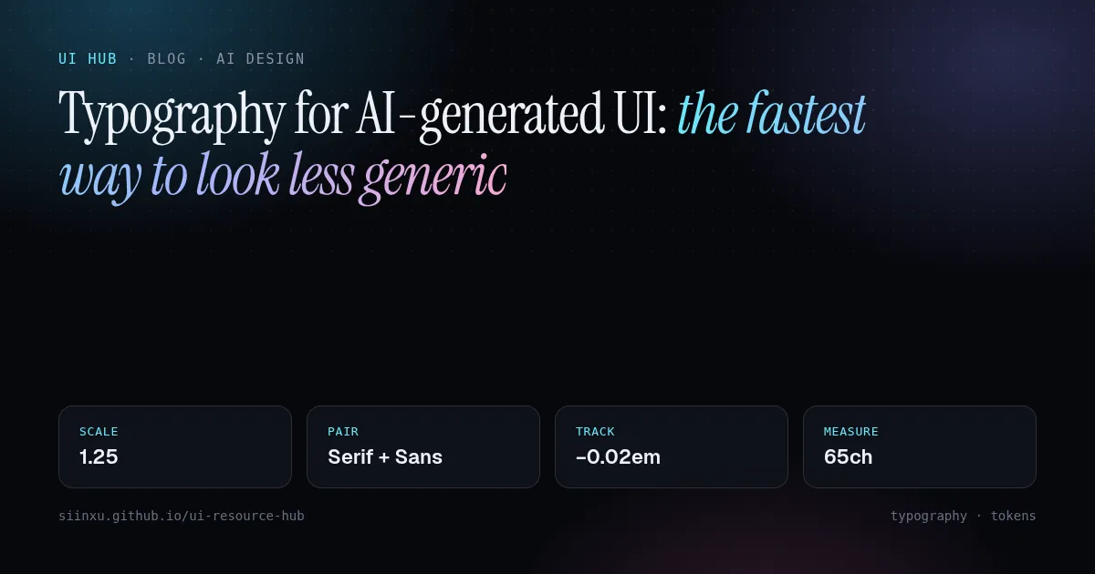
AI 生成界面的字体排印:摆脱平庸感最快的办法AI 產生介面的字體排印:擺脫平庸感最快的辦法Typography for AI-generated UI: the fastest way to look less genericAI生成UIのタイポグラフィ:没個性から抜け出す最短路AI 생성 UI의 타이포그래피: 평범함을 벗는 가장 빠른 길Tipografi untuk UI jana AITypography cho UI do AI tạo: cách nhanh nhất để bớt tầm thườngLa typographie des UI générées par IATipografía para UI generada por IATypografie für KI-generierte UIs
生成器默认一种无衬线、三个字号。一套字号阶梯、第二种字体、大字号收紧字距和合理行长,能解决大部分问题。產生器預設一種無襯線、三個字級。一套字級階梯、第二種字體、大字收緊字距和合理行長,能解決大部分問題。Generators default to one sans at three sizes. A type scale, a second typeface, tighter tracking on display sizes and real line lengths fix most of it.生成器は1書体3サイズが既定。スケール、第2書体、見出しの字詰め、行長で大半が直る。생성기는 산세리프 하나에 크기 셋. 스케일, 두 번째 서체, 자간, 줄 길이로 대부분 해결.Skala jenis, muka taip kedua, jarak huruf dan panjang baris menyelesaikan kebanyakannya.Thang cỡ chữ, font thứ hai, giãn chữ và độ dài dòng giải quyết phần lớn.Une échelle, une seconde police, l'approche et la longueur de ligne règlent l'essentiel.Una escala, una segunda fuente, el tracking y la longitud de línea resuelven casi todo.Skala, zweite Schrift, Laufweite und Zeilenlänge lösen das meiste.
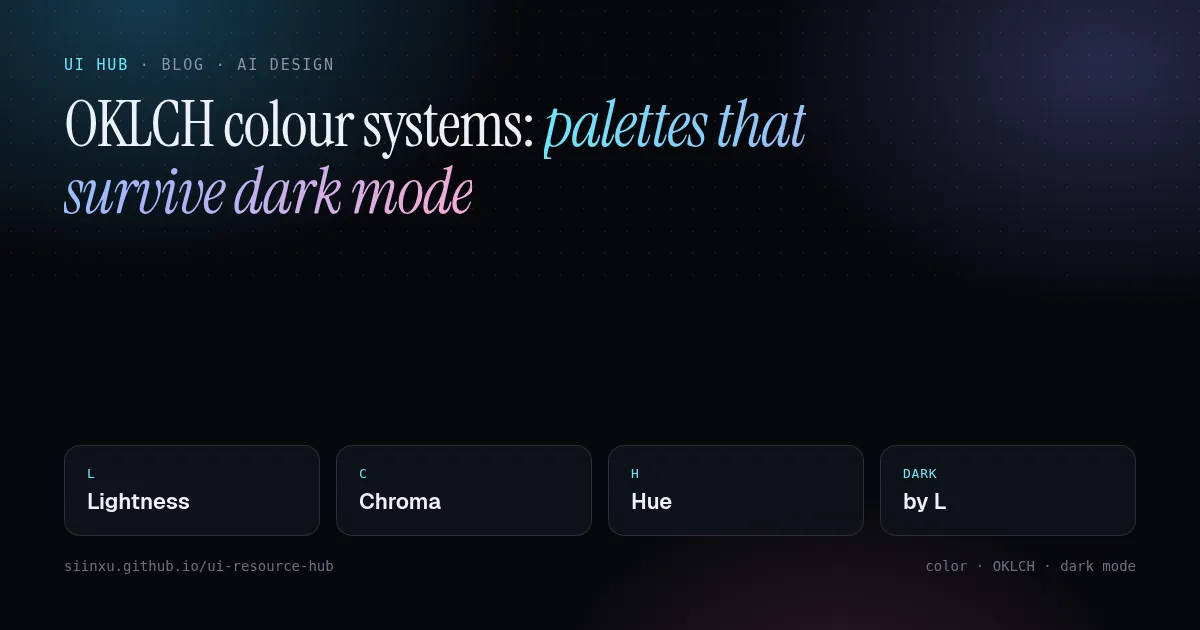
OKLCH 色彩系统:经得起暗色模式的调色板OKLCH 色彩系統:經得起暗色模式的調色盤OKLCH colour systems: palettes that survive dark modeOKLCHカラー:ダークモードに耐えるパレットOKLCH 색 체계: 다크 모드에서도 버티는 팔레트Sistem warna OKLCH: palet yang tahan mod gelapHệ màu OKLCH: bảng màu sống sót trong dark modeCouleurs OKLCH : des palettes qui tiennent en mode sombreColor OKLCH: paletas que sobreviven al modo oscuroOKLCH-Farben: Paletten, die den Dark Mode überstehen
OKLCH 让不同色相的感知亮度保持一致,色阶和暗色主题可以靠计算而不是靠肉眼。Tailwind v4 默认就用它。OKLCH 讓不同色相的感知亮度保持一致,色階與暗色主題可以靠計算而非肉眼。Tailwind v4 預設就用它。OKLCH keeps perceived lightness consistent across hues, so you can generate scales and dark themes by math instead of eyeballing. Tailwind v4 uses it by default.OKLCHは色相間で知覚明度を揃え、計算でスケールとダークテーマを作れる。Tailwind v4の既定。OKLCH는 색상 간 지각 명도를 맞춰 계산으로 스케일과 다크 테마를 만든다. Tailwind v4 기본값.OKLCH mengekalkan kecerahan persepsi; Tailwind v4 menggunakannya secara lalai.OKLCH giữ độ sáng cảm nhận đồng đều; Tailwind v4 dùng mặc định.OKLCH garde une luminosité perçue constante ; Tailwind v4 l'utilise par défaut.OKLCH mantiene la luminosidad percibida; Tailwind v4 lo usa por defecto.OKLCH hält die wahrgenommene Helligkeit konstant; Standard in Tailwind v4.
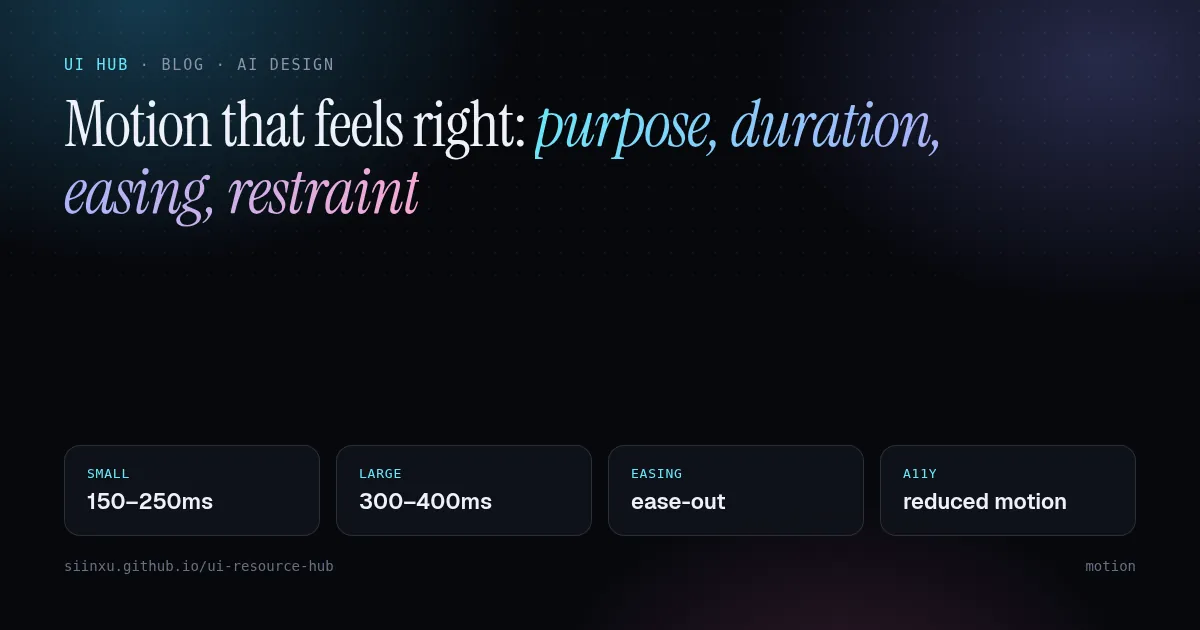
让动效"对味":目的、时长、缓动与克制讓動效「對味」:目的、時長、緩動與克制Motion that feels right: purpose, duration, easing, restraintしっくりくるモーション:目的・時間・イージング・抑制자연스러운 모션: 목적, 시간, 이징, 절제Gerakan yang terasa betul: tujuan, tempoh, easing, kawalanChuyển động đúng cảm giác: mục đích, thời lượng, easing, tiết chếUn mouvement juste : intention, durée, easing, retenueMovimiento que se siente bien: propósito, duración, easing, contenciónBewegung, die sich richtig anfühlt: Zweck, Dauer, Easing, Zurückhaltung
大多数界面动效应在 300ms 内、用 ease-out,高频操作干脆不做。炫技属于营销页,不属于工具。大多數介面動效應在 300ms 內、用 ease-out,高頻操作乾脆不做。Most UI motion should be under 300ms, ease-out, and skipped for frequent actions. Spectacle belongs on marketing pages, not in tools.UIモーションは300ms以内・ease-out、頻繁な操作には付けない。UI 모션은 300ms 이하, ease-out, 잦은 동작엔 생략.Kebanyakan gerakan UI di bawah 300ms, ease-out, dan dilangkau untuk tindakan kerap.Hầu hết chuyển động dưới 300ms, ease-out, bỏ qua với thao tác thường xuyên.Moins de 300 ms, ease-out, et rien pour les actions fréquentes.Menos de 300 ms, ease-out, y nada en acciones frecuentes.Unter 300 ms, ease-out, und keine Animation für häufige Aktionen.