Cult UI 深读:有手感、有个性的组件Cult UI 深讀:有手感、有個性的元件Cult UI deep dive: tactile components with personalityCult UI徹底解説:触感と個性のある部品Cult UI 심층 분석: 촉감과 개성이 있는 컴포넌트Cult UI mendalam: komponen taktil berperibadiCult UI chuyên sâu: component có cảm giác và cá tínhCult UI en profondeur : des composants tactiles avec du caractèreCult UI a fondo: componentes táctiles con personalidadCult UI im Detail: taktile Komponenten mit Charakter
兼容 shadcn、带物理手感的组件:灵动岛、质感按钮、可展开卡片。如何借来个性而不破坏一致性。相容 shadcn、帶物理手感的元件:動態島、質感按鈕、可展開卡片。如何借來個性而不破壞一致性。shadcn-compatible components that feel physical: dynamic islands, textured buttons, expandable cards. How to borrow personality without breaking consistency.shadcn互換で物理的な触感の部品。一貫性を壊さずに個性を借りる方法。shadcn 호환, 물리적 촉감의 컴포넌트. 일관성을 해치지 않고 개성을 빌리는 법.Komponen serasi shadcn yang terasa fizikal.Component tương thích shadcn có cảm giác vật lý.Composants compatibles shadcn au toucher physique.Componentes compatibles con shadcn con tacto físico.shadcn-kompatible Komponenten mit physischem Gefühl.
正文以簡體中文顯示。
本文は英語で表示しています。
본문은 영어로 표시됩니다.
Kandungan dipaparkan dalam bahasa Inggeris.
Nội dung hiển thị bằng tiếng Anh.
Le corps de l’article est en anglais.
El cuerpo del artículo está en inglés.
Der Beitragstext ist auf Englisch.
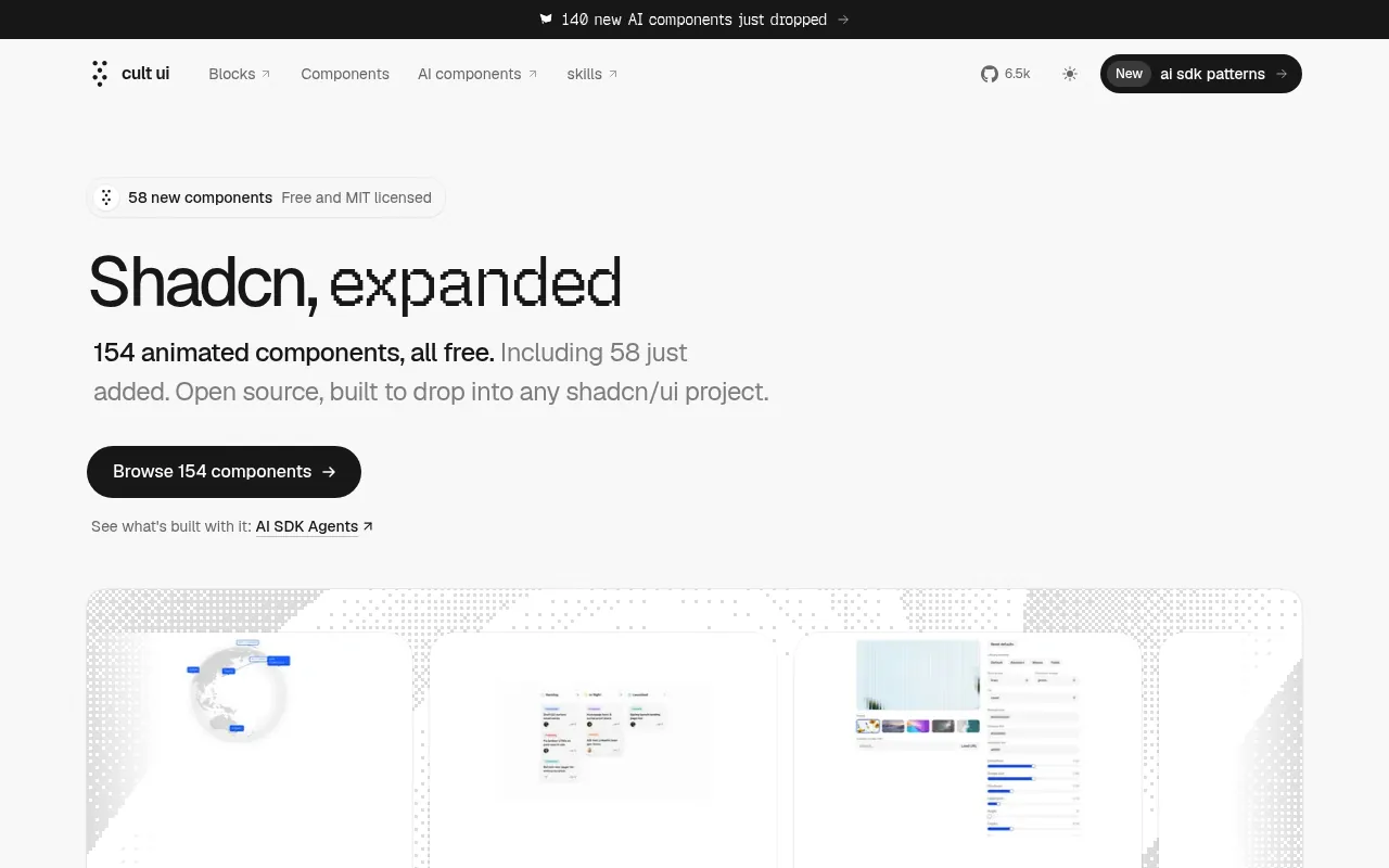
Cult UI is an open-source collection of shadcn-compatible components with a distinctly tactile feel: a dynamic-island style container, textured buttons, expandable cards and playful toolbars. Where Aceternity leans on spectacle (beams, spotlights, backgrounds), Cult UI leans on interaction feel: springs, squish and layout animation. This deep dive covers what is in the collection, how to adopt a component without breaking your design system, a step-by-step integration, and where personality components go wrong.
What kind of library it is
Like shadcn/ui itself, Cult UI is not a package you import wholesale. You take individual components into your repository, either by copying the source from the documentation or with the shadcn CLI using the registry address shown on each component's page, and then you own the code. The components are written in React with Tailwind CSS, and most of the interesting ones use Motion for layout and spring animation.
That model matters for AI work. Because the source lands in your repo, an agent can read how the dynamic island morphs between sizes and adapt it, instead of guessing at the props of a black box.
Where it shines
- Small product surfaces that benefit from springy layout transitions: toolbars, popovers, status pills, a recording indicator that expands into controls.
- Portfolio and indie-product pages where personality is the point and one memorable interaction is worth more than a polished but generic hero.
- Learning material. Reading the source of an expanding card is one of the fastest ways to understand Motion's
layoutand shared-element transitions.
Where it does not
- Dense, data-heavy tools. A squishy button in a table with 200 rows is noise.
- Frequent actions. If a control is used dozens of times a day, the spring that delights on day one slows the user down by day ten.
- Teams without a token system. Personality components bring their own colours, radii and shadows. Without tokens to map them onto, the product quickly looks like a collage.
Step by step: adopting one component
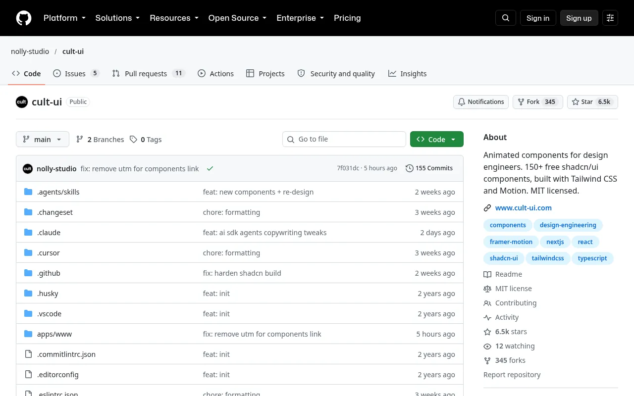
Step 1: choose one signature interaction. Decide which single interaction should carry the product's personality, for example "the status pill expands into a mini player". One is enough.
Step 2: install it into your kit folder. Bring the component in via its docs page or the shadcn CLI and put it next to your other kit components, not inside a feature folder, so there is exactly one copy.
Step 3: map its styling to your tokens. Replace hard-coded colours, radii and shadows with your variables:
// before (as copied)
<div className="rounded-[28px] bg-black text-white shadow-2xl">

// after (mapped to your system)
<div className="rounded-[var(--radius-xl)] bg-[var(--raised)] text-[var(--ink)] border border-[var(--line)]">
Step 4: unify the motion. Personality components often each ship their own spring. Pick one or two spring presets and use them everywhere, so all motion feels like one family:
// motion.ts
export const spring = {
  snappy: { type: "spring", stiffness: 500, damping: 40 },
  soft:   { type: "spring", stiffness: 260, damping: 30 },
} as const;
Step 5: add accessibility the demo skipped. Custom toggles and islands need a real <button> or the correct role, visible focus, keyboard support, and aria-expanded when they open. Announce state changes with a live region if content changes without focus moving.
Step 6: respect reduced motion. Motion's useReducedMotion hook lets you swap springs for instant or fade transitions:
import { motion, useReducedMotion } from "motion/react";

export function Island({ open }: { open: boolean }) {
  const reduce = useReducedMotion();
  return (
    <motion.div
      layout
      transition={reduce ? { duration: 0 } : { type: "spring", stiffness: 500, damping: 40 }}
      aria-expanded={open}
    />
  );
}
Measuring whether it helps
A signature interaction should earn its place. After shipping, watch two things for a couple of weeks: whether people use the control more or less than the plain version it replaced, and whether support questions or bug reports mention it. Record the screen on a mid-range phone as well; spring animations that feel crisp on a laptop can drop frames on cheaper hardware. If the interaction slows people down or confuses them, simplify it rather than adding a second one to compensate. Personality that costs usability is a bad trade.
Pitfalls
- Mixing every clever component on one page. Each one is charming; together they compete for attention.
- Keeping demo colours. A component that looks great on the docs' black background can look out of place on your off-white surface.
- Different springs everywhere. Ten different stiffness values make the interface feel inconsistent even if users cannot say why.
- Forgetting mobile. Hover-driven reveals do nothing on touch screens; give them a tap or always-visible state.
- Not checking the licence and attribution. Open-source does not mean no conditions; read the repository's licence before shipping.
How it compares
Three shadcn-compatible collections cover different ends of the "fancy" range, and knowing which end you need saves a lot of trial and error:
- Aceternity UI — spectacle: animated backgrounds, beams, spotlights, 3D cards. Best for a marketing hero.
- Magic UI — polished marketing pieces: marquees, number tickers, animated borders, bento grids. Best for landing-page sections.
- Cult UI — tactile product details: islands, expandable cards, springy toolbars. Best inside the product itself.
A common and effective combination is one Aceternity- or Magic UI-style moment on the marketing site and one Cult UI interaction inside the app, both mapped onto the same tokens. What does not work is all three on the same page.
Questions we get
Will it work with our existing shadcn setup? Generally yes, since the components follow shadcn conventions and use Tailwind and Motion. Check that your Tailwind version and Motion version match what the component expects before you start mapping styles.
Can an agent adapt a component to our product? Yes, and it is a good use of an agent, because the source is local. Give it the component, your tokens and the spring presets, and ask for a diff rather than a rewrite.
How do we keep it from looking like the demo? Change the content, colours and size to fit your product, and use the interaction for a real job: showing status, revealing controls, confirming an action.
Our take
Cult UI is our reference for the "tactile" end of the house-style range: micro-interaction over loud backgrounds. It works best when you pick one signature interaction per product, map it onto your tokens and motion presets, and let it recur. Used that way it gives a product character; used as a grab bag it makes the product feel like a demo.
Checklist
- One signature interaction chosen; others stay quiet
- Component lives once, in the kit folder
- Colours, radii and shadows mapped to tokens
- Shared spring presets used across components
- Real buttons/roles, focus, keyboard and aria-expanded added
- Reduced-motion fallback in place; licence checked
Cult UI 是一套开源的、兼容 shadcn 的组件集合,带着明显的"触感":灵动岛式容器、有质感的按钮、可展开卡片和俏皮的工具栏。Aceternity 偏重视觉奇观(光束、聚光灯、背景特效),Cult UI 偏重交互手感:弹簧、挤压和布局动画。这篇深读讲清楚:这套集合里有什么、怎么引入组件而不破坏你的设计系统、分步接入流程,以及"个性组件"容易出错的地方。
它是什么样的库
和 shadcn/ui 一样,Cult UI 不是整包导入的 npm 库。你把单个组件拿进自己的仓库:要么从文档页复制源码,要么用 shadcn CLI 加上每个组件页面给出的注册表地址安装,之后代码就归你所有。组件用 React 和 Tailwind CSS 编写,其中最有意思的那些大多用 Motion 做布局动画和弹簧动画。
这种模式对 AI 协作很重要。源码进了你的仓库,Agent 就能读到灵动岛如何在不同尺寸之间变形,再据此改写,而不是去猜一个黑盒的属性。
适合的场景
- 小的产品界面,适合有弹性的布局过渡:工具栏、弹出层、状态胶囊、展开成控制面板的录音指示器。
- 作品集和独立产品页面,个性本身就是重点,一个让人记住的交互比一个精致但普通的首屏更有价值。
- 学习材料。 读一个可展开卡片的源码,是理解 Motion 的
layout和共享元素过渡最快的方法之一。
不适合的场景
- 高密度、数据密集的工具。 200 行表格里的"果冻按钮"只是噪音。
- 高频操作。 一个控件一天要用几十次,第一天让人惊喜的弹簧,到第十天就在拖慢用户。
- 没有 token 体系的团队。 个性组件自带颜色、圆角和阴影。没有 token 可映射,产品很快就会像一张拼贴画。
分步引入一个组件
第 1 步:选定一个标志性交互。 决定由哪一个交互承载产品个性,比如"状态胶囊展开成迷你播放器"。一个就够了。
第 2 步:装进组件目录。 通过文档页或 shadcn CLI 引入组件,放在其他组件旁边,而不是某个功能目录里,保证全仓库只有一份。
第 3 步:把样式映射到你的 token。 把写死的颜色、圆角和阴影替换成你的变量:
// 修改前(原样复制)
<div className="rounded-[28px] bg-black text-white shadow-2xl">

// 修改后(映射到你的设计系统)
<div className="rounded-[var(--radius-xl)] bg-[var(--raised)] text-[var(--ink)] border border-[var(--line)]">
第 4 步:统一动效。 个性组件往往各自带一套弹簧参数。选一到两个弹簧预设并全局使用,让所有动效像一家人:
// motion.ts
export const spring = {
  snappy: { type: "spring", stiffness: 500, damping: 40 },
  soft:   { type: "spring", stiffness: 260, damping: 30 },
} as const;
第 5 步:补上演示里省略的无障碍。 自定义开关和灵动岛需要真正的 <button> 或正确的角色、可见焦点、键盘支持,展开时要有 aria-expanded。如果内容变化而焦点没有移动,用实时区域播报状态变化。
第 6 步:尊重减少动态效果设置。 Motion 的 useReducedMotion hook 可以把弹簧换成瞬间切换或淡入淡出:
import { motion, useReducedMotion } from "motion/react";

export function Island({ open }: { open: boolean }) {
  const reduce = useReducedMotion();
  return (
    <motion.div
      layout
      transition={reduce ? { duration: 0 } : { type: "spring", stiffness: 500, damping: 40 }}
      aria-expanded={open}
    />
  );
}
怎么判断它有没有帮助
标志性交互要证明自己值得存在。上线后观察两周:用户使用这个控件的频率,比被它替换的普通版本高还是低;客服问题和 bug 报告里有没有提到它。再用中端手机录一段屏幕,在笔记本上很利落的弹簧动画,在便宜的硬件上可能掉帧。如果这个交互拖慢了用户或让人困惑,就简化它,而不是再加一个来弥补。以可用性为代价换来的个性,是笔亏本买卖。
常见坑
- 把所有巧妙组件放在同一页。 单个都很可爱,放在一起就互相抢注意力。
- 保留演示配色。 在文档黑底上很好看的组件,放到你的近白底色上可能格格不入。
- 到处是不同的弹簧。 十种不同的刚度值,会让界面感觉不一致,即使用户说不出原因。
- 忘了手机。 依赖 hover 才显示的内容在触屏上不起作用;给它一个点击状态或常显状态。
- 不看许可证和署名要求。 开源不等于没有条件,上线前先读仓库的许可证。
横向对比
三套兼容 shadcn 的组件集合,分别覆盖"炫"的不同一端。知道自己需要哪一端,能省下大量试错:
- Aceternity UI:视觉奇观,比如动态背景、光束、聚光灯、3D 卡片。最适合营销页首屏。
- Magic UI:打磨好的营销组件,比如跑马灯、数字滚动、动态边框、便当盒网格。最适合落地页的各个区块。
- Cult UI:有触感的产品细节,比如灵动岛、可展开卡片、有弹性的工具栏。最适合用在产品内部。
一种常见且有效的组合是:营销站上一个 Aceternity 或 Magic UI 风格的高光时刻,应用内一个 Cult UI 交互,两者都映射到同一套 token。行不通的是把三者放在同一页。
常见问题
能和我们现有的 shadcn 配置一起用吗? 一般可以,组件遵循 shadcn 的约定,使用 Tailwind 和 Motion。开始映射样式之前,先确认你的 Tailwind 版本和 Motion 版本与组件的要求一致。
Agent 能把组件改造成适合我们产品的样子吗? 能,而且这正适合交给 Agent,因为源码在本地。把组件、你的 token 和弹簧预设交给它,要求输出 diff 而不是重写。
怎么避免看起来像演示页? 按你的产品改内容、颜色和尺寸,并让这个交互承担真实的任务:显示状态、展开控件、确认操作。
我们的看法
Cult UI 是我们风格谱系里"触感"一端的参考:用微交互取代喧闹的背景。最好的用法是每个产品选一个标志性交互,映射到你的 token 和动效预设,然后让它反复出现。这样用,它给产品带来性格;当成百宝箱乱用,产品就会像一个 demo。
清单
- 选定一个标志性交互,其余保持安静
- 组件只有一份,放在组件目录
- 颜色、圆角、阴影已映射到 token
- 各组件共用弹簧预设
- 补上了真正的按钮/角色、焦点、键盘和 aria-expanded
- 有减少动态效果的降级方案,已检查许可证
Cult UI is an open-source collection of shadcn-compatible components with a distinctly tactile feel: a dynamic-island style container, textured buttons, expandable cards and playful toolbars. Where Aceternity leans on spectacle (beams, spotlights, backgrounds), Cult UI leans on interaction feel: springs, squish and layout animation. This deep dive covers what is in the collection, how to adopt a component without breaking your design system, a step-by-step integration, and where personality components go wrong.
What kind of library it is
Like shadcn/ui itself, Cult UI is not a package you import wholesale. You take individual components into your repository, either by copying the source from the documentation or with the shadcn CLI using the registry address shown on each component's page, and then you own the code. The components are written in React with Tailwind CSS, and most of the interesting ones use Motion for layout and spring animation.
That model matters for AI work. Because the source lands in your repo, an agent can read how the dynamic island morphs between sizes and adapt it, instead of guessing at the props of a black box.
Where it shines
- Small product surfaces that benefit from springy layout transitions: toolbars, popovers, status pills, a recording indicator that expands into controls.
- Portfolio and indie-product pages where personality is the point and one memorable interaction is worth more than a polished but generic hero.
- Learning material. Reading the source of an expanding card is one of the fastest ways to understand Motion's
layoutand shared-element transitions.
Where it does not
- Dense, data-heavy tools. A squishy button in a table with 200 rows is noise.
- Frequent actions. If a control is used dozens of times a day, the spring that delights on day one slows the user down by day ten.
- Teams without a token system. Personality components bring their own colours, radii and shadows. Without tokens to map them onto, the product quickly looks like a collage.
Step by step: adopting one component
Step 1: choose one signature interaction. Decide which single interaction should carry the product's personality, for example "the status pill expands into a mini player". One is enough.
Step 2: install it into your kit folder. Bring the component in via its docs page or the shadcn CLI and put it next to your other kit components, not inside a feature folder, so there is exactly one copy.
Step 3: map its styling to your tokens. Replace hard-coded colours, radii and shadows with your variables:
// before (as copied)
<div className="rounded-[28px] bg-black text-white shadow-2xl">

// after (mapped to your system)
<div className="rounded-[var(--radius-xl)] bg-[var(--raised)] text-[var(--ink)] border border-[var(--line)]">
Step 4: unify the motion. Personality components often each ship their own spring. Pick one or two spring presets and use them everywhere, so all motion feels like one family:
// motion.ts
export const spring = {
  snappy: { type: "spring", stiffness: 500, damping: 40 },
  soft:   { type: "spring", stiffness: 260, damping: 30 },
} as const;
Step 5: add accessibility the demo skipped. Custom toggles and islands need a real <button> or the correct role, visible focus, keyboard support, and aria-expanded when they open. Announce state changes with a live region if content changes without focus moving.
Step 6: respect reduced motion. Motion's useReducedMotion hook lets you swap springs for instant or fade transitions:
import { motion, useReducedMotion } from "motion/react";

export function Island({ open }: { open: boolean }) {
  const reduce = useReducedMotion();
  return (
    <motion.div
      layout
      transition={reduce ? { duration: 0 } : { type: "spring", stiffness: 500, damping: 40 }}
      aria-expanded={open}
    />
  );
}
Measuring whether it helps
A signature interaction should earn its place. After shipping, watch two things for a couple of weeks: whether people use the control more or less than the plain version it replaced, and whether support questions or bug reports mention it. Record the screen on a mid-range phone as well; spring animations that feel crisp on a laptop can drop frames on cheaper hardware. If the interaction slows people down or confuses them, simplify it rather than adding a second one to compensate. Personality that costs usability is a bad trade.
Pitfalls
- Mixing every clever component on one page. Each one is charming; together they compete for attention.
- Keeping demo colours. A component that looks great on the docs' black background can look out of place on your off-white surface.
- Different springs everywhere. Ten different stiffness values make the interface feel inconsistent even if users cannot say why.
- Forgetting mobile. Hover-driven reveals do nothing on touch screens; give them a tap or always-visible state.
- Not checking the licence and attribution. Open-source does not mean no conditions; read the repository's licence before shipping.
How it compares
Three shadcn-compatible collections cover different ends of the "fancy" range, and knowing which end you need saves a lot of trial and error:
- Aceternity UI — spectacle: animated backgrounds, beams, spotlights, 3D cards. Best for a marketing hero.
- Magic UI — polished marketing pieces: marquees, number tickers, animated borders, bento grids. Best for landing-page sections.
- Cult UI — tactile product details: islands, expandable cards, springy toolbars. Best inside the product itself.
A common and effective combination is one Aceternity- or Magic UI-style moment on the marketing site and one Cult UI interaction inside the app, both mapped onto the same tokens. What does not work is all three on the same page.
Questions we get
Will it work with our existing shadcn setup? Generally yes, since the components follow shadcn conventions and use Tailwind and Motion. Check that your Tailwind version and Motion version match what the component expects before you start mapping styles.
Can an agent adapt a component to our product? Yes, and it is a good use of an agent, because the source is local. Give it the component, your tokens and the spring presets, and ask for a diff rather than a rewrite.
How do we keep it from looking like the demo? Change the content, colours and size to fit your product, and use the interaction for a real job: showing status, revealing controls, confirming an action.
Our take
Cult UI is our reference for the "tactile" end of the house-style range: micro-interaction over loud backgrounds. It works best when you pick one signature interaction per product, map it onto your tokens and motion presets, and let it recur. Used that way it gives a product character; used as a grab bag it makes the product feel like a demo.
Checklist
- One signature interaction chosen; others stay quiet
- Component lives once, in the kit folder
- Colours, radii and shadows mapped to tokens
- Shared spring presets used across components
- Real buttons/roles, focus, keyboard and aria-expanded added
- Reduced-motion fallback in place; licence checked
AI 提示词AI 提示詞AI promptAIプロンプトAI 프롬프트Prompt AIPrompt cho AIPrompt IAPrompt de IAKI-Prompt
复制给 Claude、Cursor、v0 等 AI 助手,让它按本文的方法处理你的项目。尖括号里的内容换成你自己的。複製給 Claude、Cursor、v0 等 AI 助手,讓它按本文的方法處理你的專案。尖括號裡的內容換成你自己的。Paste this into Claude, Cursor, v0 or another assistant to apply this post to your own project. Replace the parts in angle brackets.Claude・Cursor・v0 などのAIアシスタントに貼り付けると、この記事の方法をあなたのプロジェクトに適用できます。山括弧の部分は自分の内容に置き換えてください。Claude, Cursor, v0 같은 AI 도우미에 붙여 넣으면 이 글의 방법을 내 프로젝트에 적용할 수 있습니다. 꺾쇠괄호 안은 내 내용으로 바꾸세요.Tampal ke Claude, Cursor, v0 atau pembantu lain untuk menggunakan kaedah artikel ini pada projek anda. Gantikan bahagian dalam kurungan sudut.Dán vào Claude, Cursor, v0 hoặc trợ lý khác để áp dụng bài này cho dự án của bạn. Thay phần trong dấu ngoặc nhọn bằng nội dung của bạn.Collez-le dans Claude, Cursor, v0 ou un autre assistant pour appliquer cet article à votre projet. Remplacez les parties entre chevrons.Pégalo en Claude, Cursor, v0 u otro asistente para aplicar este artículo a tu proyecto. Sustituye lo que está entre corchetes angulares.In Claude, Cursor, v0 oder einen anderen Assistenten einfügen, um diesen Beitrag auf dein Projekt anzuwenden. Teile in spitzen Klammern ersetzen.
我想把一个 Cult UI 组件(<组件名>)加入这个基于 shadcn 的项目,作为我们唯一的标志性交互。
1. 读组件源码(我会粘贴或给你文件)。总结它的属性、依赖(如 motion),以及所有写死的颜色、圆角、阴影和弹簧数值。
2. 把它放进组件目录,和其他组件放在一起;确保仓库里只有一份。
3. 用我们的 token(<token 文件>)替换写死的样式,用 motion.ts 里的预设替换它的弹簧参数(没有的话就新建 snappy/soft 两个预设)。
4. 补上演示缺少的无障碍:真正的 <button> 或正确角色、可见焦点、键盘支持、aria-expanded/aria-controls;如果内容变化而焦点不动,加实时区域。
5. 用 useReducedMotion 加减少动态效果的降级。
6. 只在 hover 时出现的内容,要提供点击或常显的替代方式。
输出:先给总结,再给 diff,最后列出仍与我们设计系统不一致的地方。提醒我检查仓库许可证。
我想把一个 Cult UI 组件(<组件名>)加入这个基于 shadcn 的项目,作为我们唯一的标志性交互。
1. 读组件源码(我会粘贴或给你文件)。总结它的属性、依赖(如 motion),以及所有写死的颜色、圆角、阴影和弹簧数值。
2. 把它放进组件目录,和其他组件放在一起;确保仓库里只有一份。
3. 用我们的 token(<token 文件>)替换写死的样式,用 motion.ts 里的预设替换它的弹簧参数(没有的话就新建 snappy/soft 两个预设)。
4. 补上演示缺少的无障碍:真正的 <button> 或正确角色、可见焦点、键盘支持、aria-expanded/aria-controls;如果内容变化而焦点不动,加实时区域。
5. 用 useReducedMotion 加减少动态效果的降级。
6. 只在 hover 时出现的内容,要提供点击或常显的替代方式。
输出:先给总结,再给 diff,最后列出仍与我们设计系统不一致的地方。提醒我检查仓库许可证。I want to add one Cult UI component (<component name>) to this shadcn-based project as our single signature interaction.
1. Read the component's source (I will paste it or give you the file). Summarise its props, its dependencies (e.g. motion) and every hard-coded colour, radius, shadow and spring value.
2. Place it in the kit folder next to the other components; make sure there is only one copy in the repo.
3. Replace hard-coded styling with our tokens (<tokens file>) and replace its spring values with our presets in motion.ts (create snappy/soft presets if none exist).
4. Add accessibility the demo lacks: real <button> or correct role, visible focus, keyboard support, aria-expanded/aria-controls, and a live region if content changes without focus moving.
5. Add a reduced-motion fallback with useReducedMotion.
6. Give a tap/always-visible alternative for anything that only appears on hover.
Output: the summary, then the diff, then a list of anything that still differs from our design system. Remind me to check the repository licence.I want to add one Cult UI component (<component name>) to this shadcn-based project as our single signature interaction.
1. Read the component's source (I will paste it or give you the file). Summarise its props, its dependencies (e.g. motion) and every hard-coded colour, radius, shadow and spring value.
2. Place it in the kit folder next to the other components; make sure there is only one copy in the repo.
3. Replace hard-coded styling with our tokens (<tokens file>) and replace its spring values with our presets in motion.ts (create snappy/soft presets if none exist).
4. Add accessibility the demo lacks: real <button> or correct role, visible focus, keyboard support, aria-expanded/aria-controls, and a live region if content changes without focus moving.
5. Add a reduced-motion fallback with useReducedMotion.
6. Give a tap/always-visible alternative for anything that only appears on hover.
Output: the summary, then the diff, then a list of anything that still differs from our design system. Remind me to check the repository licence.I want to add one Cult UI component (<component name>) to this shadcn-based project as our single signature interaction.
1. Read the component's source (I will paste it or give you the file). Summarise its props, its dependencies (e.g. motion) and every hard-coded colour, radius, shadow and spring value.
2. Place it in the kit folder next to the other components; make sure there is only one copy in the repo.
3. Replace hard-coded styling with our tokens (<tokens file>) and replace its spring values with our presets in motion.ts (create snappy/soft presets if none exist).
4. Add accessibility the demo lacks: real <button> or correct role, visible focus, keyboard support, aria-expanded/aria-controls, and a live region if content changes without focus moving.
5. Add a reduced-motion fallback with useReducedMotion.
6. Give a tap/always-visible alternative for anything that only appears on hover.
Output: the summary, then the diff, then a list of anything that still differs from our design system. Remind me to check the repository licence.I want to add one Cult UI component (<component name>) to this shadcn-based project as our single signature interaction.
1. Read the component's source (I will paste it or give you the file). Summarise its props, its dependencies (e.g. motion) and every hard-coded colour, radius, shadow and spring value.
2. Place it in the kit folder next to the other components; make sure there is only one copy in the repo.
3. Replace hard-coded styling with our tokens (<tokens file>) and replace its spring values with our presets in motion.ts (create snappy/soft presets if none exist).
4. Add accessibility the demo lacks: real <button> or correct role, visible focus, keyboard support, aria-expanded/aria-controls, and a live region if content changes without focus moving.
5. Add a reduced-motion fallback with useReducedMotion.
6. Give a tap/always-visible alternative for anything that only appears on hover.
Output: the summary, then the diff, then a list of anything that still differs from our design system. Remind me to check the repository licence.I want to add one Cult UI component (<component name>) to this shadcn-based project as our single signature interaction.
1. Read the component's source (I will paste it or give you the file). Summarise its props, its dependencies (e.g. motion) and every hard-coded colour, radius, shadow and spring value.
2. Place it in the kit folder next to the other components; make sure there is only one copy in the repo.
3. Replace hard-coded styling with our tokens (<tokens file>) and replace its spring values with our presets in motion.ts (create snappy/soft presets if none exist).
4. Add accessibility the demo lacks: real <button> or correct role, visible focus, keyboard support, aria-expanded/aria-controls, and a live region if content changes without focus moving.
5. Add a reduced-motion fallback with useReducedMotion.
6. Give a tap/always-visible alternative for anything that only appears on hover.
Output: the summary, then the diff, then a list of anything that still differs from our design system. Remind me to check the repository licence.I want to add one Cult UI component (<component name>) to this shadcn-based project as our single signature interaction.
1. Read the component's source (I will paste it or give you the file). Summarise its props, its dependencies (e.g. motion) and every hard-coded colour, radius, shadow and spring value.
2. Place it in the kit folder next to the other components; make sure there is only one copy in the repo.
3. Replace hard-coded styling with our tokens (<tokens file>) and replace its spring values with our presets in motion.ts (create snappy/soft presets if none exist).
4. Add accessibility the demo lacks: real <button> or correct role, visible focus, keyboard support, aria-expanded/aria-controls, and a live region if content changes without focus moving.
5. Add a reduced-motion fallback with useReducedMotion.
6. Give a tap/always-visible alternative for anything that only appears on hover.
Output: the summary, then the diff, then a list of anything that still differs from our design system. Remind me to check the repository licence.I want to add one Cult UI component (<component name>) to this shadcn-based project as our single signature interaction.
1. Read the component's source (I will paste it or give you the file). Summarise its props, its dependencies (e.g. motion) and every hard-coded colour, radius, shadow and spring value.
2. Place it in the kit folder next to the other components; make sure there is only one copy in the repo.
3. Replace hard-coded styling with our tokens (<tokens file>) and replace its spring values with our presets in motion.ts (create snappy/soft presets if none exist).
4. Add accessibility the demo lacks: real <button> or correct role, visible focus, keyboard support, aria-expanded/aria-controls, and a live region if content changes without focus moving.
5. Add a reduced-motion fallback with useReducedMotion.
6. Give a tap/always-visible alternative for anything that only appears on hover.
Output: the summary, then the diff, then a list of anything that still differs from our design system. Remind me to check the repository licence.I want to add one Cult UI component (<component name>) to this shadcn-based project as our single signature interaction.
1. Read the component's source (I will paste it or give you the file). Summarise its props, its dependencies (e.g. motion) and every hard-coded colour, radius, shadow and spring value.
2. Place it in the kit folder next to the other components; make sure there is only one copy in the repo.
3. Replace hard-coded styling with our tokens (<tokens file>) and replace its spring values with our presets in motion.ts (create snappy/soft presets if none exist).
4. Add accessibility the demo lacks: real <button> or correct role, visible focus, keyboard support, aria-expanded/aria-controls, and a live region if content changes without focus moving.
5. Add a reduced-motion fallback with useReducedMotion.
6. Give a tap/always-visible alternative for anything that only appears on hover.
Output: the summary, then the diff, then a list of anything that still differs from our design system. Remind me to check the repository licence.引用来源引用來源References参考文献참고 자료RujukanNguồn tham khảoRéférencesReferenciasQuellen
- Cult UI — Cult UI
- nolly-studio/cult-ui — GitHub
- Layout animations — Motion
- ARIA Authoring Practices Guide — W3C
- useReducedMotion — Motion
- shadcn CLI — shadcn
- prefers-reduced-motion — MDN
- Aceternity UI — Aceternity
相关文章相關文章Related posts関連記事관련 글Artikel berkaitanBài liên quanArticles liésArtículos relacionadosÄhnliche Beiträge
Aceternity UI 深读:惊艳效果,要省着用Aceternity UI 深讀:驚豔效果,要省著用Aceternity UI deep dive: spectacle, used sparinglyAceternity UI徹底解説:派手さは控えめにAceternity UI 심층 분석: 화려함은 아껴서Aceternity UI mendalam: kemewahan, guna dengan jimatAceternity UI chuyên sâu: hiệu ứng ấn tượng, dùng tiết kiệmAceternity UI en profondeur : du spectacle, avec parcimonieAceternity UI a fondo: espectáculo, con moderaciónAceternity UI im Detail: Spektakel, sparsam eingesetzt
可复制粘贴的 React + Tailwind + Motion 特效,带火了「fancy」落地页风格。哪些能撑起页面,哪些会把页面变成特效合集。可複製貼上的 React + Tailwind + Motion 特效,帶紅了「fancy」落地頁風格。哪些能撐起頁面,哪些會讓頁面變成特效合輯。Copy-paste React + Tailwind + Motion effects that made the "fancy" landing look popular. Which pieces carry a page and which turn it into a demo reel.React+Tailwind+Motionのコピペ演出。ページを支える部品と、デモリールにしてしまう部品。복사-붙여넣기 React+Tailwind+Motion 효과. 페이지를 받쳐 주는 것과 데모 릴로 만드는 것.Kesan React+Tailwind+Motion salin-tampal. Mana yang menyokong halaman, mana yang jadi demo.Hiệu ứng React+Tailwind+Motion copy-paste. Phần nào nâng trang, phần nào biến trang thành demo.Effets React+Tailwind+Motion à copier-coller : ce qui porte une page, ce qui en fait une démo.Efectos React+Tailwind+Motion para copiar: lo que sostiene una página y lo que la vuelve demo.Copy-paste-Effekte mit React+Tailwind+Motion: was eine Seite trägt, was sie zur Demo macht.
Magic UI 深读:像 shadcn 一样安装的动效组件Magic UI 深讀:像 shadcn 一樣安裝的動效元件Magic UI deep dive: animated components that install like shadcnMagic UI徹底解説:shadcnのように入るアニメ部品Magic UI 심층 분석: shadcn처럼 설치되는 애니메이션 컴포넌트Magic UI mendalam: komponen animasi dipasang seperti shadcnMagic UI chuyên sâu: component động cài như shadcnMagic UI en profondeur : des composants animés qui s'installent comme shadcnMagic UI a fondo: componentes animados que se instalan como shadcnMagic UI im Detail: animierte Komponenten, installiert wie shadcn
一套开源(MIT)的动效组件,通过 shadcn registry 分发。SaaS 页面最值得用的几个,以及如何保持无障碍。一套開源(MIT)的動效元件,透過 shadcn registry 分發。SaaS 頁面最值得用的幾個,以及如何維持無障礙。An open-source (MIT) set of motion components distributed through the shadcn registry. Best picks for SaaS pages and how to keep them accessible.shadcnレジストリで配布されるMITのモーション部品。SaaSページ向けの選び方とアクセシビリティ。shadcn 레지스트리로 배포되는 MIT 모션 컴포넌트. SaaS 페이지 추천과 접근성 유지법.Komponen gerakan sumber terbuka (MIT) melalui registry shadcn.Bộ component chuyển động MIT phân phối qua shadcn registry.Composants animés open source (MIT) distribués via le registre shadcn.Componentes animados open source (MIT) distribuidos por el registro de shadcn.Open-Source-Motion-Komponenten (MIT) über die shadcn-Registry.
shadcn Blocks 与 Registry:把页面区块当源码shadcn Blocks 與 Registry:把頁面區塊當原始碼shadcn blocks and registries: page sections as source codeshadcnブロックとレジストリ:ページ部品をソースとしてshadcn 블록과 레지스트리: 페이지 섹션을 소스 코드로Blok dan registry shadcn: bahagian halaman sebagai kod sumbershadcn blocks và registry: khối trang dưới dạng mã nguồnBlocs et registres shadcn : des sections de page en code sourceBloques y registros de shadcn: secciones como código fuenteshadcn-Blocks und Registries: Seitenabschnitte als Quellcode
Blocks(仪表盘、侧栏、登录页)一条 CLI 命令就能装,任何团队都能发布自己的 registry。为什么这是 AI 智能体最好的底座。Blocks(儀表板、側欄、登入頁)一條 CLI 指令就能裝,任何團隊都能發布自己的 registry。為何這是 AI 智慧體最好的底座。Blocks (dashboards, sidebars, login pages) install with one CLI command, and any team can publish its own registry. Why this is the best substrate for AI agents.ブロックはCLI一発で導入、どのチームも独自レジストリを公開可能。AIエージェントに最適な土台の理由。블록은 CLI 한 줄로 설치, 누구나 레지스트리 공개 가능. AI 에이전트에 최적인 이유.Blok dipasang dengan satu arahan CLI; mana-mana pasukan boleh terbitkan registry.Block cài bằng một lệnh CLI; nhóm nào cũng có thể phát hành registry riêng.Les blocs s'installent en une commande ; chaque équipe peut publier son registre.Los bloques se instalan con un comando; cualquier equipo puede publicar su registro.Blocks per CLI-Befehl; jedes Team kann eine eigene Registry veröffentlichen.