组件组合:为什么"无样式 + 复制粘贴"赢了元件組合:為什麼「無樣式 + 複製貼上」贏了Component composition: why headless + copy-paste wonコンポーネント合成:ヘッドレス+コピペが勝った理由컴포넌트 합성: 헤드리스 + 복붙이 이긴 이유Komposisi komponen: mengapa headless + salin-tampal menangKết hợp component: vì sao headless + copy-paste thắngComposition de composants : pourquoi headless + copier-coller a gagnéComposición de componentes: por qué headless + copiar y pegar ganóKomponenten-Komposition: warum Headless + Copy-Paste gewonnen hat
Radix 管行为,样式归你,代码在你仓库里。复合组件让 API 更小,AI 改起来也更安全。Radix 管行為,樣式歸你,程式碼在你倉庫裡。複合元件讓 API 更小,AI 修改更安全。Radix behaviour, your styles, code you own. Compound components keep APIs small and make AI edits safer.振る舞いはRadix、スタイルは自分、コードは自分のもの。複合コンポーネントでAPIは小さく、AI編集も安全に。동작은 Radix, 스타일과 코드는 내 것. 복합 컴포넌트는 API를 작게, AI 수정을 안전하게.Tingkah laku Radix, gaya anda, kod milik anda. Komponen majmuk menjadikan suntingan AI lebih selamat.Hành vi của Radix, style của bạn, code của bạn. Component ghép giúp AI sửa an toàn hơn.Comportement Radix, vos styles, votre code. Les composants composés rendent les éditions IA plus sûres.Comportamiento de Radix, tus estilos, tu código. Los compuestos hacen más seguras las ediciones de IA.Radix-Verhalten, eigene Styles, eigener Code. Compound Components machen KI-Änderungen sicherer.
正文以簡體中文顯示。
本文は英語で表示しています。
본문은 영어로 표시됩니다.
Kandungan dipaparkan dalam bahasa Inggeris.
Nội dung hiển thị bằng tiếng Anh.
Le corps de l’article est en anglais.
El cuerpo del artículo está en inglés.
Der Beitragstext ist auf Englisch.
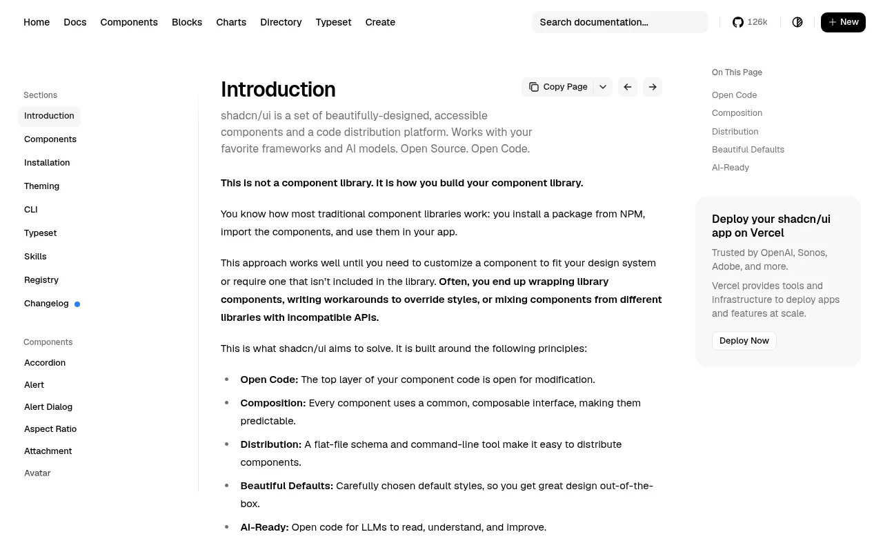
The old model of a component library was a styled npm package: you installed it, then fought its styles with overrides and !important. shadcn/ui flipped that. Behaviour and accessibility come from headless primitives such as Radix, styling comes from Tailwind classes, and the component source is copied into your repository, where you own it. This post explains why that composition model suits AI agents unusually well, how to structure the layers, and the patterns that keep generated code maintainable.
Three layers, three owners
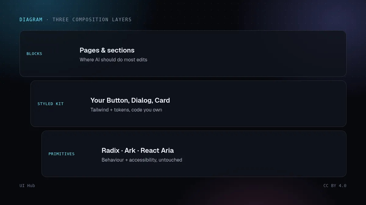
Think of your UI in three layers, each with a different rate of change and a different owner:
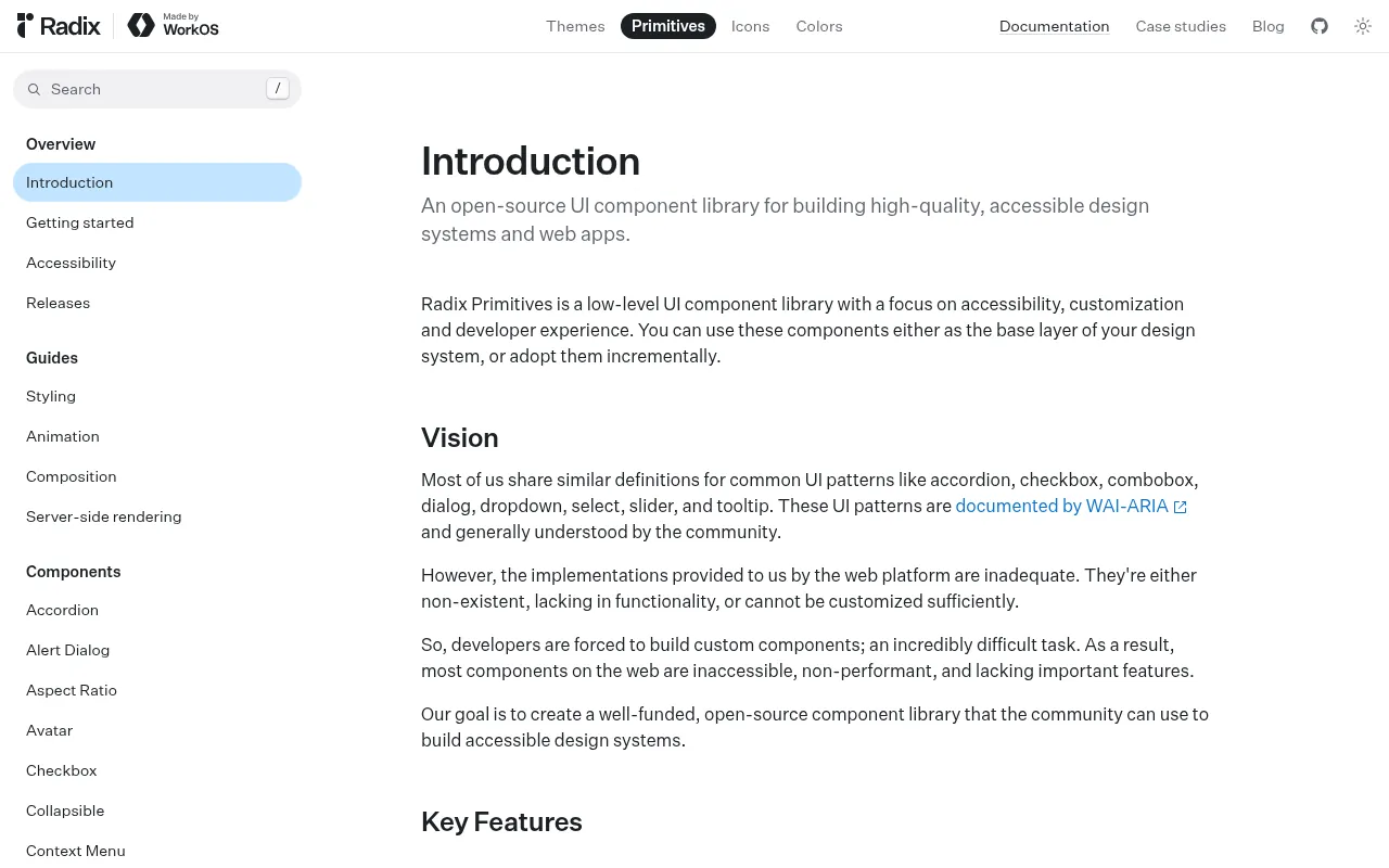
- Primitives — headless, accessible behaviour: focus management, keyboard handling, ARIA wiring, portals. Radix Primitives, React Aria and Ark UI live here. You rarely edit them.
- Your kit — styled components built on primitives:
Button,Dialog,Select,Card. This is what shadcn/ui gives you as source. You edit it occasionally, when the design system changes. - Blocks and pages — compositions of kit components: a pricing section, a settings form, a dashboard header. This changes every week.
Brad Frost's atomic design described a similar split years ago (atoms, molecules, organisms, templates, pages). The practical rule for AI work is simple: let agents work mostly at the block layer, carefully at the kit layer, and almost never at the primitive layer.
Why this suits agents
- Visible context. Code in your repo can be read. An agent asked to "add a destructive variant to Button" can open
button.tsx, see the existing variants and follow the pattern. With a closed npm package it can only guess at props. - Small surfaces. Compound components split one complex widget into parts with narrow responsibilities, so edits are local and predictable.
- Registries. A registry lets any project install the same component with one command, so an agent building a new app reuses your kit instead of writing a fresh one.
Pattern 1: compound components
A compound component exposes parts that share state through context, instead of one component with forty props. Compare:
// monolith: every new need becomes another prop
<Dialog title="Delete project" description="This cannot be undone."
  confirmLabel="Delete" cancelLabel="Cancel" danger showClose
  onConfirm={remove} footerAlign="end" />

// compound: parts you can rearrange, omit or extend
<Dialog>
  <DialogTrigger asChild><Button variant="outline">Delete</Button></DialogTrigger>
  <DialogContent>
    <DialogHeader>
      <DialogTitle>Delete project</DialogTitle>
      <DialogDescription>This cannot be undone.</DialogDescription>
    </DialogHeader>
    <DialogFooter>
      <DialogClose asChild><Button variant="ghost">Cancel</Button></DialogClose>
      <Button variant="destructive" onClick={remove}>Delete</Button>
    </DialogFooter>
  </DialogContent>
</Dialog>
The compound version is longer, but every part is obvious, and adding a checkbox ("also delete backups") means inserting one element, not designing a new prop.
Pattern 2: asChild instead of wrapper soup
Radix's asChild prop merges a primitive's behaviour into its child element instead of rendering an extra DOM node. <DialogTrigger asChild><Button/></DialogTrigger> gives you one <button> with the trigger's ARIA attributes and event handlers, not a button nested inside another button. Nested interactive elements are one of the most common accessibility bugs in generated code, so tell your agent to use asChild whenever it wraps a kit component in a primitive part.
Pattern 3: variants as data
shadcn/ui components describe styling options with class-variance-authority. Variants become a small, readable table instead of conditional class strings scattered through JSX:
const buttonVariants = cva(
  "inline-flex items-center justify-center rounded-md text-sm font-medium focus-visible:outline-none focus-visible:ring-2 disabled:opacity-50",
  {
    variants: {
      variant: {
        default: "bg-primary text-primary-foreground hover:bg-primary/90",
        outline: "border border-input bg-background hover:bg-accent",
        destructive: "bg-destructive text-destructive-foreground hover:bg-destructive/90",
      },
      size: { sm: "h-8 px-3", md: "h-9 px-4", lg: "h-10 px-6" },
    },
    defaultVariants: { variant: "default", size: "md" },
  }
);
Agents edit tables like this reliably. Ask for a new variant and you get one new line, using your existing token classes.
A step-by-step workflow for adding a block
- Inventory first. Ask the agent to list which kit components the new block needs and which are missing.
- Add missing kit pieces deliberately. Install them from the shadcn registry or your own, then review them once. Do not let a block quietly invent its own button.
- Compose the block only from kit components and layout utilities. No raw
<div onClick>. - Check states and keyboard. Tab through the block. Open and close every popover with the keyboard. Check focus returns to the trigger.
- Promote repeats. If the same composition appears in three blocks, promote it into the kit with a name.
Pitfalls
- Editing primitives to fix styling. Styling belongs in the kit layer. Forking a primitive loses upstream accessibility fixes.
- Prop explosion in the kit. If
Cardhas 15 boolean props, it wants to be a compound component. - Duplicated kits. Agents happily generate a second
Buttonin a feature folder. Search for duplicates in review. - Mixing primitive libraries. Radix for dialogs and another library for popovers means two focus-management models. Pick one per project where possible.
- Losing the source of truth. Once copied, components drift from upstream. Keep a note of which upstream version you started from.
Questions we get
Should we use shadcn/ui or a packaged library like MUI? If you want agents to edit components and you care about owning the look, source-in-repo kits are easier. If you want upstream updates with no maintenance and accept the library's look, a packaged library is fine. Mixing both in one product is the expensive option.
How do we stop agents from editing primitives? Say it in AGENTS.md, keep primitives in a clearly named folder, and add a CODEOWNERS rule or a CI check that flags changes there. Agents follow folder conventions well when they are written down.
When should a block become a kit component? When it appears in three places, has a clear name, and its variations can be described as a short variants table. Before that, duplication is cheaper than the wrong abstraction.
What about non-React stacks? The same three layers apply. Vue and Svelte have headless primitive libraries too, and the rule "agents compose blocks, carefully edit the kit, leave primitives alone" does not depend on the framework.
Our take
The composition model is the reason shadcn-style kits became the default target for AI UI tools: the source is local, the parts are small and the variants are data. Keep the three layers explicit in your folder structure, tell your agent which layer it is allowed to touch, and most "AI made a mess of my components" problems disappear.
Checklist
- Folders reflect primitives / kit / blocks
- Agents compose blocks only from kit components
- Compound components instead of many-prop monoliths
asChildused when a primitive part wraps a kit component- Variants defined as data (cva or similar)
- Keyboard and focus checked on every new block
旧式组件库是一个带样式的 npm 包:装上之后,你得用覆盖样式和 !important 跟它较劲。shadcn/ui 把这件事反过来了:行为和无障碍来自 Radix 这类无头原语,样式来自 Tailwind 类名,组件源码直接复制进你的仓库,归你所有。这篇讲为什么这种组合模式特别适合 AI Agent、各层该怎么划分,以及哪些模式能让生成的代码保持可维护。
三层,三个负责人
把界面分成三层,每层变化频率不同,负责的人也不同:
- 原语层:无头的、可访问的行为,包括焦点管理、键盘操作、ARIA 关联、Portal。Radix Primitives、React Aria、Ark UI 都在这一层。你很少改它。
- 组件层(你的 kit):在原语之上加了样式的组件,如
Button、Dialog、Select、Card。shadcn/ui 以源码形式给你的就是这一层。设计系统变化时才偶尔改。 - 区块和页面层:由组件拼出来的东西,比如定价区、设置表单、仪表盘头部。每周都在变。
Brad Frost 多年前提出的原子设计(原子、分子、有机体、模板、页面)讲的是类似的拆分。放到 AI 协作里,规则很简单:让 Agent 主要在区块层干活,在组件层谨慎改动,几乎不碰原语层。
为什么适合 Agent
- 上下文看得见。 仓库里的代码能被读到。让 Agent"给 Button 加一个危险操作变体",它可以打开
button.tsx,看到已有变体并照着写;如果是闭源 npm 包,它只能猜属性。 - 接口小。 复合组件把一个复杂控件拆成职责单一的几部分,改动是局部的、可预测的。
- 注册表。 注册表让任何项目都能用一条命令装上同一个组件,Agent 搭新应用时会复用你的组件,而不是重新写一套。
模式 1:复合组件
复合组件通过 context 共享状态,对外暴露几个部件,而不是一个有四十个属性的组件。对比一下:
// 单体:每个新需求都变成一个新属性
<Dialog title="删除项目" description="此操作无法撤销。"
  confirmLabel="删除" cancelLabel="取消" danger showClose
  onConfirm={remove} footerAlign="end" />

// 复合:部件可以重新排列、省略或扩展
<Dialog>
  <DialogTrigger asChild><Button variant="outline">删除</Button></DialogTrigger>
  <DialogContent>
    <DialogHeader>
      <DialogTitle>删除项目</DialogTitle>
      <DialogDescription>此操作无法撤销。</DialogDescription>
    </DialogHeader>
    <DialogFooter>
      <DialogClose asChild><Button variant="ghost">取消</Button></DialogClose>
      <Button variant="destructive" onClick={remove}>删除</Button>
    </DialogFooter>
  </DialogContent>
</Dialog>
复合写法更长,但每个部件一目了然。想加一个"同时删除备份"的复选框,只需要插入一个元素,不用设计新属性。
模式 2:用 asChild 代替层层包裹
Radix 的 asChild 属性会把原语的行为合并到子元素上,而不是额外渲染一个 DOM 节点。<DialogTrigger asChild><Button/></DialogTrigger> 得到的是一个带触发器 ARIA 属性和事件的 <button>,而不是按钮套按钮。嵌套的可交互元素是生成代码里最常见的无障碍问题之一,所以要告诉 Agent:用原语部件包裹组件时,一律使用 asChild。
模式 3:把变体写成数据
shadcn/ui 的组件用 class-variance-authority 描述样式选项。变体变成一张小而清楚的表,而不是散落在 JSX 里的条件类名:
const buttonVariants = cva(
  "inline-flex items-center justify-center rounded-md text-sm font-medium focus-visible:outline-none focus-visible:ring-2 disabled:opacity-50",
  {
    variants: {
      variant: {
        default: "bg-primary text-primary-foreground hover:bg-primary/90",
        outline: "border border-input bg-background hover:bg-accent",
        destructive: "bg-destructive text-destructive-foreground hover:bg-destructive/90",
      },
      size: { sm: "h-8 px-3", md: "h-9 px-4", lg: "h-10 px-6" },
    },
    defaultVariants: { variant: "default", size: "md" },
  }
);
Agent 改这种表很可靠。要一个新变体,得到的就是新增一行,用的还是你现有的 token 类名。
新增一个区块的步骤
- 先盘点。 让 Agent 列出新区块需要哪些组件、哪些还没有。
- 有意识地补齐组件。 从 shadcn 注册表或你自己的注册表安装,然后审一遍。不要让区块悄悄发明一个自己的按钮。
- 只用组件和布局工具类拼区块。 不要出现裸的
<div onClick>。 - 检查状态和键盘。 用 Tab 走一遍区块,用键盘打开、关闭每个弹层,确认焦点会回到触发按钮。
- 把重复提升为组件。 同一种组合在三个区块里出现,就给它起个名字,提升到组件层。
常见坑
- 为了改样式去改原语。 样式属于组件层。fork 原语会丢掉上游的无障碍修复。
- 组件层属性爆炸。 如果
Card有 15 个布尔属性,它就该改成复合组件了。 - 重复的组件。 Agent 很乐意在某个功能目录里再生成一个
Button。审代码时要搜重复。 - 混用多个原语库。 对话框用 Radix、弹出层用另一个库,就有两套焦点管理模型。尽量每个项目只选一个。
- 丢了来源。 组件复制进来之后会和上游逐渐分叉,记下你最初基于哪个上游版本。
常见问题
用 shadcn/ui 还是 MUI 这类打包好的库? 如果你希望 Agent 能改组件,并且在意掌控外观,源码放在仓库里的组件库更方便。如果你想要零维护的上游更新,也接受库本身的外观,打包库也没问题。最贵的选择是在同一个产品里混用两者。
怎么阻止 Agent 改原语层? 写进 AGENTS.md,把原语放在命名清楚的目录里,再加一条 CODEOWNERS 规则或 CI 检查,发现那里有改动就提示。只要写下来,Agent 对目录约定的遵守程度很高。
区块什么时候该变成组件? 当它出现在三个地方、有清楚的名字、变化能用一张简短的变体表描述时。在那之前,重复比错误的抽象便宜。
不是 React 技术栈怎么办? 三层结构同样适用。Vue 和 Svelte 也有无头原语库,"Agent 拼区块、谨慎改组件、不碰原语"这条规则和框架无关。
我们的看法
shadcn 式组件库之所以成为 AI 界面工具的默认目标,靠的就是这种组合模式:源码在本地,部件小,变体是数据。在目录结构里把三层分清楚,告诉 Agent 它可以动哪一层,大部分"AI 把我的组件搞乱了"的问题都会消失。
清单
- 目录结构体现原语 / 组件 / 区块三层
- Agent 只用组件拼区块
- 用复合组件代替属性繁多的单体组件
- 原语部件包裹组件时使用
asChild - 变体写成数据(cva 或类似方案)
- 每个新区块都检查过键盘和焦点
The old model of a component library was a styled npm package: you installed it, then fought its styles with overrides and !important. shadcn/ui flipped that. Behaviour and accessibility come from headless primitives such as Radix, styling comes from Tailwind classes, and the component source is copied into your repository, where you own it. This post explains why that composition model suits AI agents unusually well, how to structure the layers, and the patterns that keep generated code maintainable.
Three layers, three owners
Think of your UI in three layers, each with a different rate of change and a different owner:
- Primitives — headless, accessible behaviour: focus management, keyboard handling, ARIA wiring, portals. Radix Primitives, React Aria and Ark UI live here. You rarely edit them.
- Your kit — styled components built on primitives:
Button,Dialog,Select,Card. This is what shadcn/ui gives you as source. You edit it occasionally, when the design system changes. - Blocks and pages — compositions of kit components: a pricing section, a settings form, a dashboard header. This changes every week.
Brad Frost's atomic design described a similar split years ago (atoms, molecules, organisms, templates, pages). The practical rule for AI work is simple: let agents work mostly at the block layer, carefully at the kit layer, and almost never at the primitive layer.
Why this suits agents
- Visible context. Code in your repo can be read. An agent asked to "add a destructive variant to Button" can open
button.tsx, see the existing variants and follow the pattern. With a closed npm package it can only guess at props. - Small surfaces. Compound components split one complex widget into parts with narrow responsibilities, so edits are local and predictable.
- Registries. A registry lets any project install the same component with one command, so an agent building a new app reuses your kit instead of writing a fresh one.
Pattern 1: compound components
A compound component exposes parts that share state through context, instead of one component with forty props. Compare:
// monolith: every new need becomes another prop
<Dialog title="Delete project" description="This cannot be undone."
  confirmLabel="Delete" cancelLabel="Cancel" danger showClose
  onConfirm={remove} footerAlign="end" />

// compound: parts you can rearrange, omit or extend
<Dialog>
  <DialogTrigger asChild><Button variant="outline">Delete</Button></DialogTrigger>
  <DialogContent>
    <DialogHeader>
      <DialogTitle>Delete project</DialogTitle>
      <DialogDescription>This cannot be undone.</DialogDescription>
    </DialogHeader>
    <DialogFooter>
      <DialogClose asChild><Button variant="ghost">Cancel</Button></DialogClose>
      <Button variant="destructive" onClick={remove}>Delete</Button>
    </DialogFooter>
  </DialogContent>
</Dialog>
The compound version is longer, but every part is obvious, and adding a checkbox ("also delete backups") means inserting one element, not designing a new prop.
Pattern 2: asChild instead of wrapper soup
Radix's asChild prop merges a primitive's behaviour into its child element instead of rendering an extra DOM node. <DialogTrigger asChild><Button/></DialogTrigger> gives you one <button> with the trigger's ARIA attributes and event handlers, not a button nested inside another button. Nested interactive elements are one of the most common accessibility bugs in generated code, so tell your agent to use asChild whenever it wraps a kit component in a primitive part.
Pattern 3: variants as data
shadcn/ui components describe styling options with class-variance-authority. Variants become a small, readable table instead of conditional class strings scattered through JSX:
const buttonVariants = cva(
  "inline-flex items-center justify-center rounded-md text-sm font-medium focus-visible:outline-none focus-visible:ring-2 disabled:opacity-50",
  {
    variants: {
      variant: {
        default: "bg-primary text-primary-foreground hover:bg-primary/90",
        outline: "border border-input bg-background hover:bg-accent",
        destructive: "bg-destructive text-destructive-foreground hover:bg-destructive/90",
      },
      size: { sm: "h-8 px-3", md: "h-9 px-4", lg: "h-10 px-6" },
    },
    defaultVariants: { variant: "default", size: "md" },
  }
);
Agents edit tables like this reliably. Ask for a new variant and you get one new line, using your existing token classes.
A step-by-step workflow for adding a block
- Inventory first. Ask the agent to list which kit components the new block needs and which are missing.
- Add missing kit pieces deliberately. Install them from the shadcn registry or your own, then review them once. Do not let a block quietly invent its own button.
- Compose the block only from kit components and layout utilities. No raw
<div onClick>. - Check states and keyboard. Tab through the block. Open and close every popover with the keyboard. Check focus returns to the trigger.
- Promote repeats. If the same composition appears in three blocks, promote it into the kit with a name.
Pitfalls
- Editing primitives to fix styling. Styling belongs in the kit layer. Forking a primitive loses upstream accessibility fixes.
- Prop explosion in the kit. If
Cardhas 15 boolean props, it wants to be a compound component. - Duplicated kits. Agents happily generate a second
Buttonin a feature folder. Search for duplicates in review. - Mixing primitive libraries. Radix for dialogs and another library for popovers means two focus-management models. Pick one per project where possible.
- Losing the source of truth. Once copied, components drift from upstream. Keep a note of which upstream version you started from.
Questions we get
Should we use shadcn/ui or a packaged library like MUI? If you want agents to edit components and you care about owning the look, source-in-repo kits are easier. If you want upstream updates with no maintenance and accept the library's look, a packaged library is fine. Mixing both in one product is the expensive option.
How do we stop agents from editing primitives? Say it in AGENTS.md, keep primitives in a clearly named folder, and add a CODEOWNERS rule or a CI check that flags changes there. Agents follow folder conventions well when they are written down.
When should a block become a kit component? When it appears in three places, has a clear name, and its variations can be described as a short variants table. Before that, duplication is cheaper than the wrong abstraction.
What about non-React stacks? The same three layers apply. Vue and Svelte have headless primitive libraries too, and the rule "agents compose blocks, carefully edit the kit, leave primitives alone" does not depend on the framework.
Our take
The composition model is the reason shadcn-style kits became the default target for AI UI tools: the source is local, the parts are small and the variants are data. Keep the three layers explicit in your folder structure, tell your agent which layer it is allowed to touch, and most "AI made a mess of my components" problems disappear.
Checklist
- Folders reflect primitives / kit / blocks
- Agents compose blocks only from kit components
- Compound components instead of many-prop monoliths
asChildused when a primitive part wraps a kit component- Variants defined as data (cva or similar)
- Keyboard and focus checked on every new block
AI 提示词AI 提示詞AI promptAIプロンプトAI 프롬프트Prompt AIPrompt cho AIPrompt IAPrompt de IAKI-Prompt
复制给 Claude、Cursor、v0 等 AI 助手,让它按本文的方法处理你的项目。尖括号里的内容换成你自己的。複製給 Claude、Cursor、v0 等 AI 助手,讓它按本文的方法處理你的專案。尖括號裡的內容換成你自己的。Paste this into Claude, Cursor, v0 or another assistant to apply this post to your own project. Replace the parts in angle brackets.Claude・Cursor・v0 などのAIアシスタントに貼り付けると、この記事の方法をあなたのプロジェクトに適用できます。山括弧の部分は自分の内容に置き換えてください。Claude, Cursor, v0 같은 AI 도우미에 붙여 넣으면 이 글의 방법을 내 프로젝트에 적용할 수 있습니다. 꺾쇠괄호 안은 내 내용으로 바꾸세요.Tampal ke Claude, Cursor, v0 atau pembantu lain untuk menggunakan kaedah artikel ini pada projek anda. Gantikan bahagian dalam kurungan sudut.Dán vào Claude, Cursor, v0 hoặc trợ lý khác để áp dụng bài này cho dự án của bạn. Thay phần trong dấu ngoặc nhọn bằng nội dung của bạn.Collez-le dans Claude, Cursor, v0 ou un autre assistant pour appliquer cet article à votre projet. Remplacez les parties entre chevrons.Pégalo en Claude, Cursor, v0 u otro asistente para aplicar este artículo a tu proyecto. Sustituye lo que está entre corchetes angulares.In Claude, Cursor, v0 oder einen anderen Assistenten einfügen, um diesen Beitrag auf dein Projekt anzuwenden. Teile in spitzen Klammern ersetzen.
你在一个 React 代码库里工作,结构是:无头原语(Radix / React Aria / Ark)+ 带样式的组件层(shadcn 式,源码在本仓库)+ 页面区块。
任务:新建一个区块:<描述这个区块>。
规则:
1. 先列出要用的组件,以及缺少的组件。新建组件之前先停下来问我。
2. 只用组件和布局工具类拼装。不要 <div onClick>,不要嵌套可交互元素;原语部件包裹组件时使用 asChild。
3. 不要修改原语层的文件。任何地方都不要再建第二个 Button/Input/Card。
4. 新的样式选项加到组件的变体表(cva)里,使用现有 token 类名。
5. 每个弹层/对话框/菜单都要实现键盘操作和焦点回归。
输出:组件清单 → 代码 → 指出哪些组合已在 3 个以上区块出现、应该提升为组件。
你在一个 React 代码库里工作,结构是:无头原语(Radix / React Aria / Ark)+ 带样式的组件层(shadcn 式,源码在本仓库)+ 页面区块。
任务:新建一个区块:<描述这个区块>。
规则:
1. 先列出要用的组件,以及缺少的组件。新建组件之前先停下来问我。
2. 只用组件和布局工具类拼装。不要 <div onClick>,不要嵌套可交互元素;原语部件包裹组件时使用 asChild。
3. 不要修改原语层的文件。任何地方都不要再建第二个 Button/Input/Card。
4. 新的样式选项加到组件的变体表(cva)里,使用现有 token 类名。
5. 每个弹层/对话框/菜单都要实现键盘操作和焦点回归。
输出:组件清单 → 代码 → 指出哪些组合已在 3 个以上区块出现、应该提升为组件。You are working in a React codebase that uses headless primitives (Radix / React Aria / Ark) + a styled kit (shadcn-style, source in this repo) + page blocks.
Task: build <describe the block> as a new block.
Rules:
1. First list the kit components you will use and any that are missing. Stop and ask before creating a new kit component.
2. Compose only from kit components and layout utilities. No <div onClick>, no nested interactive elements; use asChild when a primitive part wraps a kit component.
3. Do not edit files in the primitives layer. Do not create a second Button/Input/Card anywhere.
4. New styling options go into the component's variants table (cva), using existing token classes.
5. Implement keyboard behaviour and focus return for every popover/dialog/menu.
Output: component list → code → a note on anything that appears in 3+ blocks and should be promoted to the kit.You are working in a React codebase that uses headless primitives (Radix / React Aria / Ark) + a styled kit (shadcn-style, source in this repo) + page blocks.
Task: build <describe the block> as a new block.
Rules:
1. First list the kit components you will use and any that are missing. Stop and ask before creating a new kit component.
2. Compose only from kit components and layout utilities. No <div onClick>, no nested interactive elements; use asChild when a primitive part wraps a kit component.
3. Do not edit files in the primitives layer. Do not create a second Button/Input/Card anywhere.
4. New styling options go into the component's variants table (cva), using existing token classes.
5. Implement keyboard behaviour and focus return for every popover/dialog/menu.
Output: component list → code → a note on anything that appears in 3+ blocks and should be promoted to the kit.You are working in a React codebase that uses headless primitives (Radix / React Aria / Ark) + a styled kit (shadcn-style, source in this repo) + page blocks.
Task: build <describe the block> as a new block.
Rules:
1. First list the kit components you will use and any that are missing. Stop and ask before creating a new kit component.
2. Compose only from kit components and layout utilities. No <div onClick>, no nested interactive elements; use asChild when a primitive part wraps a kit component.
3. Do not edit files in the primitives layer. Do not create a second Button/Input/Card anywhere.
4. New styling options go into the component's variants table (cva), using existing token classes.
5. Implement keyboard behaviour and focus return for every popover/dialog/menu.
Output: component list → code → a note on anything that appears in 3+ blocks and should be promoted to the kit.You are working in a React codebase that uses headless primitives (Radix / React Aria / Ark) + a styled kit (shadcn-style, source in this repo) + page blocks.
Task: build <describe the block> as a new block.
Rules:
1. First list the kit components you will use and any that are missing. Stop and ask before creating a new kit component.
2. Compose only from kit components and layout utilities. No <div onClick>, no nested interactive elements; use asChild when a primitive part wraps a kit component.
3. Do not edit files in the primitives layer. Do not create a second Button/Input/Card anywhere.
4. New styling options go into the component's variants table (cva), using existing token classes.
5. Implement keyboard behaviour and focus return for every popover/dialog/menu.
Output: component list → code → a note on anything that appears in 3+ blocks and should be promoted to the kit.You are working in a React codebase that uses headless primitives (Radix / React Aria / Ark) + a styled kit (shadcn-style, source in this repo) + page blocks.
Task: build <describe the block> as a new block.
Rules:
1. First list the kit components you will use and any that are missing. Stop and ask before creating a new kit component.
2. Compose only from kit components and layout utilities. No <div onClick>, no nested interactive elements; use asChild when a primitive part wraps a kit component.
3. Do not edit files in the primitives layer. Do not create a second Button/Input/Card anywhere.
4. New styling options go into the component's variants table (cva), using existing token classes.
5. Implement keyboard behaviour and focus return for every popover/dialog/menu.
Output: component list → code → a note on anything that appears in 3+ blocks and should be promoted to the kit.You are working in a React codebase that uses headless primitives (Radix / React Aria / Ark) + a styled kit (shadcn-style, source in this repo) + page blocks.
Task: build <describe the block> as a new block.
Rules:
1. First list the kit components you will use and any that are missing. Stop and ask before creating a new kit component.
2. Compose only from kit components and layout utilities. No <div onClick>, no nested interactive elements; use asChild when a primitive part wraps a kit component.
3. Do not edit files in the primitives layer. Do not create a second Button/Input/Card anywhere.
4. New styling options go into the component's variants table (cva), using existing token classes.
5. Implement keyboard behaviour and focus return for every popover/dialog/menu.
Output: component list → code → a note on anything that appears in 3+ blocks and should be promoted to the kit.You are working in a React codebase that uses headless primitives (Radix / React Aria / Ark) + a styled kit (shadcn-style, source in this repo) + page blocks.
Task: build <describe the block> as a new block.
Rules:
1. First list the kit components you will use and any that are missing. Stop and ask before creating a new kit component.
2. Compose only from kit components and layout utilities. No <div onClick>, no nested interactive elements; use asChild when a primitive part wraps a kit component.
3. Do not edit files in the primitives layer. Do not create a second Button/Input/Card anywhere.
4. New styling options go into the component's variants table (cva), using existing token classes.
5. Implement keyboard behaviour and focus return for every popover/dialog/menu.
Output: component list → code → a note on anything that appears in 3+ blocks and should be promoted to the kit.You are working in a React codebase that uses headless primitives (Radix / React Aria / Ark) + a styled kit (shadcn-style, source in this repo) + page blocks.
Task: build <describe the block> as a new block.
Rules:
1. First list the kit components you will use and any that are missing. Stop and ask before creating a new kit component.
2. Compose only from kit components and layout utilities. No <div onClick>, no nested interactive elements; use asChild when a primitive part wraps a kit component.
3. Do not edit files in the primitives layer. Do not create a second Button/Input/Card anywhere.
4. New styling options go into the component's variants table (cva), using existing token classes.
5. Implement keyboard behaviour and focus return for every popover/dialog/menu.
Output: component list → code → a note on anything that appears in 3+ blocks and should be promoted to the kit.引用来源引用來源References参考文献참고 자료RujukanNguồn tham khảoRéférencesReferenciasQuellen
- shadcn/ui docs — shadcn
- Radix Primitives introduction — WorkOS / Radix
- Compound Pattern — patterns.dev (Lydia Hallie & Addy Osmani)
- Atomic Design, chapter 2 — Brad Frost
- Composition (asChild) — Radix
- React Aria — Adobe
- Ark UI — Chakra Systems
- class-variance-authority — Joe Bell
相关文章相關文章Related posts関連記事관련 글Artikel berkaitanBài liên quanArticles liésArtículos relacionadosÄhnliche Beiträge
Aceternity UI 深读:惊艳效果,要省着用Aceternity UI 深讀:驚豔效果,要省著用Aceternity UI deep dive: spectacle, used sparinglyAceternity UI徹底解説:派手さは控えめにAceternity UI 심층 분석: 화려함은 아껴서Aceternity UI mendalam: kemewahan, guna dengan jimatAceternity UI chuyên sâu: hiệu ứng ấn tượng, dùng tiết kiệmAceternity UI en profondeur : du spectacle, avec parcimonieAceternity UI a fondo: espectáculo, con moderaciónAceternity UI im Detail: Spektakel, sparsam eingesetzt
可复制粘贴的 React + Tailwind + Motion 特效,带火了「fancy」落地页风格。哪些能撑起页面,哪些会把页面变成特效合集。可複製貼上的 React + Tailwind + Motion 特效,帶紅了「fancy」落地頁風格。哪些能撐起頁面,哪些會讓頁面變成特效合輯。Copy-paste React + Tailwind + Motion effects that made the "fancy" landing look popular. Which pieces carry a page and which turn it into a demo reel.React+Tailwind+Motionのコピペ演出。ページを支える部品と、デモリールにしてしまう部品。복사-붙여넣기 React+Tailwind+Motion 효과. 페이지를 받쳐 주는 것과 데모 릴로 만드는 것.Kesan React+Tailwind+Motion salin-tampal. Mana yang menyokong halaman, mana yang jadi demo.Hiệu ứng React+Tailwind+Motion copy-paste. Phần nào nâng trang, phần nào biến trang thành demo.Effets React+Tailwind+Motion à copier-coller : ce qui porte une page, ce qui en fait une démo.Efectos React+Tailwind+Motion para copiar: lo que sostiene una página y lo que la vuelve demo.Copy-paste-Effekte mit React+Tailwind+Motion: was eine Seite trägt, was sie zur Demo macht.
Cult UI 深读:有手感、有个性的组件Cult UI 深讀:有手感、有個性的元件Cult UI deep dive: tactile components with personalityCult UI徹底解説:触感と個性のある部品Cult UI 심층 분석: 촉감과 개성이 있는 컴포넌트Cult UI mendalam: komponen taktil berperibadiCult UI chuyên sâu: component có cảm giác và cá tínhCult UI en profondeur : des composants tactiles avec du caractèreCult UI a fondo: componentes táctiles con personalidadCult UI im Detail: taktile Komponenten mit Charakter
兼容 shadcn、带物理手感的组件:灵动岛、质感按钮、可展开卡片。如何借来个性而不破坏一致性。相容 shadcn、帶物理手感的元件:動態島、質感按鈕、可展開卡片。如何借來個性而不破壞一致性。shadcn-compatible components that feel physical: dynamic islands, textured buttons, expandable cards. How to borrow personality without breaking consistency.shadcn互換で物理的な触感の部品。一貫性を壊さずに個性を借りる方法。shadcn 호환, 물리적 촉감의 컴포넌트. 일관성을 해치지 않고 개성을 빌리는 법.Komponen serasi shadcn yang terasa fizikal.Component tương thích shadcn có cảm giác vật lý.Composants compatibles shadcn au toucher physique.Componentes compatibles con shadcn con tacto físico.shadcn-kompatible Komponenten mit physischem Gefühl.
Magic UI 深读:像 shadcn 一样安装的动效组件Magic UI 深讀:像 shadcn 一樣安裝的動效元件Magic UI deep dive: animated components that install like shadcnMagic UI徹底解説:shadcnのように入るアニメ部品Magic UI 심층 분석: shadcn처럼 설치되는 애니메이션 컴포넌트Magic UI mendalam: komponen animasi dipasang seperti shadcnMagic UI chuyên sâu: component động cài như shadcnMagic UI en profondeur : des composants animés qui s'installent comme shadcnMagic UI a fondo: componentes animados que se instalan como shadcnMagic UI im Detail: animierte Komponenten, installiert wie shadcn
一套开源(MIT)的动效组件,通过 shadcn registry 分发。SaaS 页面最值得用的几个,以及如何保持无障碍。一套開源(MIT)的動效元件,透過 shadcn registry 分發。SaaS 頁面最值得用的幾個,以及如何維持無障礙。An open-source (MIT) set of motion components distributed through the shadcn registry. Best picks for SaaS pages and how to keep them accessible.shadcnレジストリで配布されるMITのモーション部品。SaaSページ向けの選び方とアクセシビリティ。shadcn 레지스트리로 배포되는 MIT 모션 컴포넌트. SaaS 페이지 추천과 접근성 유지법.Komponen gerakan sumber terbuka (MIT) melalui registry shadcn.Bộ component chuyển động MIT phân phối qua shadcn registry.Composants animés open source (MIT) distribués via le registre shadcn.Componentes animados open source (MIT) distribuidos por el registro de shadcn.Open-Source-Motion-Komponenten (MIT) über die shadcn-Registry.